The Chinese stock market has been quite the ride over the last week, with the Shanghai Composite Index falling from its (very short lived) June 2015 high of around 5100 to closing under 3000 on Friday January 15. When things like this happen, traders in other world markets buy a lot more Pepto-Bismol than usual. Global trade being what it is, economies around the world are linked in a lot more intimate ways. And you know what it’s like taking a shot like this in the intimates.
I heard an economist on NPR this week mention that there has been talk that the Chinese market was overvalued and that maybe a correction should have been expected. Now to call something overvalued suggests that you know what its price should be. But economists and stock market analysts never really have good answers about what they think a stock index value should be, or even how you would go about making such a determination. Maybe it’s a secret. But a good tool to have would enable good estimates of what a stock index value should be. Broad market indices can average out the noise that is in individual stock prices, so they should be the target for the tool and not individual company stocks.
Short term, day-to-day changes in any stock price or index are essentially unpredictable. Lots of people have tried. The things that impact day-to-day changes are numerous and perhaps even chaotic in the mathematical sense. And having to weight their impacts on valuation makes a very difficult problem even harder. But a good forecasting tool doesn’t need to make short term predictions. A useful tool needs to make long term average value predictions. It should determine baseline values to fluctuate around on shorter timescales, and maybe even determine what a normal range of those variations should be. Overvalued or undervalued is then a call made by comparing the current value with the model values.
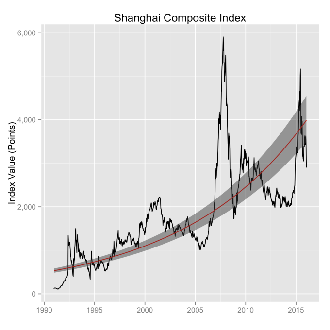
The Chinese market index everyone is talking about is the Shanghai Composite Index. The difficultly in doing analysis with this index is that it’s only been around since the very end of 1990. This means there are a limited number of bear/bull markets to average through as compared with the Dow Jones or the S&P500. Given the good results I’ve had with other market indices, I’m going to stick with my exponential model approach and see how it does. The model uses the assumption that baseline growth is exponential in time. With other market indices, this has shown to be a good assumption. What you see in the plot below is the exponential fit to the data (red line), along with the uncertainty in the fit (wide grey line). The uncertainty you find when applying this approach to other markets with more years of data (i.e, the Dow, the S&P500, the NASDAQ…) is much smaller. In time this uncertainty will shrink and average rates of growth determined from this model for this index will be more accurate.
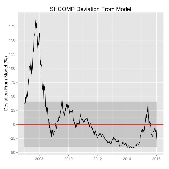
This red line gives the first part of what we need—the model value of the index. That is, it shows us what we should expect the value of the index to be at any point in time. But we also need to consider how the index varies from this value. We can find that by comparing the difference between the index value and the model value, and we do this as a percentage of the model value. Using a percentage ensures that we don’t let the value of the index weight the answer. When we do this, we find the histogram below—most of the time the actual value of the index is within ±40% of the model value for the index (one standard deviation is actually 43%). Friday’s closing value is shown as the red line, well within the “normal” range of variations. This approach to stock index modeling yields similar types of plots when looking at the Dow, the S&P500 or the NASDAQ.
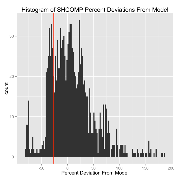
So was the Shanghai Composite Index overvalued? The answer is pretty clearly a no. As long as it bounces around inside of the ±40% range it is in “normal” territory (one standard deviation). The last time this index was out of this range was before the 2008 global financial meltdown. And that was pretty clearly a bubble, peaking at over 175% above the model value. Friday’s close took it to about 25% down from the model, but without other information that suggests the end is near, it is statistically exceedingly likely that it continues to bounce around inside of the shaded region.
The power of this model approach is clearer when we look at it in a different way. Short math refresher: If you plot an exponential function on a log scale, the result is a straight line. And straight lines are much easier to look at than exponential functions. So let’s look at the Shanghai Composite Index, and also the Dow Jones Industrial Average together so we can compare them, on a log scale. And lets also extend our model forecast out to 2050.
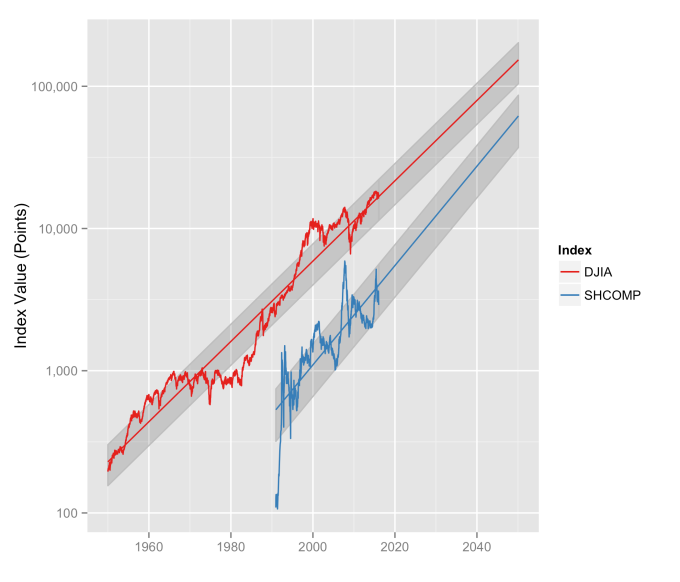
First we can see the reasonableness of the exponential model approach—the straight line fit looks very good for both of these indices. If it didn’t, well, I wouldn’t be writing about it. The DJIA model shows a doubling about every 10 years, which is around a 7.2% annual rate of growth. The SHCOMP model is a little higher, closer to 10% annually, but it also has a bigger error in the fit because there’s less data to fit. Call them even when it comes to rates of growth. But both of them are what we would call “well behaved,” and that is a good thing to observe.
Second, we can see just how well the real index values stay within 1 standard deviation (grey region) of the model for both indices. This should give us some confidence that even though it may feel like the markets have fallen into the toilet, that they’re actually quite in line with their normal historical moves. The market indices are well within their natural range of fluctuations; this isn’t new territory. This doesn’t make the folks on Wall Street consume any less Pepto, but it is pretty clear that the sky is not falling.
Now look ahead in the years leading up to 2050. What is important to see here is that the variation in the index is proportional to the index value. That means in terms of point values, these stock indices are going to fluctuate more in the future. In other words, a 43% drop from a 5,000 point index value is a 2100 point move (June 2015 to Friday was a drop of about that value). But a 43% drop from a 20,000 point index (some time in the 2040s) is 8600 points. Psychologically, that might be a more difficult pill to swallow, but it will still fall within the normal range of the index. That’s just the stock market for you.
