It has been some time since I posted any updates to my stock market index analysis charts. Now seems like a good time to follow up with my data-driven view of the equities investment environment.
My thesis for the behavior of the equities markets is that they obey stable long term exponential growth rules (constant annual percentage growth rates) with normally distributed perturbations around these rules. Meaning that “normal” index values should be expected to vary within some fixed percent of the model values. Over- and under-valued markets can then easily be observed because they fall outside of the expected statistical variation range. The power of this approach is twofold. First, it does appear to accurately reflect reality. Second, it takes emotion and opinion out of one’s assessment of how the markets are doing. Numbers here were updated as of April 3, 2020.
The coronavirus pandemic has caused quite a disturbance in equities. But 65 years of Dow Jones Industrial Average index values show things in perspective. The recent decline, while significant by any consideration, still leaves the index well within its normal variation while being just below the model expectations in absolute terms. We have seen perhaps the largest points drop, but the recent fall hasn’t even been as significant as the response to 2008 financial crisis.
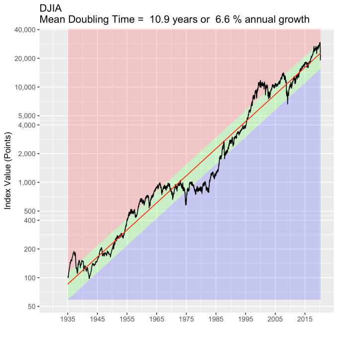
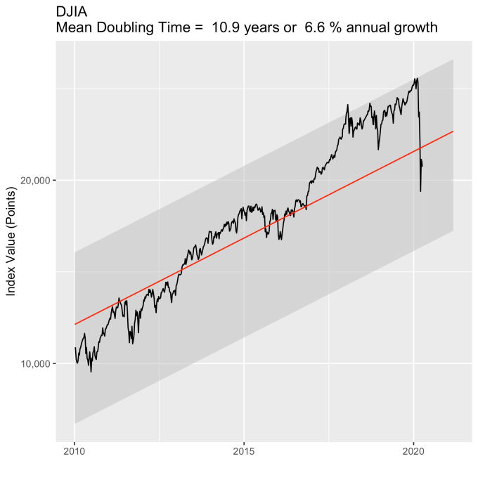
This is clearer if we just look at the last ~10 years. The DJIA was bouncing around the upper limit of what we should expect when the pandemic hit. This top limit is about 30% higher than the red line model value, so much of what was lost was “gravy.” It was value that long-term investors shouldn’t use as a baseline. Yes we all felt it in our 401(k) and IRA statements, but this shouldn’t impact long term strategies at all.
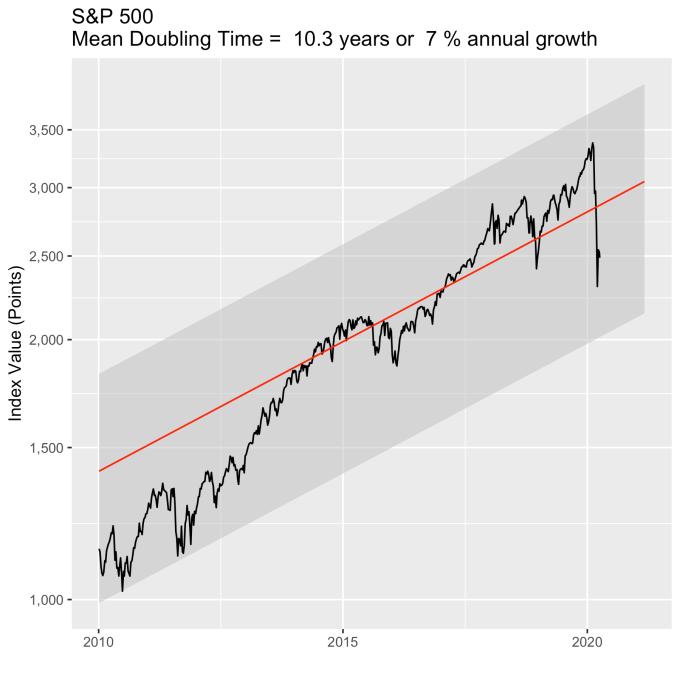
The DJIA is a small index, only 50 companies. Let’s turn our attention to a broader index – the S&P 500. The plot below shows that the S&P was not as aggressively flirting with its normal range, and remains in the green zone, like the DJIA, somewhat below it’s model value, but still comfortably so.
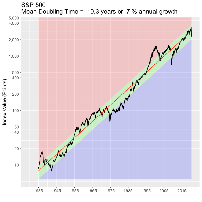
Again, looking at the last ~10 years shows this with more clarity. It too has fallen, but the broader market shows a more tempered response, both in terms of its recent willingness to explore the top range of normal, and its response to the pandemic.
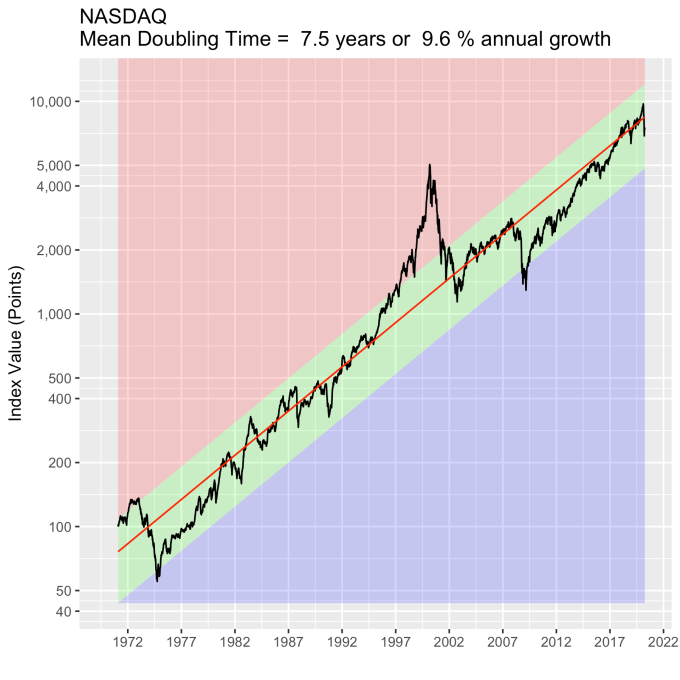
The NASDAQ is also broad like the S&P in terms of the number of companies in the index, but is focused primarily on tech stocks. It has a much more aggressive growth rate (9.6% annual compared with 7% for the S&P), but has held the S&P-like tempered response to the pandemic.
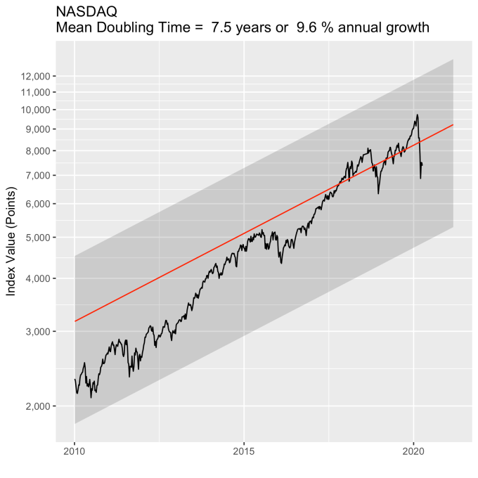
For completeness, here is the last ~10 year view as well. It is still well aligned with its long term trend, and its historical variations around that trend.
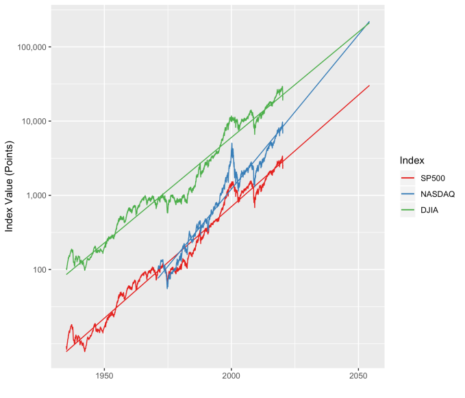
I always like to show these three indices together, along with their longer term model forecasts. The NASDAQ continues on its trend to be on par with the DJIA in the 2040s (with index values on the order of 100,000) and overtake it in the 2050s. This is always a plot that surprises people. Note that neither the tech bubble of 2000, the financial crisis of 2008, or the pandemic response of 2020 have made any of these indices deviate for any significant length of time from their long term growth baselines.