2020 Stock Market Index Update

It has been some time since I posted any updates to my stock market index analysis charts.  Now seems like a good time to follow up with my data-driven view of the equities investment environment.

My thesis for the behavior of the equities markets is that they obey stable long term exponential growth rules (constant annual percentage growth rates) with normally distributed perturbations around these rules.  Meaning that “normal” index values should be expected to vary within some fixed percent of the model values.  Over- and under-valued markets can then easily be observed because they fall outside of the expected statistical variation range.  The power of this approach is twofold.  First, it does appear to accurately reflect reality.  Second, it takes emotion and opinion out of one’s assessment of how the markets are doing.  Numbers here were updated as of April 3, 2020.

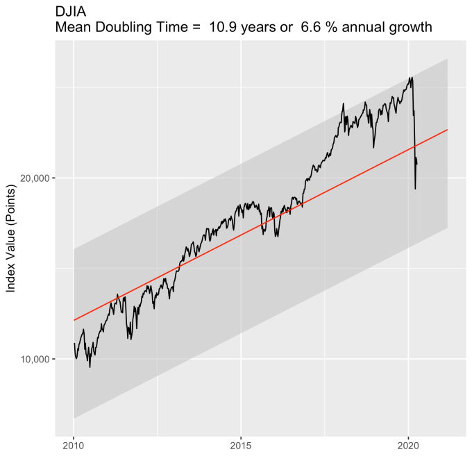
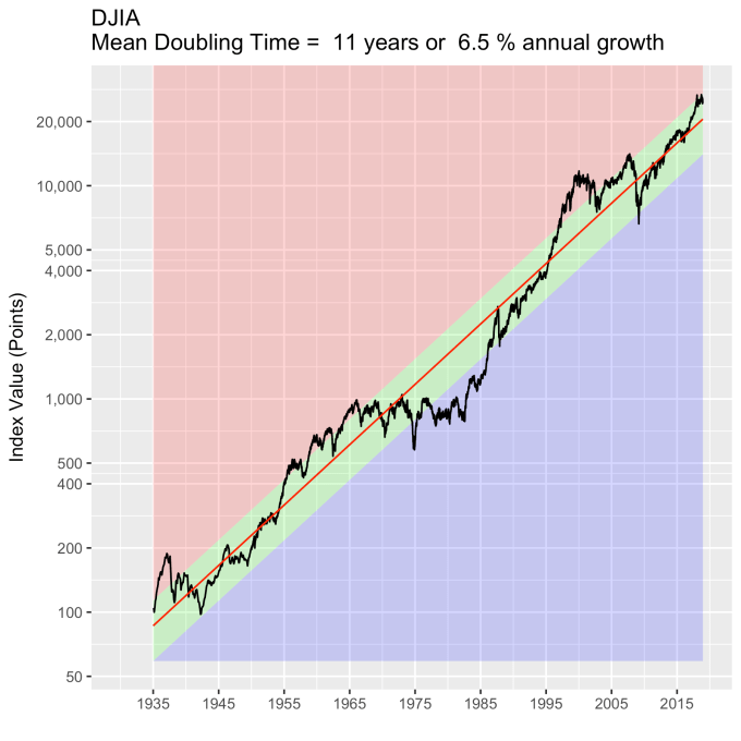
The coronavirus pandemic has caused quite a disturbance in equities.  But 65 years of Dow Jones Industrial Average index values show things in perspective.  The recent decline, while significant by any consideration, still leaves the index well within its normal variation while being just below the model expectations in absolute terms.  We have seen perhaps the largest points drop, but the recent fall hasn’t even been as significant as the response to 2008 financial crisis.

DJIA-forecast2

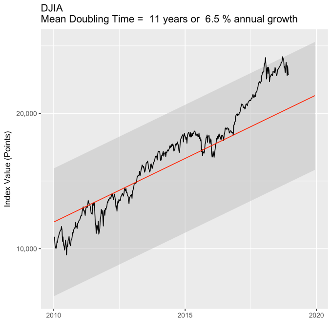
This is clearer if we just look at the last ~10 years.  The DJIA was bouncing around the upper limit of what we should expect when the pandemic hit.  This top limit is about 30% higher than the red line model value, so much of what was lost was “gravy.”  It was value that long-term investors shouldn’t use as a baseline.  Yes we all felt it in our 401(k) and IRA statements, but this shouldn’t impact long term strategies at all.

DJIA-forecast-recent

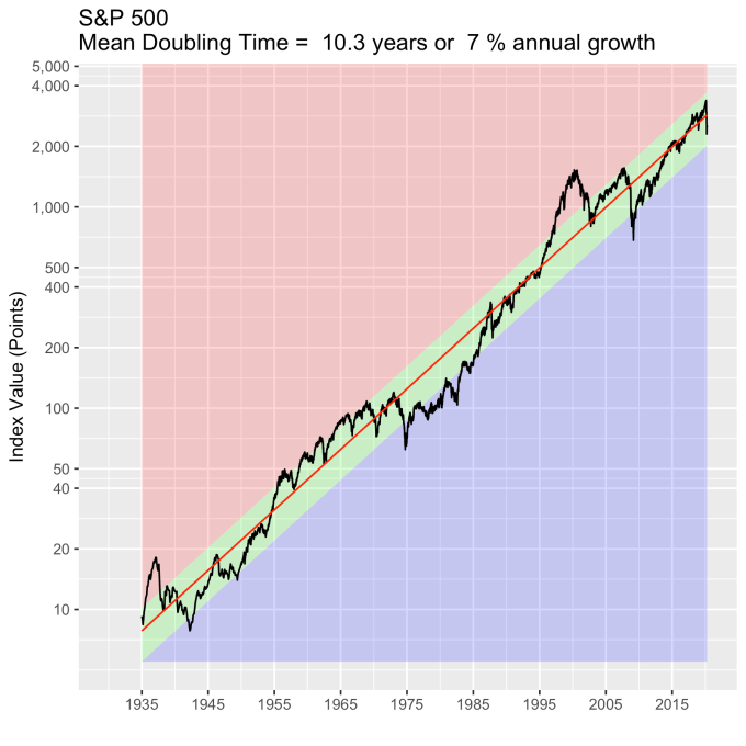
The DJIA is a small index, only 50 companies.  Let’s turn our attention to a broader index – the S&P 500.  The plot below shows that the S&P was not as aggressively flirting with its normal range, and remains in the green zone, like the DJIA, somewhat below it’s model value, but still comfortably so.

SP500-forecast2

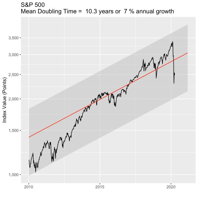
Again, looking at the last ~10 years shows this with more clarity.  It too has fallen, but the broader market shows a more tempered response, both in terms of its recent willingness to explore the top range of normal, and its response to the pandemic.

SP500-forecast-recent

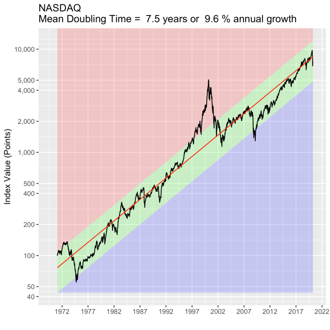
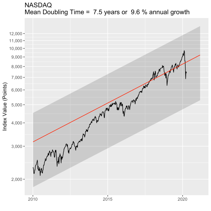
The NASDAQ is also broad like the S&P in terms of the number of companies in the index, but is focused primarily on tech stocks.  It has a much more aggressive growth rate (9.6% annual compared with 7% for the S&P), but has held the S&P-like tempered response to the pandemic.

NASDAQ-forecast2

For completeness, here is the last ~10 year view as well.  It is still well aligned with its long term trend, and its historical variations around that trend.

NASDAQ-forecast-recent

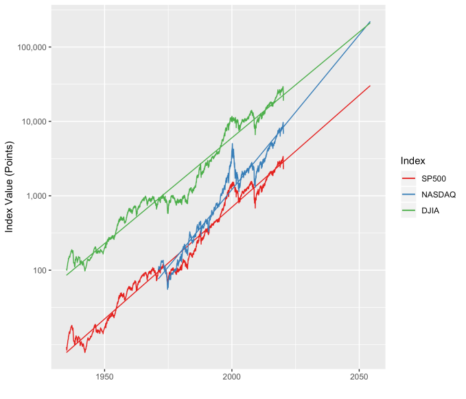
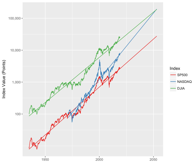
I always like to show these three indices together, along with their longer term model forecasts.  The NASDAQ continues on its trend to be on par with the DJIA in the 2040s (with index values on the order of 100,000) and overtake it in the 2050s.  This is always a plot that surprises people.  Note that neither the tech bubble of 2000, the financial crisis of 2008, or the pandemic response of 2020 have made any of these indices deviate for any significant length of time from their long term growth baselines.

combined_indices

Laws of the Markets Update

It has been some time since I last posted on my market index model.  Quickly, I was looking for an objective, data-drive method for evaluating the value status of the stock market.  Ten different people on the television will tell you ten different opinions of whether the markets are over valued or under valued or whether you should worry.  This is silly.  We have data, let’s use it.

You can read the older post for the details, but the essence is that the “wisdom of the crowd” in terms of investors and traders, knows where a given index should be and where their comfort levels around that number are.  It turns out the comfort levels lie within about 30% or so of that number, just drawing from statistics.  Over long periods of time, stock indices grow at constant annual rates; the day to day variations fluctuate around these long term numbers (and are probably completely unpredictable in any meaningful way).

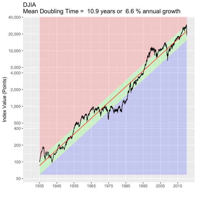
Starting with the blue-chips, I have extended the model to take weekly Dow Jones Industrial Average data from 1935 until 10 December 2018.  For all the plots below, the red line is the model fit to the data, which is a 6.5% annual growth rate here, and the green zone around it is one standard deviation of the actual data around the model value – about 32 percent in each direction for the Dow.

DJIA-forecast2

My thesis here is that the green zone boundary, one standard deviation from the model value, is essentially a turnaround point – inside it reflects the “normal” variation in index value.  Broadly speaking, when the index value crosses into the red, the market will respond as though the market is overvalued, and when it crosses into the blue, the market will respond as though the index is under valued.

Recent events are agree with this thesis.  Below is the DJIA since 2010.  In 2018 it has been floating around the top of the “normal” zone (shaded grey in this plot), even crossing into being overvalued a few times, but generally not for very long.  Though the DJIA has taken a beating lately, it is well within its historically normal (throughout 85 years) range of variation.  The people who claim it is a bubble are not basing their claims on objective, historical reasoning.

DJIA-forecast-recent.png

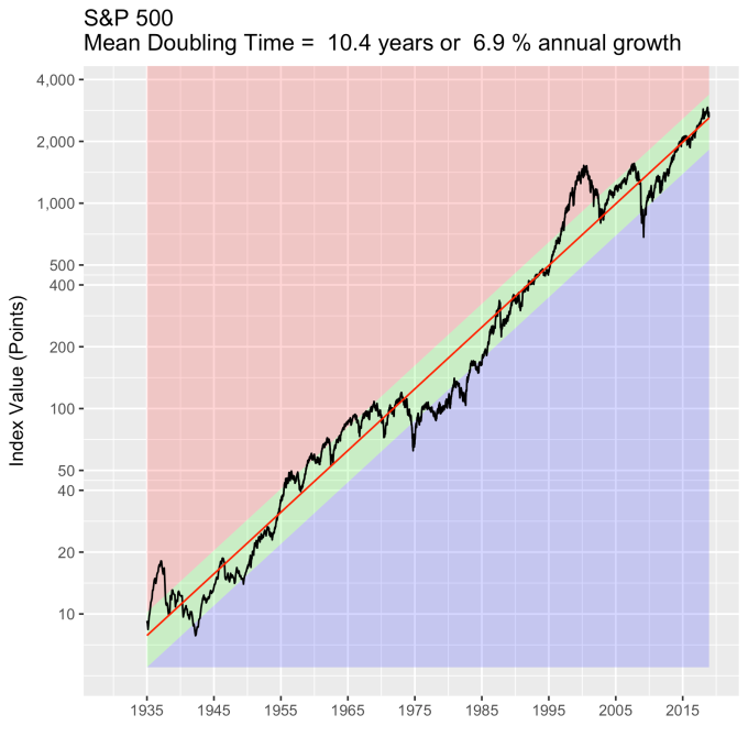
How about the broader indices?  Below is S&P 500 back to 1935.  The green zone here is 30% of the model value, and it adheres quite a bit more closely to my turnaround rule.  That there are ten times more stocks in this index than the last one probably helps it behave better.

SP500-forecast2.png

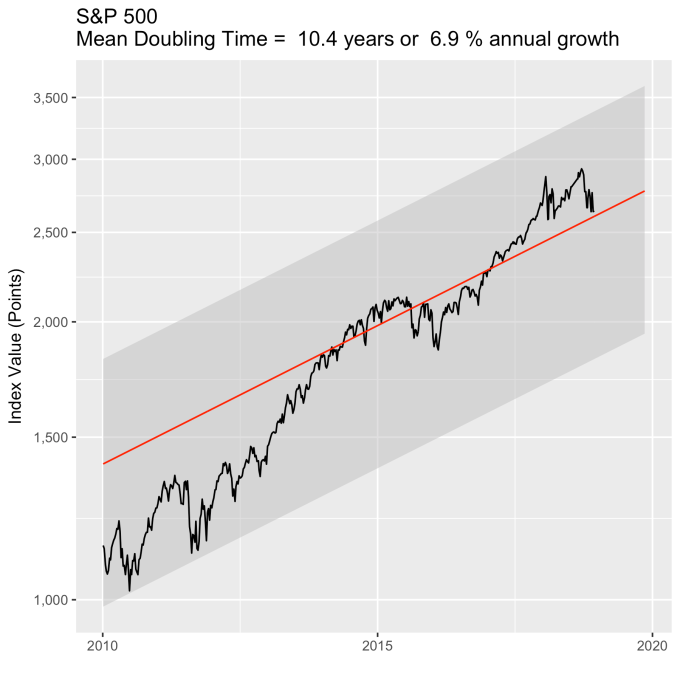
How is the S&P 500 doing lately?  The data from above are replotted below since 2010, just like with the Dow previously.  The S&P 500 is precisely where you would expect it to be from 83 years of data.

SP500-forecast-recent.png

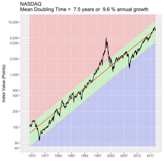
How about tech stocks?  The NASDAQ (1972 to present) has a wider standard deviation than the previous two, about 43%, mainly from the tech bubble (where it was trading at 3x the model value).  But note the NASDAQ is still tracking the same annual percentage growth line it’s been on for 46 years.

NASDAQ-forecast2.png

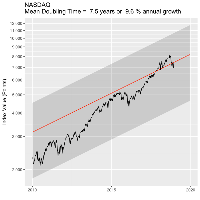
For consistency, below are the data since 2010.

NASDAQ-forecast-recent.png

You may ask how the actual index values are distributed around the model values.  Meaning, is the standard deviation a good metric?  Histograms of the percent deviation from the model are below for all three indices, with the first standard deviation colored green.  They aren’t perfect gaussian distributions, but they are clearly symmetric around the model.  You can clearly see, on the NASDAQ histogram, just how big the tech bubble was.

DJIA-ModelDeviation-percent-histogramSP500-ModelDeviation-percent-histogramNASDAQ-ModelDeviation-percent-histogram

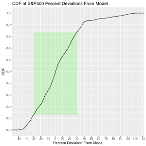
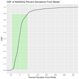
If you’re statistically inclined, the cumulative distributions make the case for the model quite well.  The green rectangle is one standard deviation horizontally and the vertical axis reflects the time spent at or below a given deviation.  The DJIA spends 65% of its time inside the box, the S&P 500 spends 70% there, and the NASDAQ spends 88%.

DJIA-ModelDeviation-percent-CDFSP500-ModelDeviation-percent-CDFNASDAQ-ModelDeviation-percent-CDF

One last thing.  Since we have such well behaved data, we can take a little gamble and forecast a little bit.  Historically the average growth rate of the NASDAQ is almost 50% higher than the other two I’ve mentioned.  What should we expect in the future if decades of data continue to hold true?  Plotting them all together paints an interesting future.  That is, some time around 2050 the NASDAQ should be overtaking the DJIA.  And both the DJIA and the NASDAQ index values will be over 100,000 sometime around 2040.

combined_indices.png

The Three Laws of the Markets

A 2015 Gallup poll showed that 55% of American adults have money invested in the stock market.   This is down somewhat from the 2008 high of 65%, but the percentage has not dropped below 52% during the time reported in the survey.  This is a significant number of families whose futures are at least partially impacted by long-term market trends.  This is because a lot of these investments are money that is tied up in retirement investments, like 401(k)s.  That is, by people who put a part of every paycheck into their retirement accounts and won’t touch that money again until perhaps decades later in retirement.  For them, what happened to the markets on any given day is completely immaterial.  Whether, for example, the Dow Jones Industrial Average shows gains or losses today doesn’t impact their investment strategy, nor will it have any significant impact on their portfolio value when it comes time to begin withdrawing money from their accounts.  But how the broad markets change on a long-term scale is hugely important, and completely overlooked by pretty much everybody.

So it makes sense to look at the stock market behavior with a long-term view for a change.  That is, let’s not focus on the 52 week average, but the 52 year behavior.

The markets, it turns out, obey three laws.  That is, there are three rules governing the behavior of the stock markets, broadly speaking.  They may not hold strongly for any particular stock, as one company’s stock price is dependent on a great deal of considerations, but when the marketplace is looked at as a whole, these rules apply.

The three laws governing the long term behavior of the stock markets are:

  1. Broad market indices grow, on average, exponentially in time.
  2. An index value at any time will naturally fall within some distribution around its exponential average value curve.  This range of values is a fixed percentage of the average value.
  3. The impact of bubbles and crashes is short term only.  After either of these is over, the index returns to the normal range as if the bubble/crash never happened.

Let’s look at each of these in more detail.

First, Law 1: Broad market indices grow, on average, exponentially in time.  Below I have plotted the Dow Jones Industrial Average, the Standard and Poor’s 500, and the NASDAQ Composite values from inception of the index to current value. Each of them covers a different span of time because they all started in different years, but they all cover multiple decades.  These plots may look slightly different from ones you may be used to seeing since I’m using a semi-log scale.  Plotted in this way, an exponential curve will show up as a straight line.  Exponential fits to each of the index values are shown in these plots as straight red lines.  Each red line isn’t expected to show the actual index value at any time, but rather to show the model value that the actual number should be centered around if it grew exponentially.  That is, the red line is an average, or mean, value.  If the fit is good, then the red line should split the black line of actual values evenly, which each does quite well.

DJIA-forecast2SP500-forecast2NASDAQ-forecast2Some indices hold to the line a bit tighter than others, but this general exponential trend represents the mean value with a great degree of accuracy.  This general agreement, which we will see more clearly shortly, is a validation of the first law.  The important thing to observe here is that while the short-term changes in the markets are widely considered to be completely unpredictable, the long-term values are not.  Long-term values obey the exponential growth law on average, but fluctuate around it on the short-term.

Which brings us to the Law 2:  An index value at any time will naturally fall within some distribution around its exponential average value curve.  This range of values is a fixed percentage of the average value.  If we look at the statistics of the differences between the actual black line values and the red line models, we can understand what the normal range of variation from the model is.  That is, the range we should expect to find it in at any time.  We can express the difference as a percentage of the model (red line value) for simplicity, and this turns out to be a valuable approach.  Consider that a 10 point change is an enormous deal if the index is valued at 100 points, but a much smaller deal if the index is valued at 10,000 points.  Using percentages makes the difficulty of using point values directly go away.  But it is also valuable because it allows us to observe the second law directly.

The histograms below show how often the actual black line index value is some percentage above or below the red line. These distributions are all centered around zero, indicating a good fit for the red line, as was mentioned previously.  And I have colored in green the region that falls within +/- 1 standard deviation from the model value.

DJIA-ModelDeviation-percent-histogramSP500-ModelDeviation-percent-histogram

NASDAQ-ModelDeviation-percent-histogram

That +/- 1 standard deviation from the model is the rule I used to color in the green region in the charts of index values at the top.  If we consider this range to be the range that the index value fall in under “normal” conditions, i.e. not a bubble and not a crash, then we can readily determine what would be over-valued and under-valued conditions for the index.  That is, we define and apply a standard, objective, data-based method to determine the market valuation condition as opposed to wild speculation or some other arbitrary or emotional method used by the talking heads.

These over- and under-valued conditions are marked in the (light) red and blue regions on first three plots.  Note just how well the region borders indicate turning points in the index value curves.  This second law gives us a powerful ability to make objective interpretations of how the markets are performing.  It gives us the ability, not to predict day-to-day variations, but the understand the normal behavior of the markets, and how to identify abnormal conditions.

This approach immediately raises two questions:  what are these normal ranges for each index, and how often is this methodology representative of the index’s value.  Without boring you too much about how those values are calculated, let me simply direct you to the answers in the table below.  Note that the magnitude of the effect of tech bubble in the late 1990s and early 2000s on the NASDAQ makes the standard deviation for it larger than the other two.  These variations, in the 30-40% range, are large, to be sure.  But they take into account how the markets actually behave: how well the companies in the index fit individual traders’ beliefs about what the future will bring.

Index 1 Standard Deviation (%) % Time Representative
DJIA 32.5 63.4
S&P 500 30.3 70.2
NASDAQ 44.2 87.5

What can be readily seen here is the psychology of the market.  That is, when individual traders start to feel that things might be growing too quickly, approaching overvaluation, they start to sell and take some profits.  This leads to a decrease in the value of the index, which then quickly falls back into the “normal” range.  The same psychology works in the opposite fashion when the index value shows a bargain.  When the value is low, the time is ripe for buying which drives the value back up into the “normal” range.  If you look closely at those first three plots, you’ll see how often the index value flirts with the borders of the green region.  Actual values might cross this border, but generally not for long.  And interestingly, if you calculate this standard deviation percentage for other indices (DAX, FTSE, Shanghai Composite, etc.), you’ll find numbers in the 30s and see precisely the same behavior.

This brings us to Law 3:  The impact of bubbles and crashes is short term only.  After either of these is over, the index returns to the normal range as if the bubble/crash never happened.  The definitions of bubbles and crashes are subjective, and will vary among analysts.  But we agree on a few.  It is unlikely that anyone will dispute the so-called tech bubble of the late 1990s into the early 2000s.  All of the market indices ran far into overvalued territory.  Similarly, few would call the crash of 2008 by any other name, with major point drops over a very short period of time.  So we will start with these.

An examination of any of the first three plots show precisely this third law in effect for both of these large transitional events.  After the tech boom, the Dow, the S&P, and the NASDAQ all fell back to, look to see that this is true, within a few percent of the red line – which is where they would have been had the bubble not happened.  The 2008 crash similarly showed a sharp drop down into the undervalued blue zone for all three indices.  All three were back into the “normal” range within a year, and have been hovering around the red line for some time now.  The three major US indices today are exactly where their long term behavior suggests they should be.

There are plenty of other mini crashes – sharp drops in value due to economic recession.  The St. Louis Federal Reserve Economic Database (FRED) lists the dates of official economic recession for the US economy.  Overlaying those dates (light red vertical bars) onto the Dow Jones plot shows what happens to the index value during economic recession, and what happens after.  This is typically a return to a value close to what it was before.

DJIA-recessions

Overall, even with the crummy performance in the 1970s, the Dow shows over 60 years of average growth that is precisely in line with the exponential model.  By the mid 1980s the effect of the languid 70s was gone and the DJIA was right back up to the red line, following the trend it would have taken had the 70s poor performance not happened.  In no case, for any of the three indices shown here or foreign indices such as the DAX, the FTSE, the Shanghai Composite, or the HangSeng, has bubble growth increased long term growth, and similarly, never has a crash slowed the overall long term growth.

To wrap up, there is a defining characteristic of exponential growth, one single feature which distinguishes it from all other curves.  This defining characteristic is a constant growth rate.  It is this constant rate of growth that produces the exponential behavior from a mathematical perspective.  Any quantity that has a constant rate of growth (or decay) will follow an exponential curve. Population growth, radioactive decay, and compound interest are all real world examples.  And while the growth rate is the most obvious number that can characterize these curves, perhaps the more interesting one is the doubling time (or half life, if you’re thinking about radioactive decay).

The doubling time is the how long it would take for an index’s value to double.  The larger the growth rate, the smaller the doubling time.  Note that this effect will happen almost 3.5 years sooner for a NASDAQ fund than for a DJIA fund.  This, then, is where rubber meets road.

Index Mean Annual Growth Rate (%) Doubling Time (years)
DJIA 6.7 10.7
S&P 500 7.1 10.1
NASDAQ 9.9 7.3

To understand the significance of the market laws in general (the first two, anyway) and these numbers specifically, let’s do an example.  Imagine that we receive $1000 in gifts upon graduating from high school.  We invest all of that money in an index fund, never adding to it and never withdrawing any money from the fund.  We leave it there until we retire at age 65.  Assuming we start this experiment at 18, our money, in the DJIA fund, will double 4.4 times over the years (47 years/10.7 year doubling time), giving us about $21,000.   Not bad for a $1000 investment.  It will double 4.7 times in the S&P 500 fund giving us a slightly higher $25,000 if we went that option.  Now consider the NASDAQ, where it will double 6.4 times resulting in almost $87,000.

But that is just the application of the first law, which applies to average growth.  We need to consider the second law, because it tells us what range around that mean we should expect.  The numbers we need to do this are in the first table above, which express the variability in the value of the index as a percentage of its mean value.

Doing the math, we see that we should expect the DJIA investment at age 65 to be fall roughly between $14,000 and $28,000 (a standard deviation of $6700), the S&P 500 to fall between $17,500 and $32,000 (a standard deviation of $7500), and the NASDAQ to be between $49,000 and $125,000 (a standard deviation of $38,000).  Certainly the NASDAQ fund’s variation is quite large, but note that even the low side of the NASDAQ fund’s projected value is still almost double that of the DJIA’s best outcome.

Because some people, like me, process things better visually, here are is the plot.  The “normal” range is shaded for each index.  Note that by about age 24 the prospect of a loss of principal is essentially gone.

example

The third law, it should be said, tells us we should expect these numbers to be good in spite of any significant bubbles or crashes that happen in the middle years.  Laws are powerful.  Use them wisely.
The Over/Under on the Shanghai Composite

The Chinese stock market has been quite the ride over the last week, with the Shanghai Composite Index falling from its (very short lived) June 2015 high of around 5100 to closing under 3000 on Friday January 15.  When things like this happen, traders in other world markets buy a lot more Pepto-Bismol than usual.  Global trade being what it is, economies around the world are linked in a lot more intimate ways.  And you know what it’s like taking a shot like this in the intimates.

I heard an economist on NPR this week mention that there has been talk that the Chinese market was overvalued and that maybe a correction should have been expected.  Now to call something overvalued suggests that you know what its price should be.  But economists and stock market analysts never really have good answers about what they think a stock index value should be, or even how you would go about making such a determination.  Maybe it’s a secret.  But a good tool to have would enable good estimates of what a stock index value should be.  Broad market indices can average out the noise that is in individual stock prices, so they should be the target for the tool and not individual company stocks.

Short term, day-to-day changes in any stock price or index are essentially unpredictable.  Lots of people have tried.  The things that impact day-to-day changes are numerous and perhaps even chaotic in the mathematical sense.  And having to weight their impacts on valuation makes a very difficult problem even harder.  But a good forecasting tool doesn’t need to make short term predictions.  A useful tool needs to make long term average value predictions.  It should determine baseline values to fluctuate around on shorter timescales, and maybe even determine what a normal range of those variations should be.  Overvalued or undervalued is then a call made by comparing the current value with the model values.

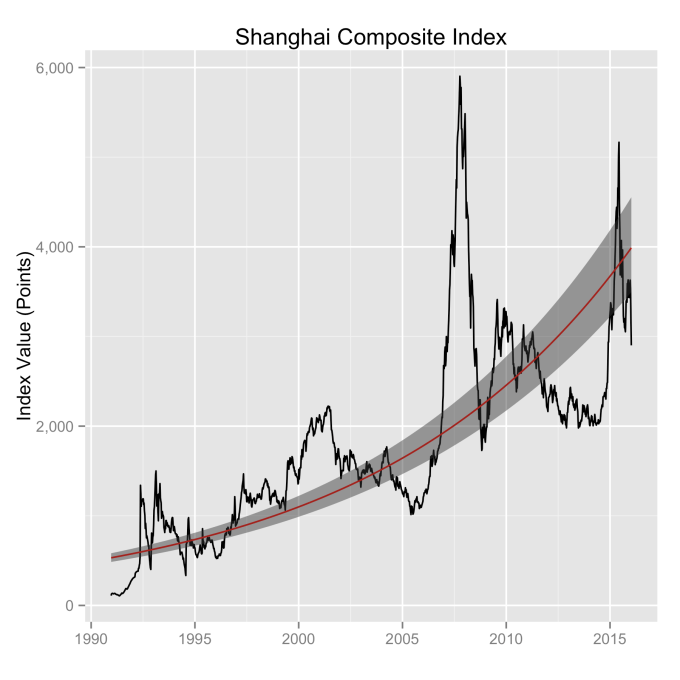
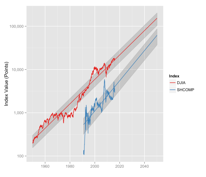
The Chinese market index everyone is talking about is the Shanghai Composite Index.  The difficultly in doing analysis with this index is that it’s only been around since the very end of 1990.  This means there are a limited number of bear/bull markets to average through as compared with the Dow Jones or the S&P500.  Given the good results I’ve had with other market indices, I’m going to stick with my exponential model approach and see how it does.  The model uses the assumption that baseline growth is exponential in time.  With other market indices, this has shown to be a good assumption.  What you see in the plot below is the exponential fit to the data (red line), along with the uncertainty in the fit (wide grey line).  The uncertainty you find when applying this approach to other markets with more years of data (i.e, the Dow, the S&P500, the NASDAQ…) is much smaller.  In time this uncertainty will shrink and average rates of growth determined from this model for this index will be more accurate.

SHCOMP-fit

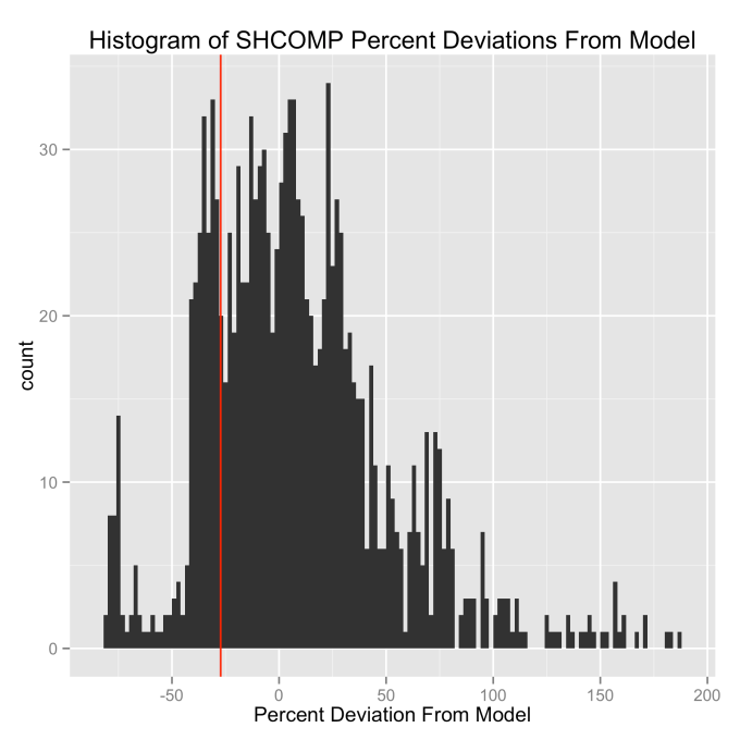
This red line gives the first part of what we need—the model value of the index.  That is, it shows us what we should expect the value of the index to be at any point in time.  But we also need to consider how the index varies from this value.  We can find that by comparing the difference between the index value and the model value, and we do this as a percentage of the model value.  Using a percentage ensures that we don’t let the value of the index weight the answer.  When we do this, we find the histogram below—most of the time the actual value of the index is within ±40% of the model value for the index (one standard deviation is actually 43%).  Friday’s closing value is shown as the red line, well within the “normal” range of variations.  This approach to stock index modeling yields similar types of plots when looking at the Dow, the S&P500 or the NASDAQ.

SHCOMP-ModelDeviation-percent-histogram

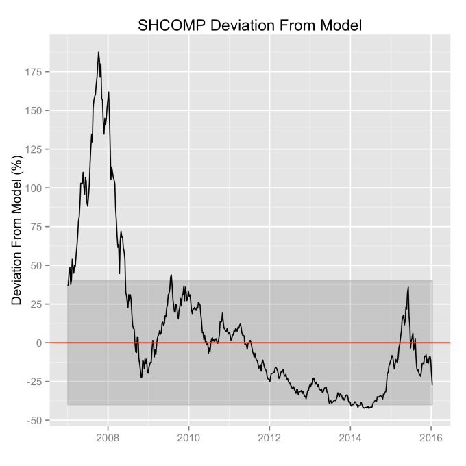
So was the Shanghai Composite Index overvalued?  The answer is pretty clearly a no.  As long as it bounces around inside of the ±40% range it is in “normal” territory (one standard deviation).  The last time this index was out of this range was before the 2008 global financial meltdown.  And that was pretty clearly a bubble, peaking at over 175% above the model value.  Friday’s close took it to about 25% down from the model, but without other information that suggests the end is near, it is statistically exceedingly likely that it continues to bounce around inside of the shaded region.

SHCOMP-ModelDeviation-Percent(recent).png

The power of this model approach is clearer when we look at it in a different way.  Short math refresher:  If you plot an exponential function on a log scale, the result is a straight line.  And straight lines are much easier to look at than exponential functions.  So let’s look at the Shanghai Composite Index, and also the Dow Jones Industrial Average together so we can compare them, on a log scale.  And lets also extend our model forecast out to 2050.

combined_indices-SHCOMP-DJIA.png

First we can see the reasonableness of the exponential model approach—the straight line fit looks very good for both of these indices.  If it didn’t, well, I wouldn’t be writing about it.  The DJIA model shows a doubling about every 10 years, which is around a 7.2% annual rate of growth.  The SHCOMP model is a little higher, closer to 10% annually, but it also has a bigger error in the fit because there’s less data to fit.  Call them even when it comes to rates of growth.  But both of them are what we would call “well behaved,” and that is a good thing to observe.

Second, we can see just how well the real index values stay within 1 standard deviation (grey region) of the model for both indices.  This should give us some confidence that even though it may feel like the markets have fallen into the toilet, that they’re actually quite in line with their normal historical moves.  The market indices are well within their natural range of fluctuations; this isn’t new territory.  This doesn’t make the folks on Wall Street consume any less Pepto, but it is pretty clear that the sky is not falling.

Now look ahead in the years leading up to 2050.  What is important to see here is that the variation in the index is proportional to the index value.  That means in terms of point values, these stock indices are going to fluctuate more in the future.  In other words, a 43% drop from a 5,000 point index value is a 2100 point move (June 2015 to Friday was a drop of about that value).  But a 43% drop from a 20,000 point index (some time in the 2040s) is 8600 points.  Psychologically, that might be a more difficult pill to swallow, but it will still fall within the normal range of the index.  That’s just the stock market for you.

The Big Friday Effect

The Big Friday effect is what I have called my observation that more mail is delivered on Friday than on any other day of the week.  It became apparent very quickly as I began to analyze my USPS mail and has remained through the entire year that I’ve been conducting this mail-counting experiment. You can see the Big Friday effect in the figure below, which plots the total number of pieces of mail I’ve received by weekday.  It is a curious effect that has an interesting cause.

The quantity of mail, by category, with the day of the week it was delivered.

The quantity of mail, by category, by the day of the week it was delivered. Notice that Friday is significantly higher than the other weekdays.

I wanted to look more deeply into the weekday distribution to understand what is behind Big Friday. I analyzed the mail from individual senders to see how it was distributed throughout the week, restricting the analysis to the top 15 largest senders (see below).  This limits me to senders with mail volumes of about 1 item per month or more.  Any sender with less mail volume than that won’t be able to have much of an impact on any given day.

Mail totals for the top 15 senders of mail (to me), broken down into categories.

Mail totals for the top 15 senders of mail (to me), broken down into categories.

Plotting each sender’s mail into weekdays is revealing.  Most of the them have mail delivery distributed throughout the week, which is what you would expect for a mostly random sending process.  There are two notable exceptions — they are the senders with the majority of their mail deliveries concentrated into one weekday.

The weekday mail totals for the top 15 senders.  Note that the y-axes all have independent scales.  Note the scale for Redplum.

The weekday mail totals for the top 15 senders. Note that the y-axes all have independent scales. Note the scale for Redplum.

The Amherst Citizen is a local newspaper which is generally delivered on Wednesdays.  This does give Wednesday a boost in the top figure, but it isn’t a huge contributor because it doesn’t come out every week.  It is also not that reliably delivered on Wednesday, with Thursday deliveries being about 1/3 as many as Wednesday’s.  But look at Redplum (lower left), the well known junk mail merchant.  With 44 deliveries on Friday alone it dominates the weekday totals.  Thursday and Saturday have two each.  Considering that there are 54 weeks of mail deliveries in these numbers, Redplum would seem to be very effective at getting advertisements and coupons delivered to households just in time for weekend shopping plans.

To illustrate just how strongly Redplum impacts the numbers, we can look the mail by weekday for these top 15:

Mail received by the listed senders by the weekday it was received.  Note the large contribution from Redplum on Friday.

Mail received by the listed senders by the weekday it was received. Note the large contribution from Redplum on Friday.

And then without Redplum’s contribution’s.  And so we find that Big Friday is all about one junk mail marketer being very precise with their product’s delivery.

Mail received by the listed senders by the weekday it was received.  Redplum was removed to illustrate it's effect.

Mail received by the listed senders by the weekday it was received. Redplum was removed to illustrate it’s effect.

Bubble Markets, Burst Markets

Wall Street forecasters are notoriously bad at predicting what the markets are going to do.  In fact the forecasts for 2001, 2002, and 2008 were actually worse than guessing.  Granted, predicting the future is a hard job, but when it comes to stock markets, there are some things you can count on.  Disclaimer:  This is a look at the numbers; it is not investment advice.

Let’s take the Standard & Poor’s 500.  It is an index of 500 large US companies stock values, much broader than the Dow Jones’s 30 company average.  It isn’t a stock, and you can’t buy shares in it.  But it is a convenient tool for tracking the overall condition of the stock market.  It may also reflect on the state of the economy, which we’ll look at in a bit.  Below are the monthly closing values of the S&P 500 since 1950.  It’s value was about 17 points in January of 1950 and it closed around 2100 points here in June of 2015.  It’s bounced around plenty in between.

Closing values of the S&P 500 stock index.

Closing values of the S&P 500 stock index.

One of the questions to ask is whether the markets are overvalued or undervalued.  Forecasters hope to predict crashes, but also to look for good buying opportunities.  Short term fluctuations in the markets have proven to be very unpredictable.  But longer term trends are a different story, and looking at them can give huge insights into what’s currently going on.

But first we have to look at the numbers in a different way.  The raw data plot above makes things more difficult than they really need to be because it fails to let you clearly see the trend in how the index grows.  Stocks have a tendency to grow exponentially in time.  This is no secret, and most of the common online stock performance charts give you a log view option.  Exponential growth is why advisors recommend most working people to get into investments early and ride them out for the long haul.

The exponential growth in the S&P is easy to see in the plot below, where I plotted the logarithm of the index value.  For convenience I also plotted the straight line fit to these data — this is its exponential trend.  Note that these data span six and a half decades, so we have some bull and bear markets in there — and whatever came in between them.  And what you see is that no matter what short term silliness was going on, the index value always came back down to the red line.  It didn’t necessarily stay there very long, but the line represents the stability position.  It is a kind of first order term in a perturbation theory model, if you will.  The line shows the value that the short term fluctuations move around.

Here I've taken the logarithm (base 10) of the index values to show the exponential growth trend.  The grey area represents the confidence intervals.

Here I’ve taken the logarithm (base 10) of the index values to show the exponential growth trend. The grey area represents the confidence intervals.

This return to the line is a little bit clearer if we plot the difference between the index and the trend.  This would seem to be a reasonable way to spot overvalued or undervalued markets.  Meaning, that in 2000, when the S&P was some 800 points over its long term model value, the corresponding rapid drop back down to the line should have caught no one by surprise.

Differences between the S&P 500 index value and the exponential trend model value.

Differences between the S&P 500 index value and the exponential trend model value.

But this look at the numbers is a bit disingenuous.  That’s because the value of the index has changed by huge amounts since 1950, so small points swings that we don’t care about at all today were a much bigger deal then.  This makes more recent fluctuations appear to be a bigger deal than they may really be.  So what we want to see is the percentage of the change, not the actual change.

And on top of this, let’s mark recession years (from the Federal Reserve Economic Database) in red.  From this view we can see the bubble markets develop and the resulting panics that result when they burst (hello 2008).  And that every recession brought a drop in the index (some bigger than others), but not every index drop represented a recession.  In the tech bubble of the late 1990s the market was 110% overvalued at its peak.  The crash of 2008 had it drop to about 45%, which is considerably undervalued.  All that in 8 years.  I think it’s safe to call that a panic.  I know it made me panic.

Deviations in the S&P 500 index value from the exponential model are shown as a percentage of the index values.  And recession years (from FRED) are shown in light red.

Deviations in the S&P 500 index value from the exponential model are shown as a percentage of the index values. And recession years (from FRED) are shown in light red.

What we see is that the exponential model does a good job at calculating the baseline (stable position) values.  If it didn’t, the recession-related drops in the index wouldn’t line up with the FRED data, and things like the 1990s bubble and the 2008 financial meltdown wouldn’t match the timeline.  But they do.  Quite well, actually.  So this is a useful analysis tool.

It is also enlightening to take the same looks at the NASDAQ index since it represents a different sector of the stock market.  NASDAQ started in 1971 and is more of a technology focused index.  The NASDAQ composite index is created from all of the stocks listed on the NASDAQ exchange, which is more than 3000 stocks.  So more companies in the index means this is a broader look, but it is focused on tech stocks.

So, as with the S&P above, here are the raw data.  It looks similar to the S&P, and the size of the tech bubble is more clear.  The initial monthly close of the index was 101 points, and it is over 5000 today.

Closing values of the NASDAQ stock index.

Closing values of the NASDAQ stock index.

Not surprising to anyone, this index also grows with an exponential trend.  The NASDAQ was absolutely on fire in the late 1990s.  I wonder if this is what Prince meant when he wanted to party like it was 1999.  Maybe he knew that would be the time to cash out?

Here I've taken the logarithm (base 10) of the index values to show the exponential growth trend.  The grey area represents the confidence intervals.

Here I’ve taken the logarithm (base 10) of the index values to show the exponential growth trend. The grey area represents the confidence intervals.

The size of the dot-com bubble is clearer if we look at the deviation from the model, as we did with the S&P.  At the height of the tech bubble, the NASDAQ was about 3500 points overvalued.  Considering that the model puts its expected value at about 1300 points in 2000, I have to ask myself, what were they thinking?

Differences between the NASDAQ index value and the exponential trend model value.

Differences between the NASDAQ index value and the exponential trend model value.

The percent deviation plot shows this very clearly.  At the height of the tech bubble, the NASDAQ was some 275% overvalued, almost three times that of the S&P 500’s overvalue.  Before the late 1990s the NASDAQ had never strayed more than about 50% from the model value.  Warren Buffet has said that the rear view mirror is always clearer than the windshield, but maybe Stevie Wonder shouldn’t be the one doing the driving.

Deviations in the NASDAQ index value from the exponential model are shown as a percentage of the index values.  And recession years (from FRED) are shown in light red.

Deviations in the NASDAQ index value from the exponential model are shown as a percentage of the index values. And recession years (from FRED) are shown in light red.

From this perspective, the NASDAQ today actually looks a few percentage points undervalued, so tech still seems to be a slightly better buy than the broader market (this is not investment advice).

Not only that, but the growth model of the NASDAQ, based on its 45 years of data, shows that it grows considerably faster than the broader market.  If you go back and look at the raw data for either of the two indices, you’ll notice something special about the nature of exponential growth.  The time it takes to double (triple, etc.) is a constant.  As these are bigger numbers and because it is convenient, let’s look at the time it takes to grow by a factor of ten (decuple).  The S&P 500 index decuples every 33.3 or so years.  The NASDAQ composite, on the other hand, decuples every ~24 years (about 23 years and 11 months, give or take).  This has huge implications for growth.  That’s nine fewer years to grow by the same factor of 10.

Now comes the dangerous part.  Let’s take the both of these indices and forecast their model values out thirty years.  Both of the datasets contain more than thirty years worth of data, so forecasting this far out is a bit of a stretch, but not without some reasonable basis.  Still, this is an exercise in “what if,” not promises, and certainly not investment advice.

Since we started with the S&P, let’s look at that first.  If the historic growth trends continue, the model forecasts that the S&P 500 (currently around 2000 points) should be bouncing around the 10,000 point mark some time in the middle of 2038.

S&500 data, along with its exponential model fit, extended out thirty years.  The grey area represents the confidence intervals.

S&500 data, along with its exponential model fit, extended out thirty years. The grey area represents the confidence intervals.

The NASDAQ, on the other hand, which is currently around 5000 points, should average around 10,000 in late 2021, and 100,000 near the end of 2045.  (Note: the S&P should be around 16,000 points at that time).  Today the ratio of the NASDAQ to the S&P is about 2.4.  But in 2045 it could reasonably be expected to be more than 6.  Depending on the number of zeroes in your investment portfolio (before the decimal point…), that could be significant.

NASDAQ data, along with its exponential model fit, extended out thirty years.  The grey area represents the confidence intervals.

NASDAQ data, along with its exponential model fit, extended out thirty years. The grey area represents the confidence intervals.

This forecasting method will not predict market crashes.  But that’s OK, because the professionals who try to forecast them can’t do that either.  (Now if only Goldman-Sachs would hire me.)  What it can do is give us a very clear idea of the market is over or under valued.  By forecasting the stable position trend, we can easily spot bubbles, identify their size, and perhaps make wise decisions as a result.

The Adjacent Possible and the Law of Accelerating Returns

A concept that inventor and futurist Ray Kurzweil drives home in his books is what he calls the Law of Accelerating Returns.  That is, the observation that technology growth (among other things) follows an exponential curve.  He shows this for no small number of pages for varying technologies and concepts.  Most famous is Moore’s Law, in which Gordon Moore (one of the founders of Intel Corporation) observed that the number of transistors on a die doubled in a fixed amount of time (about every two years).  Kurzweil argues that this exponential growth pattern applies to both technological and biological evolution. In other words, that progress grows exponentially in time.  It should be clear that this is an observation rather than something derived from fundamental scientific theories.

What makes this backward looking observation particularly interesting is that in spite of our observation of it as generally true over vast periods of time, humans are very linear thinkers and have a difficult time envisioning exponential growth rates forward in time.  Kurzweil is a notable exception to that rule.  Because of exponential growth, the technological progress we make in the next 50 years will not be the same as what we have realized in the last 50 years.  It will be very much larger.  Almost unbelievably larger — the equivalent of the progress made in the last ~600 years.  This is the nature of exponential growth (and why some people find Kurzweil’s predictions difficult to swallow).

Interestingly, when a survey of scientific literature was done by Derek Price in 1961, an exponential growth in scientific publications was readily observed, but dismissed as unsustainable.  This unsustainability in the growth rate was understood to be obvious by Price.  The survey was revisited in 2010 (citing the original work), with the exponential growth still being observed 39 years later.  So this linear forecasting is a handicap that seems to exist even when we have the data to the contrary staring us in the face.

On the other hand we have biologist Stuart Kauffmann.  He introduced the concept of the Adjacent Possible which was made more widely known in Steven Johnson’s excellent book, Where Good Ideas Come From.  The Adjacent Possible concept is another backwards-looking observation that describes how biological complexity has progressed through the combining of whatever nature had on hand at the time.  At first glimpse this sounds sort of bland and altogether obvious.  But it is a hugely powerful statement when you dig a little deeper.  This is a way of defining what change is possible.  That combining things that already exist is how things of greater complexity are formed.  Said slightly differently, what is actual today defines what is possible tomorrow.  And what becomes possible will then influence what can become actual.  And so on.  So while dramatic changes can happen, only certain changes are possible based on what is here now.  And thus the set of actual/possible combinations expands in time, increasing the complexity of what’s in the toolbox.

Johnson describes it in this way:

“Four billion years ago, if you were a carbon atom, there were a few hundred molecular configurations you could stumble into.  Today that same carbon atom, whose atomic properties haven’t changed one single nanogram, can help build a sperm whale or a giant redwood or an H1N1 virus, along with a near infinite list of other carbon-based life forms that were not part of the adjacent possible of prebiotic earth.  Add to that an equally list of human concoctions that rely on carbon—every single object on the planet made of plastic, for instance—and you can see how far the kingdom of the adjacent possible has expanded since those fatty acids self-assembled into the first membrane.” — Steven Johnson, Where Good Ideas Come From

Kauffmann’s complexity theory is really an ingenious observation.  Perhaps what is most shocking is that, given how obvious it is in hindsight, no one managed to put it into words before.  I should note that Charles Darwin’s contemporaries expressed the same sentiments.

What is next most shocking is that Kauffman’s observation is basically the same as Kurzweil’s.  We have to do a little bit of math to show this is true.  I promise, it isn’t too painful.

The Adjacent Possible is all about combinations.  So first let’s assume we have some set of n number of objects.  We want to take k of them at a time and determine how many unique k-sized combinations there are.  This is popularly known in mathematics as “n choose k.”  In other words, if I have three objects, how many different ways are there to combine them two at a time?  That’s what we’re working out.  There is a shortcut in math notation that says if we are going to multiply a number by all of the integers less than it, that we can write the number with an exclamation mark.  So 3x2x1 would simply be written as 3!, and the exclamation mark is pronounced “factorial” when you read it.  This turns out to be very helpful in counting combinations.  Our n choose k counting problem can then be written as:

Math5

You can try this out for relatively small numbers for n and k and see that this is true.

The pertinent question, however, is what are the total number of combinations for all possible values of k.  That is, if I have n objects, how many unique ways can I combine them if I take them one at a time, two at a time, three at a time, etc., all the way up to the whole set?  To find this out you evaluate the above equation for all values of k from 0 all the way to n and sum them all up.  When you do this you find that the answer is 2^n. Or written more mathematically:

Math1

So as an example, let us take 3 objects (n=3), let’s call them playing cards, and count all of the possible combinations of these three cards, as shown in the table below.  Note that there are exactly 2^3=8 distinct combinations.  Here a 1 in the row indicates a card’s inclusion in that combination.  We have no cards, all combinations of one card, all combinations of two cards, and then all three cards, for a total of 8 unique combinations.

Card 3 Card 2 Card 1
0 0 0
0 0 1
0 1 0
0 1 1
1 0 0
1 0 1
1 1 0
1 1 1

You can repeat this for any size set and you’ll find that the total number of unique combinations of any size for a set of size n will always be 2^n.  If you are familiar with base 2 math, you might have recognized that already.  So for n=3 objects we have the 2^3 (8) combinations that we just saw.  And for n=4 we get 2^4 (16) combinations, for n=5 we have 2^5 (32) combinations, and so on.

So in other words, the number of possible combinations grows exponentially with the number of objects in the set.  But this exponential growth is exactly what Kurzweil observes in his Law of Accelerating Returns.  Kurzweil simply pays attention to how n grows with time, while Kauffman pays attention to the growth of (bio)diversity without being concerned about the time aspect.

Kauffman uses this model to describe the growth in complexity of biological systems.  That simple structures first evolved, and that combinations of those simple things made structures that were more complex, and that combinations of these more complex structures went on to create even more complex structures.  A simple look at any living thing shows a mind-boggling amount of complexity, but sometimes it is obvious how the component systems evolved.  Amino acids lead to proteins.  Proteins lead to membranes.  Membranes lead to cells.  Cells combine and specialize.  Entire biological systems develop.  Each of these steps relies on components of lower complexity as bits of their construction.

Kurzweil’s observation is one of technological progress.  That the limits of ideas are pushed through paradigm after paradigm, but still it is the combination of ideas that enable us to come up with the designs, the processes, and materials that get more transistors on a die year after year.  That is to say, semiconductor engineers 30 years ago had no clues how they would get around the challenges they faced in reaching today’s level of sophistication.  But adding new ways of thinking about the problems lead to entirely new types of solutions (paradigms) and the growth curve kept its pace.

Linking combinatorial complexity to progress gives us the modern definition of innovation.  That innovation is really the exploring and exploiting of the Adjacent Possible.  It is easy to look back in time and see the exponential growth of innovation that has brought us to the quality of life we have today.  It is much easier to dismiss it continuing on because we are faced with problems that we don’t currently have good ideas about how to solve.  What we see from Kurzweil’s and Kauffman’s observations is that the likelihood of coming up with good ideas, better ideas, life-changing ideas, increases exponentially in time, and happily, we have no good reason to expect this behavior to change.

The USPS and You

Every day but Sunday, a government employee comes to that place you call home and leaves you with any number of items.  Packages perhaps, but certainly letters, bills, advertisements, or magazines.  Most of these are sent to you by complete strangers.  Is there something interesting or valuable that can be learned by paying attention to what arrives in the mailbox?

Questions we might want to ask:  “How much mail do I get?”, “Who sends me mail?”, “How often do they send it?”, and “What kinds of mail do I get?”  Advertisers certainly have each one of us in their databases.  I’m sort of curious to know something about what they think they know about me.  But I’m also eager to explore what can be learned by simply paying attention to something that goes on around me with a high degree of regularity.

I’ve mentioned this before, but my methods here are to record the sender and the category of each piece of mail I receive daily.  This is for mail specifically directed to me, or not specifically directed to anyone (i.e. “Resident”).  I’ve been doing this since the end of July 2014, so I have a fair amount of data now.

Let’s start with quantity.  On average I’m getting about 100 pieces of mail per month.  This is pretty consistent over 8 months, but note that things picked up at the beginning of November and then dropped back in January.  The rate (i.e., slope) didn’t really change, there was just a shift in the baseline.  The November shift is undoubtedly from election related mail.  The January shift is the post-Christmas dropoff that we’ll see later.

Cumulative amount of delivered mail.

Cumulative amount of delivered mail.

One of the more interesting observations is the breakdown of the mail by category.  It should come as no surprise these days that the majority of mail is advertising.  If you include political adverting (a category I break out separately), this overall advertising category accounts for more than half of the mail I get in my letterbox.  Considering that the USPS’s own numbers suggest about 52% of the mail was advertising in 2014, it looks like my dataset is representative.  Interestingly, the percentage of mail that was advertising in 2005 was only about 47%, so the percentage of mail that is advertising is on the increase.  This is not unexpected.  The NY Times published a piece in 2012 indicating that the Postal Service had announced their plan for addressing the huge decreases first class mail.  It was to focus on increasing the amount of advertising mail that they carry.  The Wall Street Journal has a piece from 2011 showing that the advertising percentage was only about 25% in 1980 and has been increasing steadily ever since.  Mission accomplished.

Categorical percentages of delivered mail.

Categorical percentages of delivered mail.

The next largest category, “Information”, is communications from people that I know or businesses that I deal with.  In other words, mail I want or care about in some fashion.  This is about 22% of the total.  Bills are a separate category as I think they are different enough to track separately.  Yes I still get magazines.  No I don’t wish to convert to a digital subscription.  But thank you for asking.

I find it interesting to look at the breakdown of the composition of the mail over time.  Judging from the sharp changes in color in the largest category (bottom bar), you can probably guess when the last state primary and general election took place.  But note that in general, each week is dominated by advertisements.  Notable times that this is not true are the week leading up to an election, when political advertisements dominate (note that these are still advertisements), and the weeks leading up to Christmas.  This last week shows an increase in “Information” mail largely because of Christmas Cards.

Weekly mail by category.  Note that 2015 began mid-week.

Weekly mail by category. Note that 2015 began mid-week.

Let’s look more closely at the advertisement mail numbers all by themselves.  October was the peak month, which is somewhat surprising given the frenzy over the Black Friday shopping.  Predictably, direct mail fell off in January after the end of the Christmas shopping season.  But somewhat surprisingly it climbs back without too much delay.

Amount of advertising mail received each month.

Amount of advertising mail received each month.

So who exactly is it that sends me so much junk mail?  Good question.  Redplum is the biggest of them all by far.  Also known as Valassis Communications, Inc., they provide media and marketing services internationally, and they are one of the largest coupon distributors in the world.  In other words, they’re a junk mail vendor.  You can count on them, as I’m sure the USPS does, for a weekly delivery of a collection of ads contained inside of their overwrap.  After that I have Citibank, Bank of America, SiriusXM, and Geico, in that order.  I would not have expected Geico to show up this high on the list, but there they are.

The amount of advertising mail sorted by sender.

The amount of advertising mail sorted by sender, restricted to those with 2 or more pieces of mail being delivered.

Another question to consider is when does all this mail come?  We looked before at the monthly advertisement mailings numbers, but we can dig a little deeper and look at how mail deliveries vary by weekday.  If we look at raw numbers, we notice that Friday is by far the biggest mail day in terms of the number of items received.  This has been consistently true for the entire time I have been analyzing my mail.  I don’t have a good explanation for this observation.

The quantity of mail, by category, with the day of the week it was delivered.

The quantity of mail, by category, with the day of the week it was delivered.

But there’s more to it than just that.  We don’t get mail every weekday.  Lots of federal holidays fall on Mondays where there is no mail delivery.  What we really want to do is to look at how much mail we get for every day that mail was actually delivered.  This lets us compensate for an uneven amount of delivery weekdays.  When we do this, we find things even out quite a bit.  Big Friday is still the king, but the other days even out quite nicely.  Understanding what is going on with Friday deliveries is something I’m interested in.

Mail by category each weekday, normalized to the number of days mail was delivered each weekday.

Mail by category each weekday, normalized to the number of days mail was delivered each weekday.

What you can see from all this is that you are (or I am, in any case) more likely to get certain types of mail on some days than on others.  This is somewhat easier to see if we plot each category by itself.  I find it remarkable to see that I basically don’t get bills on Wednesdays.  Credit card applications come primarily Saturdays.  Charities don’t ask me for money on Mondays.  And political ads come on Thursdays and Fridays.  I’ll bet that if I further broke down the advertisement category into senders that more weekday specificity would emerge.

Normalized daily mail categories per weekday.

Normalized daily mail categories per weekday.

In the interest of completeness, we finish up by looking at the statistics of the daily mail delivery.  That is, how often do we get some particular number of pieces of mail in the letterbox?  Here we don’t concern ourselves with the category, only the quantity and how many times that quantity shows up.  We can see from the plot that we most often find three pieces of mail and have never found more than thirteen.  This distribution in quantities approximately follows what is known as a Poisson distribution.  It has nothing to do with fish, but rather was named after a French mathematician Siméon Denis Poisson.  The red line fit is a scaled Poisson distribution with the average (lambda) equal to 3.5.  This indicates that, on average, I get 3.5 pieces of mail daily.  This is slightly lower than the mean value from the plots above of 3.9, but they’re calculated in slightly different ways and have somewhat different meanings.

The distribution of mail quantities follows a Poisson distribution.

The distribution of mail quantities follows a Poisson distribution.

The most unexpected things that I have observed are the Big Friday effect, and the amount of regularity in the weekly of delivery of some specific types of mail.  As they have endured over eight months of data collection, I am inclined to think they are real, but it will be interesting to watch and see if they exist after an entire year of mail collection.  It is also interesting that the Wikipedia article on the Poisson distribution specifically mentions that it should apply to mail, seemingly appropriately, but I can find no record anywhere that anyone has actually done this experiment.

Followup: The Effect of Elections on Gasoline Prices

My intention for the last post, The Effect of Elections on Gasoline Prices, was to be as thorough and quantitative as possible.  A friend who is properly trained in statistics pointed out the need to run significance tests on the results.  This is good advice and the analysis will be complete with its inclusion.

That last post ended with a visualization of the non-seasonal changes in gasoline prices in the months leading up to the election (August to November) for election years (Presidential or midterm), and used the same data in the same timeframe in non-election years as a control.  We used inflation-adjusted, constant 2008 dollars to properly subtract the real seasonal changes and discover real trends in the analysis.  That final figure (below) clearly showed that there is no trend of election-related price decreases.  In fact, prices have tended to increase somewhat as the election nears.  But the question that I failed to adequately address last time is:  Are the price changes in election years significantly different from those of non-election years?  This is the definitive question.

Non-seasonal, August to November changes in U.S. regular unleaded gasoline prices from 1976 to 2013.  The comparison is made for election and non-election years.  Original data source is the U.S. Bureau of Labor Statistics.

Non-seasonal, August to November changes in U.S. regular unleaded gasoline prices from 1976 to 2013. The comparison is made for election and non-election years. Original data source is the U.S. Bureau of Labor Statistics.

Because any sampled data set will suffer from sampling errors (it would be extremely difficult for every gas station in the country to be included in the BLS study each month), the sampled distribution will differ somewhat from the actual distribution.  This is important because we frequently represent and compare data sets using their composite statistical values, like their mean values.  And two independent samplings of the same distribution will produce two sets with different mean values; this makes understanding significant differences between them an important problem.  What we need is a way to determine how different the datasets are, and if these differences are meaningful or if they are simply sampling errors (errors of chance).

Fortunately we are not the first to need such a tool.  Mathematicians have developed a way to compare datasets to determine if their differences are significant or not.  These are “tests of significance.”  The t-test is one of these tests and it determines the probability that the differences between the means of the two distributions are due to chance. The first thing we should do is look at the distributions of these price changes.  The two large election-year price drops (2006, 2008) are very clearly seen to be outliers, and the significant overlap of the distribution of price changes is readily visible.

Distributions of non-seasonal, August to November changes in U.S. regular unleaded gasoline prices from 1976 to 2013. Original data source is the U.S. Bureau of Labor Statistics.

Distributions of non-seasonal, August to November changes in U.S. regular unleaded gasoline prices from 1976 to 2013 for both election and non-election years. Original data source is the U.S. Bureau of Labor Statistics.

It is clear that were it not for the outliers in the election year data, these distributions would be considered to be very nearly identical.  But to characterize the significance of their differences, we’ll run an independent t-test.  The primary output of the test that we are concerned with is the p-value.  This is the probability that differences between the two distributions are due to chance.  Recall that the maximum value of a probability is 1.  If it matters, I’m using R for data analysis.

Welch Two Sample t-test

data:  electionyear$changes and nonelectionyear$changes
t = -0.6427, df = 21.385, p-value = 0.5273
alternative hypothesis: true difference in means is not equal to 0
95 percent confidence interval:
  -0.2530637 0.1334810
sample estimates:
  mean of x mean of y 
-0.02367507 0.03611627

This p-value tells us that there is a 52.7% probability that differences between these two distributions are chance.  The alternative hypothesis is then rejected and the difference in means is the same as 0.  This answers the question that we posed and indicates that the changes in gas prices in election years are not significantly different from those of non-election years.

The Effect of Elections on Gasoline Prices

A quick web search shows that I’m not the only one who’s heard the talk about how gasoline prices always decline before an upcoming election.  Of course, this always gets mentioned when local gas prices are declining and an election is coming up.  But is this actually true?  Do gas prices in the United States decrease leading up to an election?  There are lots of articles written about this topic, and some even use numbers and statistics to back up their position, but I intend to be a bit more thorough here.

To get started, we’ll use the inflation-adjusted price of gasoline that we get from the U.S. Bureau of Labor Statistics.  We’ve looked at these data in a previous post, and if you’re at all interested in how constant-dollar costs are calculated, you should go read that post first.  This dataset goes back to 1976, so it includes a sizable number of election years.  Nineteen, to be precise.  It is important to use inflation adjusted data in this analysis because it compensates for the price changes from the changing buying power of the dollar.  Ten cent changes in the price of gas in 1980 and in 2010 aren’t the same, and inflation-adjusted prices account for this.

Unleaded regular gasoline prices from 1980 to 2014 in constant 2008 dollars.  Source:  U.S. Bureau of Labor Statistics.

Unleaded regular gasoline prices from 1980 to 2014 in constant 2008 dollars. Source: U.S. Bureau of Labor Statistics.

The first thing we should do is to look for annual trends.  It is entirely reasonable to expect that the price of gas shows some regular changes each year, so we should first understand if this happens and by how much so that we can account for it in our analysis.  To do this, we break the above graph up into its parts.  We separate the observed data into the parts that repeat on an annual basis (seasonal changes), the parts that change more slowly (long-term trend), and the parts that change more quickly (remainder).  If we add these all parts back together we will get the original observation.  For gasoline, this additive decomposition gives us the results plotted below.  Note the differences in the y-axis scales for the different plots.  The “trend” component is the largest.  Seasonal variations swing about seventeen cents from high to low, but the remainder, the fast-changing non-periodic fluctuations, can be in excess of a dollar, though they generally exist inside of a quarter of a dollar on either side of zero.

Decomposition of U.S. Gasoline prices into seasonal and other components.  Original data source:  U.S. Bureau of Labor Statistics.

Decomposition of U.S. Gasoline prices into seasonal and other components. Original data source: U.S. Bureau of Labor Statistics.

The seasonal component here is the part we’re interested in first.  There are a couple of ways to extract this component in a decomposition, but because we are using constant-dollar prices and looking for the true seasonal fluctuations, we don’t want to window the filter at all.  So let’s take a closer look at that seasonal component.  Recall that this is the component that occurs repeatably every year since 1976.

Seasonal change in U.S. gasoline prices (regular unleaded) in constant 2008 dollars.  Original source:  U.S. Bureau of Labor Statistics.

Seasonal change in U.S. gasoline prices (regular unleaded) in constant 2008 dollars. Original source: U.S. Bureau of Labor Statistics.

Not too surprisingly, we see there is a 7.7 cent increase in the summer, peaking in the June driving season, and a 9.2 cent decrease in gas prices in the winter, with the bottom arriving in December.  Interestingly, since elections are in November, they occur during the natural seasonal price decline.  This will not be a problem for us.

The key to determining whether or not non-seasonal conditions (i.e., elections) impact prices is simply to use the non-seasonal components of the prices for comparison.  That is, by considering only the trend and remainder components.  By excluding the seasonal fluctuations we can see how the non-seasonal prices changed, and from there the effect of elections on price changes will be able to be observed.

For the sake of simplicity, let’s define the time before the election that we are interested in to August through November.  This is an assumption on my part.  But the last quarter before the election seems to be the time we should pay the most attention to.  We can repeat the analysis using any other window of time if we desire.  Since we’ve already identified the seasonal changes in the decomposition, this is straightforward.  I’ve highlighted the pre-election time on the following graph for ease of viewing.

Non-seasonal changes in U.S. regular unleaded gasoline prices, in constant 2008 dollars during election years from 1976 to 2012.  Original source:  U.S. Bureau of Labor Statistics.

Non-seasonal changes in U.S. regular unleaded gasoline prices, in constant 2008 dollars during election years from 1976 to 2012. Original source: U.S. Bureau of Labor Statistics.

So when we do this we find the following for election year, non-seasonal gas price changes:

  • 1976:  +$0.08/gallon
  • 1978:  +$0.09/gallon
  • 1980:  -$0.02/gallon
  • 1982:  No Change
  • 1984:  +$0.10/gallon
  • 1986:  +$0.05/gallon
  • 1988:  +$0.02/gallon
  • 1990:  +$0.37/gallon
  • 1992:  +$0.09/gallon
  • 1994:  +$0.07/gallon
  • 1996:  +$0.10/gallon
  • 1998:  +$0.07/gallon
  • 2000:  +$0.14/gallon
  • 2002:  +$0.12/gallon
  • 2004:  +$0.21/gallon
  • 2006:  -$0.64/gallon
  • 2008:  -$1.40/gallon
  • 2010:  +$0.20/gallon
  • 2012:  -$0.10/gallon

So only four out of the last 19 election years have shown a drop in gas prices that were not part of the normal seasonal variation.  And only two of those were by more than a dime.  The average change here is a 2.3 cent drop, but that is very heavily influenced by the 2008 drop of $1.40/gallon, statistically an outlier.  The median value of an 8.1 cent increase is more in line with the typical behavior.  And of the years when the prices don’t drop, the average increase is 11.5 cents.  In other words, there is no election-year drop in gasoline prices using the BLS data.

We should ask ourselves how these election year results differ from those of non-election years.  This is also straightforward to answer.

Non-seasonal changes in U.S. regular unleaded gasoline prices, in constant 2008 dollars during non-election years from 1977 to 2013. Original source: U.S. Bureau of Labor Statistics.

Non-seasonal changes in U.S. regular unleaded gasoline prices, in constant 2008 dollars during non-election years from 1977 to 2013. Original source: U.S. Bureau of Labor Statistics.

And we find the following non-election year, non-seasonal gas price change results (August to November):

  • 1977:  +$0.06/gallon
  • 1979:  +$0.17/gallon
  • 1981:  +$0.04/gallon
  • 1983:  -$0.02/gallon
  • 1985:  +$0.04/gallon
  • 1987:  +$0.05/gallon
  • 1989:  -$0.01/gallon
  • 1991:  +$0.08/gallon
  • 1993:  +$0.11/gallon
  • 1995:  +$0.01/gallon
  • 1997:  +$0.04/gallon
  • 1999:  +$0.10/gallon
  • 2001:  -$0.09/gallon
  • 2003:  No Change
  • 2005:  -$0.09/gallon
  • 2007:  +$0.35/gallon
  • 2009:  +$0.13/gallon
  • 2011:  -$0.09/gallon
  • 2013:  -$0.20/gallon

And so we find that just six of the nineteen non-election years showed August to November gas price decreases, and only one of those was more than a dime drop.  The average price change in non-election years is a 3.6 cent increase with the median value of a 3.8 cent increase (it is nice when they agree).  And for the years that show an increase, the average change is a rise of 9.9 cents.  I think it is easier to grasp this visually.

Non-seasonal, August to November changes in U.S. regular unleaded gasoline prices from 1976 to 2013.  The comparison is made for election and non-election years.  Original data source is the U.S. Bureau of Labor Statistics.

Non-seasonal, August to November changes in U.S. regular unleaded gasoline prices from 1976 to 2013. The comparison is made for election and non-election years. Original data source is the U.S. Bureau of Labor Statistics.

This tells us that the non-seasonal median gas price change between August and November in an election year actually increases by 4.3 cents/gallon (in constant 2008 dollars) in an election year compared to the same time frame in a non-election year.  The caveat here is that we are dealing with national prices instead of local, but I think we can call this myth busted.