2020 Stock Market Index Update

It has been some time since I posted any updates to my stock market index analysis charts.  Now seems like a good time to follow up with my data-driven view of the equities investment environment.

My thesis for the behavior of the equities markets is that they obey stable long term exponential growth rules (constant annual percentage growth rates) with normally distributed perturbations around these rules.  Meaning that “normal” index values should be expected to vary within some fixed percent of the model values.  Over- and under-valued markets can then easily be observed because they fall outside of the expected statistical variation range.  The power of this approach is twofold.  First, it does appear to accurately reflect reality.  Second, it takes emotion and opinion out of one’s assessment of how the markets are doing.  Numbers here were updated as of April 3, 2020.

The coronavirus pandemic has caused quite a disturbance in equities.  But 65 years of Dow Jones Industrial Average index values show things in perspective.  The recent decline, while significant by any consideration, still leaves the index well within its normal variation while being just below the model expectations in absolute terms.  We have seen perhaps the largest points drop, but the recent fall hasn’t even been as significant as the response to 2008 financial crisis.

DJIA-forecast2

This is clearer if we just look at the last ~10 years.  The DJIA was bouncing around the upper limit of what we should expect when the pandemic hit.  This top limit is about 30% higher than the red line model value, so much of what was lost was “gravy.”  It was value that long-term investors shouldn’t use as a baseline.  Yes we all felt it in our 401(k) and IRA statements, but this shouldn’t impact long term strategies at all.

DJIA-forecast-recent

The DJIA is a small index, only 50 companies.  Let’s turn our attention to a broader index – the S&P 500.  The plot below shows that the S&P was not as aggressively flirting with its normal range, and remains in the green zone, like the DJIA, somewhat below it’s model value, but still comfortably so.

SP500-forecast2

Again, looking at the last ~10 years shows this with more clarity.  It too has fallen, but the broader market shows a more tempered response, both in terms of its recent willingness to explore the top range of normal, and its response to the pandemic.

SP500-forecast-recent

The NASDAQ is also broad like the S&P in terms of the number of companies in the index, but is focused primarily on tech stocks.  It has a much more aggressive growth rate (9.6% annual compared with 7% for the S&P), but has held the S&P-like tempered response to the pandemic.

NASDAQ-forecast2

For completeness, here is the last ~10 year view as well.  It is still well aligned with its long term trend, and its historical variations around that trend.

NASDAQ-forecast-recent

I always like to show these three indices together, along with their longer term model forecasts.  The NASDAQ continues on its trend to be on par with the DJIA in the 2040s (with index values on the order of 100,000) and overtake it in the 2050s.  This is always a plot that surprises people.  Note that neither the tech bubble of 2000, the financial crisis of 2008, or the pandemic response of 2020 have made any of these indices deviate for any significant length of time from their long term growth baselines.

combined_indices

Laws of the Markets Update

It has been some time since I last posted on my market index model.  Quickly, I was looking for an objective, data-drive method for evaluating the value status of the stock market.  Ten different people on the television will tell you ten different opinions of whether the markets are over valued or under valued or whether you should worry.  This is silly.  We have data, let’s use it.

You can read the older post for the details, but the essence is that the “wisdom of the crowd” in terms of investors and traders, knows where a given index should be and where their comfort levels around that number are.  It turns out the comfort levels lie within about 30% or so of that number, just drawing from statistics.  Over long periods of time, stock indices grow at constant annual rates; the day to day variations fluctuate around these long term numbers (and are probably completely unpredictable in any meaningful way).

Starting with the blue-chips, I have extended the model to take weekly Dow Jones Industrial Average data from 1935 until 10 December 2018.  For all the plots below, the red line is the model fit to the data, which is a 6.5% annual growth rate here, and the green zone around it is one standard deviation of the actual data around the model value – about 32 percent in each direction for the Dow.

DJIA-forecast2

My thesis here is that the green zone boundary, one standard deviation from the model value, is essentially a turnaround point – inside it reflects the “normal” variation in index value.  Broadly speaking, when the index value crosses into the red, the market will respond as though the market is overvalued, and when it crosses into the blue, the market will respond as though the index is under valued.

Recent events are agree with this thesis.  Below is the DJIA since 2010.  In 2018 it has been floating around the top of the “normal” zone (shaded grey in this plot), even crossing into being overvalued a few times, but generally not for very long.  Though the DJIA has taken a beating lately, it is well within its historically normal (throughout 85 years) range of variation.  The people who claim it is a bubble are not basing their claims on objective, historical reasoning.

DJIA-forecast-recent.png

How about the broader indices?  Below is S&P 500 back to 1935.  The green zone here is 30% of the model value, and it adheres quite a bit more closely to my turnaround rule.  That there are ten times more stocks in this index than the last one probably helps it behave better.

SP500-forecast2.png

How is the S&P 500 doing lately?  The data from above are replotted below since 2010, just like with the Dow previously.  The S&P 500 is precisely where you would expect it to be from 83 years of data.

SP500-forecast-recent.png

How about tech stocks?  The NASDAQ (1972 to present) has a wider standard deviation than the previous two, about 43%, mainly from the tech bubble (where it was trading at 3x the model value).  But note the NASDAQ is still tracking the same annual percentage growth line it’s been on for 46 years.

NASDAQ-forecast2.png

For consistency, below are the data since 2010.

NASDAQ-forecast-recent.png

You may ask how the actual index values are distributed around the model values.  Meaning, is the standard deviation a good metric?  Histograms of the percent deviation from the model are below for all three indices, with the first standard deviation colored green.  They aren’t perfect gaussian distributions, but they are clearly symmetric around the model.  You can clearly see, on the NASDAQ histogram, just how big the tech bubble was.

DJIA-ModelDeviation-percent-histogramSP500-ModelDeviation-percent-histogramNASDAQ-ModelDeviation-percent-histogram

If you’re statistically inclined, the cumulative distributions make the case for the model quite well.  The green rectangle is one standard deviation horizontally and the vertical axis reflects the time spent at or below a given deviation.  The DJIA spends 65% of its time inside the box, the S&P 500 spends 70% there, and the NASDAQ spends 88%.

DJIA-ModelDeviation-percent-CDFSP500-ModelDeviation-percent-CDFNASDAQ-ModelDeviation-percent-CDF

One last thing.  Since we have such well behaved data, we can take a little gamble and forecast a little bit.  Historically the average growth rate of the NASDAQ is almost 50% higher than the other two I’ve mentioned.  What should we expect in the future if decades of data continue to hold true?  Plotting them all together paints an interesting future.  That is, some time around 2050 the NASDAQ should be overtaking the DJIA.  And both the DJIA and the NASDAQ index values will be over 100,000 sometime around 2040.

combined_indices.png

Update on Amherst Property Taxes (2018)

Some years ago I was involved in budget evaluation for one of the town’s school districts.  I was asked to extend a budget analysis I did back then to include recent data.  I’d take it back farther, but I don’t have older data.

First thing first.  Data comes from the numbers reported by the state.  Scroll down to “Valuations, Property Tax Assessments, and School Tax Rates.”  I made one tiny change when updating this set of data in that previously I called 2000-2001 data FY2001 while I recognized that the state just indicates it to be from 2000.  So the dates are back shifted by 1 year in these updates to be consistent with how the state reported the numbers.  Constant dollar calculations come from Consumer Price Index data from the US Bureau of Labor Statistics.

First, total property taxes for Amherst, Bedford, and Merrimack from 2000 to 2016.  These are actual dollars.

Local Property Tax Liability (2000-2016)

Let’s examine the fractional growth in the budget from 2000.  This makes it easier to compare growth figures.  Not quite double in 16 years for us.

Total Property Tax Growth (2000-2016)

Same thing, but in constant 2000 dollars.

Total Property Tax Growth Constant Dollars (2000-2016)

Here’s how Amherst property tax rates break down.  The fluctuations mean less because the total property value of the town (Net Assessed Value) changes over time (see last graph).  But this is how the mil rates compare over time.

Amherst Property Tax Mil Rates (2000-2016).png

Since education makes up most of it, let’s just extract that number for Amherst, Bedford, and Merrimack.  This is the local education tax liability.

Local Education Tax Liability (2000-2016).png

Here’s the growth chart (plotted is the multiplier).

Local Education Tax Growth (2000-2016).png

And in constant 2000 dollars.  This basically says we in Amherst have had flat education spending (changing pretty much with inflation only) since 2005.

Local Education Tax Growth Constant Dollars (2000-2016).png

The Net Assessed Value (total taxable property value) for all three towns.

Net Assessed Property Value(2000-2016).png


The Three Laws of the Markets

A 2015 Gallup poll showed that 55% of American adults have money invested in the stock market.   This is down somewhat from the 2008 high of 65%, but the percentage has not dropped below 52% during the time reported in the survey.  This is a significant number of families whose futures are at least partially impacted by long-term market trends.  This is because a lot of these investments are money that is tied up in retirement investments, like 401(k)s.  That is, by people who put a part of every paycheck into their retirement accounts and won’t touch that money again until perhaps decades later in retirement.  For them, what happened to the markets on any given day is completely immaterial.  Whether, for example, the Dow Jones Industrial Average shows gains or losses today doesn’t impact their investment strategy, nor will it have any significant impact on their portfolio value when it comes time to begin withdrawing money from their accounts.  But how the broad markets change on a long-term scale is hugely important, and completely overlooked by pretty much everybody.

So it makes sense to look at the stock market behavior with a long-term view for a change.  That is, let’s not focus on the 52 week average, but the 52 year behavior.

The markets, it turns out, obey three laws.  That is, there are three rules governing the behavior of the stock markets, broadly speaking.  They may not hold strongly for any particular stock, as one company’s stock price is dependent on a great deal of considerations, but when the marketplace is looked at as a whole, these rules apply.

The three laws governing the long term behavior of the stock markets are:

  1. Broad market indices grow, on average, exponentially in time.
  2. An index value at any time will naturally fall within some distribution around its exponential average value curve.  This range of values is a fixed percentage of the average value.
  3. The impact of bubbles and crashes is short term only.  After either of these is over, the index returns to the normal range as if the bubble/crash never happened.

Let’s look at each of these in more detail.

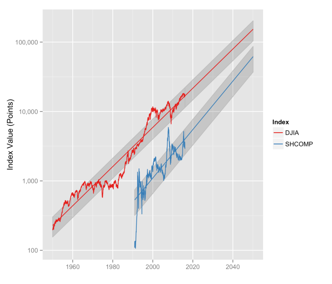
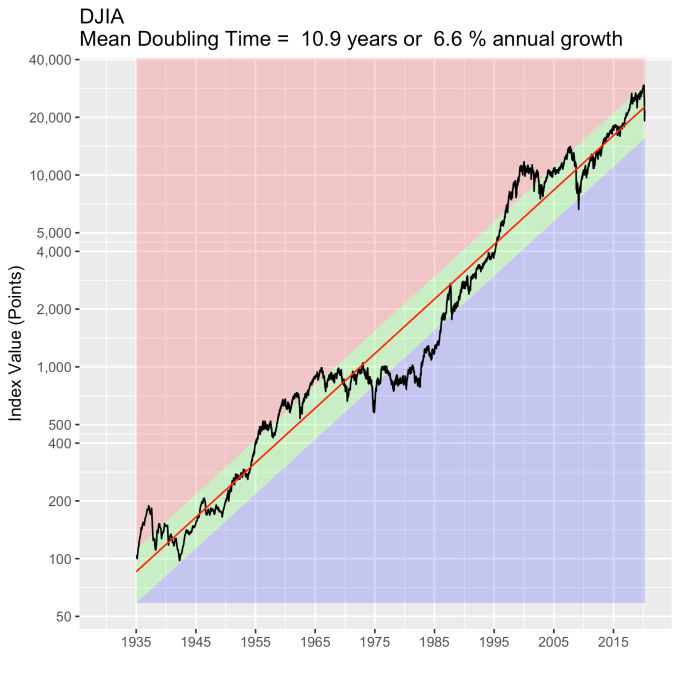
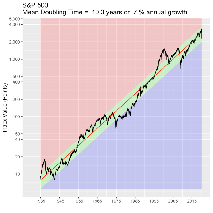
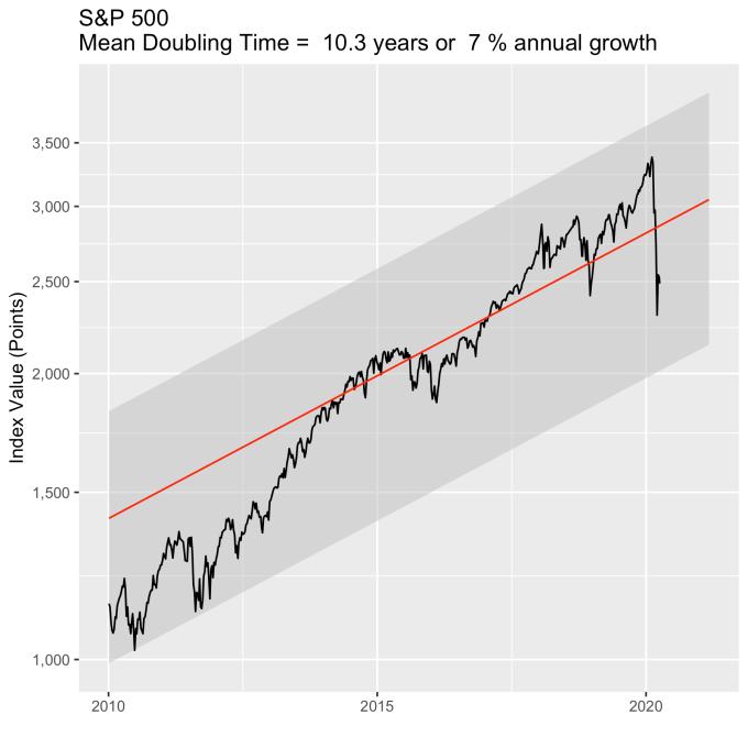
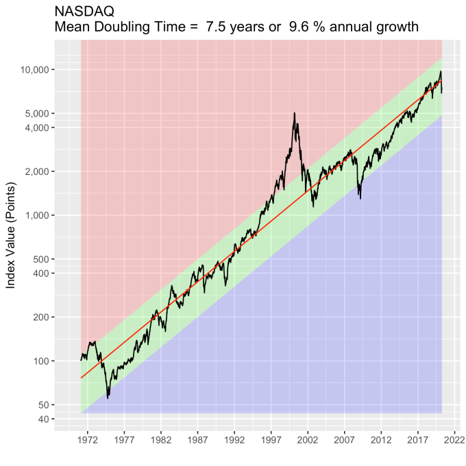
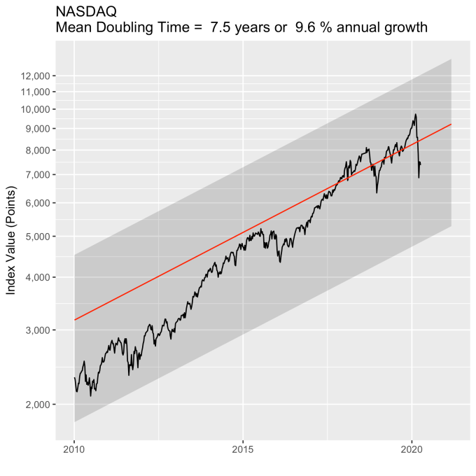
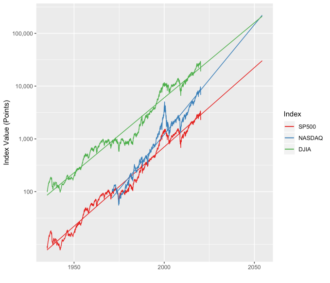
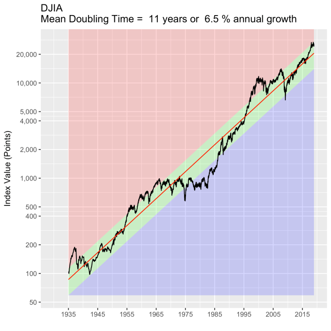
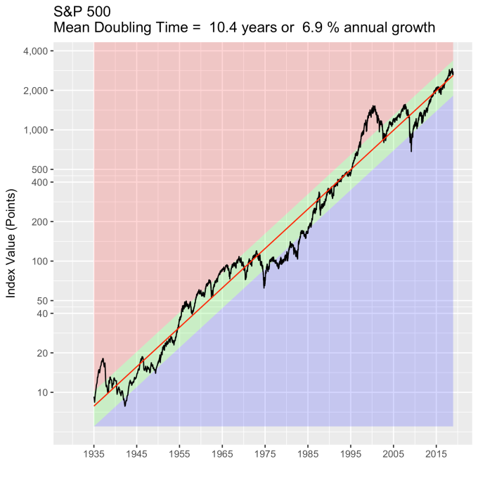
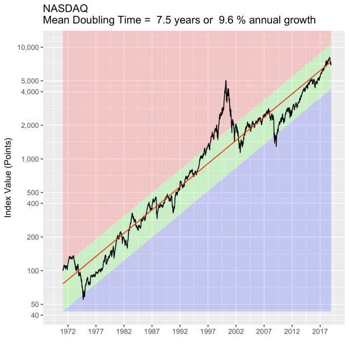
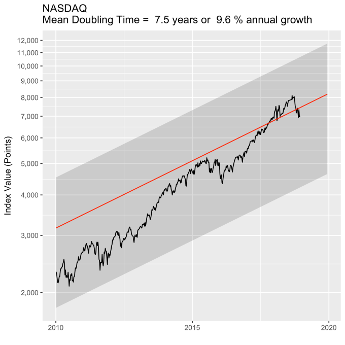
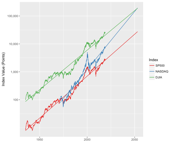
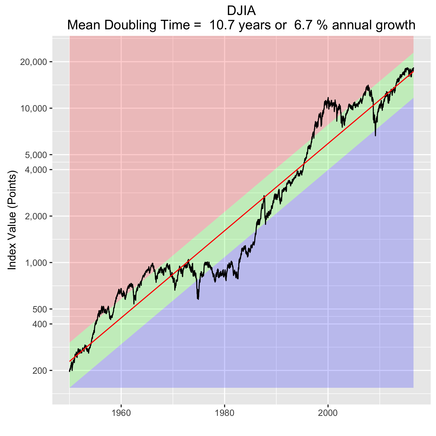
First, Law 1: Broad market indices grow, on average, exponentially in time.  Below I have plotted the Dow Jones Industrial Average, the Standard and Poor’s 500, and the NASDAQ Composite values from inception of the index to current value. Each of them covers a different span of time because they all started in different years, but they all cover multiple decades.  These plots may look slightly different from ones you may be used to seeing since I’m using a semi-log scale.  Plotted in this way, an exponential curve will show up as a straight line.  Exponential fits to each of the index values are shown in these plots as straight red lines.  Each red line isn’t expected to show the actual index value at any time, but rather to show the model value that the actual number should be centered around if it grew exponentially.  That is, the red line is an average, or mean, value.  If the fit is good, then the red line should split the black line of actual values evenly, which each does quite well.

DJIA-forecast2SP500-forecast2NASDAQ-forecast2Some indices hold to the line a bit tighter than others, but this general exponential trend represents the mean value with a great degree of accuracy.  This general agreement, which we will see more clearly shortly, is a validation of the first law.  The important thing to observe here is that while the short-term changes in the markets are widely considered to be completely unpredictable, the long-term values are not.  Long-term values obey the exponential growth law on average, but fluctuate around it on the short-term.

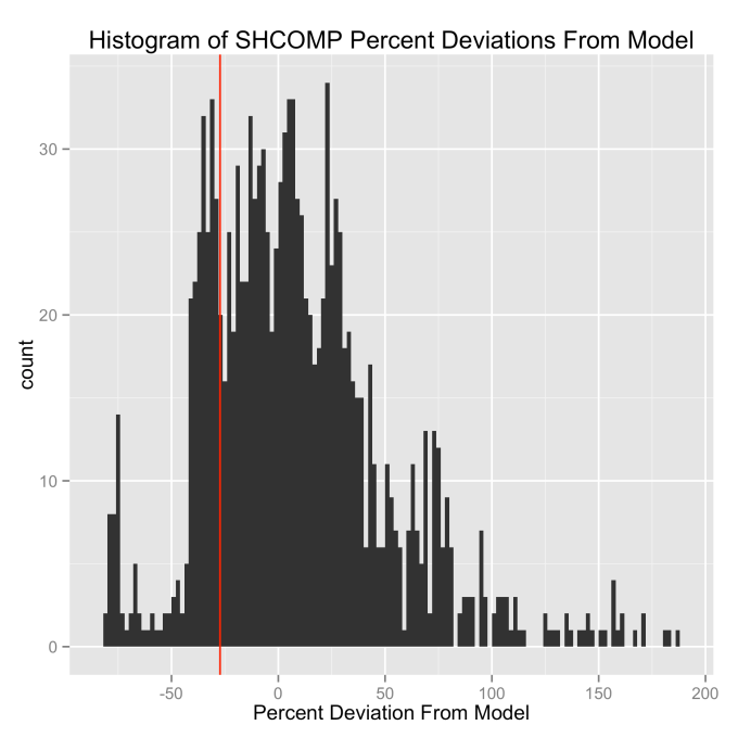
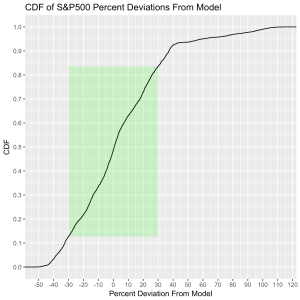
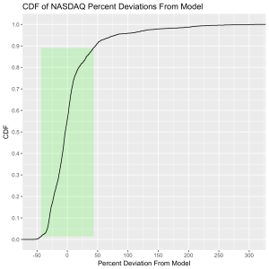
Which brings us to the Law 2:  An index value at any time will naturally fall within some distribution around its exponential average value curve.  This range of values is a fixed percentage of the average value.  If we look at the statistics of the differences between the actual black line values and the red line models, we can understand what the normal range of variation from the model is.  That is, the range we should expect to find it in at any time.  We can express the difference as a percentage of the model (red line value) for simplicity, and this turns out to be a valuable approach.  Consider that a 10 point change is an enormous deal if the index is valued at 100 points, but a much smaller deal if the index is valued at 10,000 points.  Using percentages makes the difficulty of using point values directly go away.  But it is also valuable because it allows us to observe the second law directly.

The histograms below show how often the actual black line index value is some percentage above or below the red line. These distributions are all centered around zero, indicating a good fit for the red line, as was mentioned previously.  And I have colored in green the region that falls within +/- 1 standard deviation from the model value.

DJIA-ModelDeviation-percent-histogramSP500-ModelDeviation-percent-histogram

NASDAQ-ModelDeviation-percent-histogram

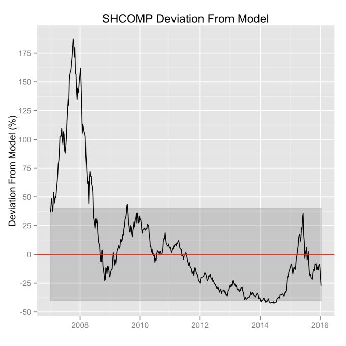
That +/- 1 standard deviation from the model is the rule I used to color in the green region in the charts of index values at the top.  If we consider this range to be the range that the index value fall in under “normal” conditions, i.e. not a bubble and not a crash, then we can readily determine what would be over-valued and under-valued conditions for the index.  That is, we define and apply a standard, objective, data-based method to determine the market valuation condition as opposed to wild speculation or some other arbitrary or emotional method used by the talking heads.

These over- and under-valued conditions are marked in the (light) red and blue regions on first three plots.  Note just how well the region borders indicate turning points in the index value curves.  This second law gives us a powerful ability to make objective interpretations of how the markets are performing.  It gives us the ability, not to predict day-to-day variations, but the understand the normal behavior of the markets, and how to identify abnormal conditions.

This approach immediately raises two questions:  what are these normal ranges for each index, and how often is this methodology representative of the index’s value.  Without boring you too much about how those values are calculated, let me simply direct you to the answers in the table below.  Note that the magnitude of the effect of tech bubble in the late 1990s and early 2000s on the NASDAQ makes the standard deviation for it larger than the other two.  These variations, in the 30-40% range, are large, to be sure.  But they take into account how the markets actually behave: how well the companies in the index fit individual traders’ beliefs about what the future will bring.

Index 1 Standard Deviation (%) % Time Representative
DJIA 32.5 63.4
S&P 500 30.3 70.2
NASDAQ 44.2 87.5

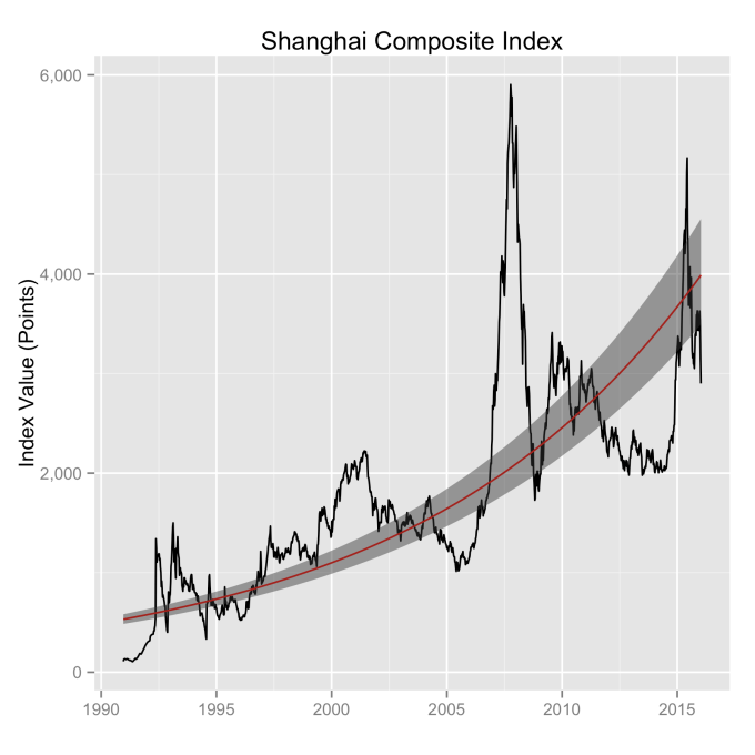
What can be readily seen here is the psychology of the market.  That is, when individual traders start to feel that things might be growing too quickly, approaching overvaluation, they start to sell and take some profits.  This leads to a decrease in the value of the index, which then quickly falls back into the “normal” range.  The same psychology works in the opposite fashion when the index value shows a bargain.  When the value is low, the time is ripe for buying which drives the value back up into the “normal” range.  If you look closely at those first three plots, you’ll see how often the index value flirts with the borders of the green region.  Actual values might cross this border, but generally not for long.  And interestingly, if you calculate this standard deviation percentage for other indices (DAX, FTSE, Shanghai Composite, etc.), you’ll find numbers in the 30s and see precisely the same behavior.

This brings us to Law 3:  The impact of bubbles and crashes is short term only.  After either of these is over, the index returns to the normal range as if the bubble/crash never happened.  The definitions of bubbles and crashes are subjective, and will vary among analysts.  But we agree on a few.  It is unlikely that anyone will dispute the so-called tech bubble of the late 1990s into the early 2000s.  All of the market indices ran far into overvalued territory.  Similarly, few would call the crash of 2008 by any other name, with major point drops over a very short period of time.  So we will start with these.

An examination of any of the first three plots show precisely this third law in effect for both of these large transitional events.  After the tech boom, the Dow, the S&P, and the NASDAQ all fell back to, look to see that this is true, within a few percent of the red line – which is where they would have been had the bubble not happened.  The 2008 crash similarly showed a sharp drop down into the undervalued blue zone for all three indices.  All three were back into the “normal” range within a year, and have been hovering around the red line for some time now.  The three major US indices today are exactly where their long term behavior suggests they should be.

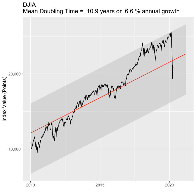
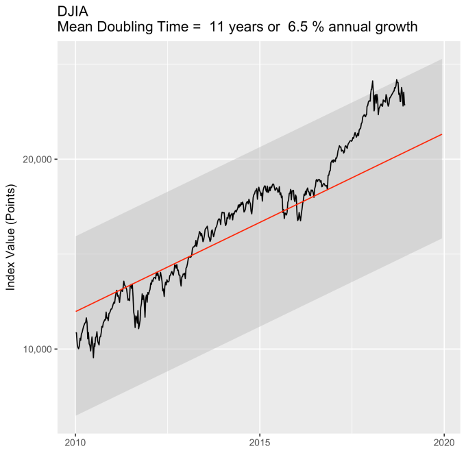
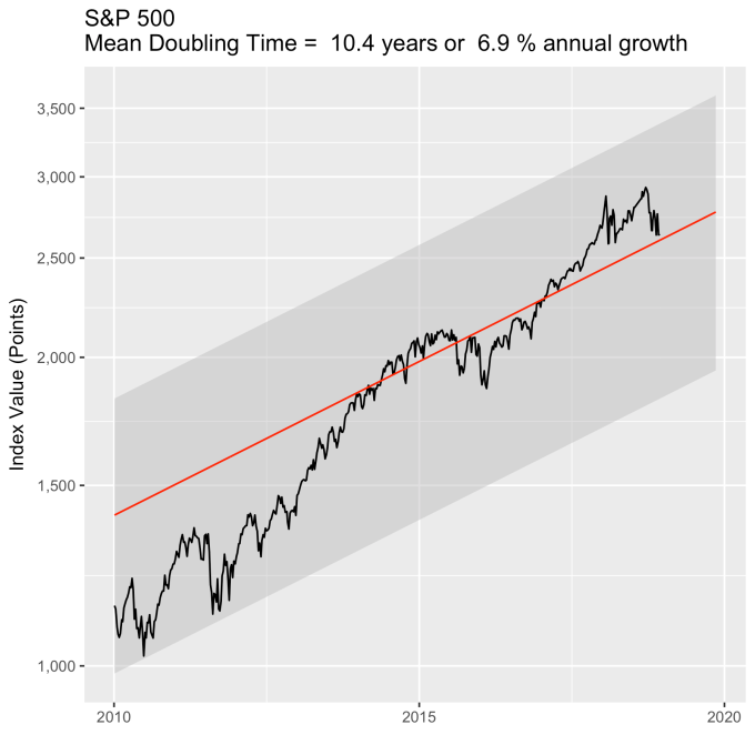
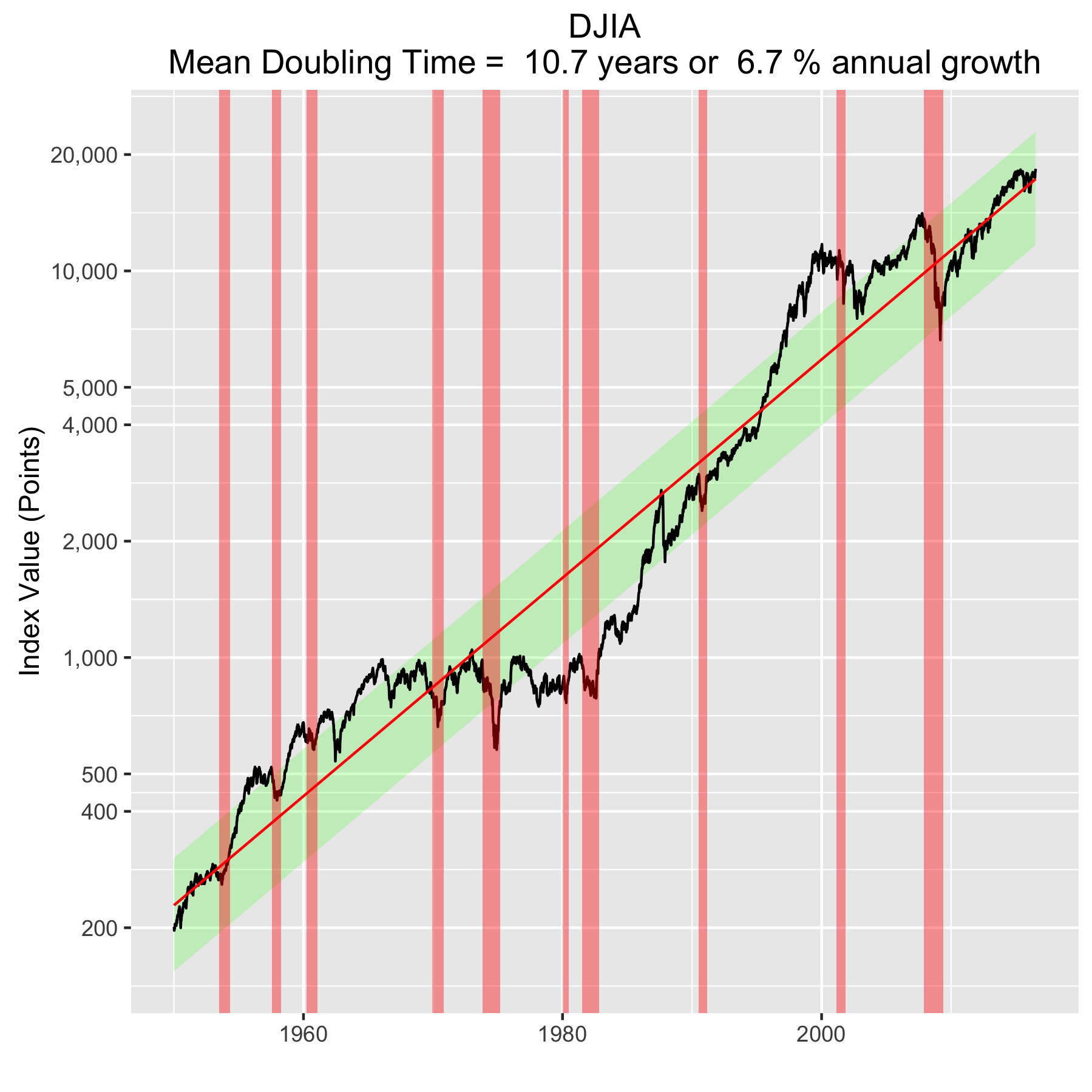
There are plenty of other mini crashes – sharp drops in value due to economic recession.  The St. Louis Federal Reserve Economic Database (FRED) lists the dates of official economic recession for the US economy.  Overlaying those dates (light red vertical bars) onto the Dow Jones plot shows what happens to the index value during economic recession, and what happens after.  This is typically a return to a value close to what it was before.

DJIA-recessions

Overall, even with the crummy performance in the 1970s, the Dow shows over 60 years of average growth that is precisely in line with the exponential model.  By the mid 1980s the effect of the languid 70s was gone and the DJIA was right back up to the red line, following the trend it would have taken had the 70s poor performance not happened.  In no case, for any of the three indices shown here or foreign indices such as the DAX, the FTSE, the Shanghai Composite, or the HangSeng, has bubble growth increased long term growth, and similarly, never has a crash slowed the overall long term growth.

To wrap up, there is a defining characteristic of exponential growth, one single feature which distinguishes it from all other curves.  This defining characteristic is a constant growth rate.  It is this constant rate of growth that produces the exponential behavior from a mathematical perspective.  Any quantity that has a constant rate of growth (or decay) will follow an exponential curve. Population growth, radioactive decay, and compound interest are all real world examples.  And while the growth rate is the most obvious number that can characterize these curves, perhaps the more interesting one is the doubling time (or half life, if you’re thinking about radioactive decay).

The doubling time is the how long it would take for an index’s value to double.  The larger the growth rate, the smaller the doubling time.  Note that this effect will happen almost 3.5 years sooner for a NASDAQ fund than for a DJIA fund.  This, then, is where rubber meets road.

Index Mean Annual Growth Rate (%) Doubling Time (years)
DJIA 6.7 10.7
S&P 500 7.1 10.1
NASDAQ 9.9 7.3

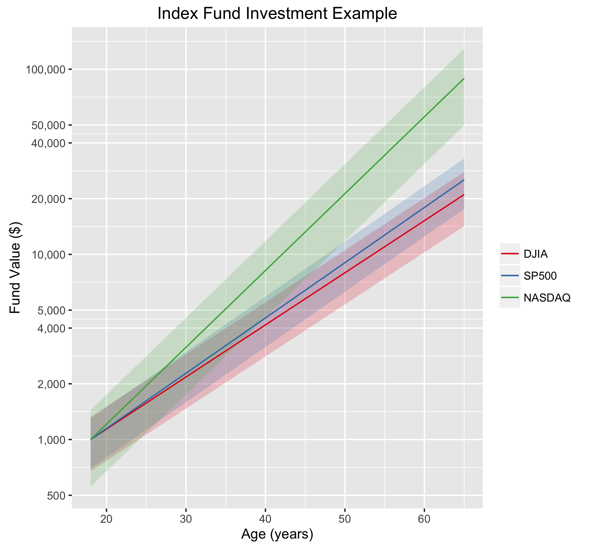
To understand the significance of the market laws in general (the first two, anyway) and these numbers specifically, let’s do an example.  Imagine that we receive $1000 in gifts upon graduating from high school.  We invest all of that money in an index fund, never adding to it and never withdrawing any money from the fund.  We leave it there until we retire at age 65.  Assuming we start this experiment at 18, our money, in the DJIA fund, will double 4.4 times over the years (47 years/10.7 year doubling time), giving us about $21,000.   Not bad for a $1000 investment.  It will double 4.7 times in the S&P 500 fund giving us a slightly higher $25,000 if we went that option.  Now consider the NASDAQ, where it will double 6.4 times resulting in almost $87,000.

But that is just the application of the first law, which applies to average growth.  We need to consider the second law, because it tells us what range around that mean we should expect.  The numbers we need to do this are in the first table above, which express the variability in the value of the index as a percentage of its mean value.

Doing the math, we see that we should expect the DJIA investment at age 65 to be fall roughly between $14,000 and $28,000 (a standard deviation of $6700), the S&P 500 to fall between $17,500 and $32,000 (a standard deviation of $7500), and the NASDAQ to be between $49,000 and $125,000 (a standard deviation of $38,000).  Certainly the NASDAQ fund’s variation is quite large, but note that even the low side of the NASDAQ fund’s projected value is still almost double that of the DJIA’s best outcome.

Because some people, like me, process things better visually, here are is the plot.  The “normal” range is shaded for each index.  Note that by about age 24 the prospect of a loss of principal is essentially gone.

example

The third law, it should be said, tells us we should expect these numbers to be good in spite of any significant bubbles or crashes that happen in the middle years.  Laws are powerful.  Use them wisely.

1 + 1 = 2 Expounded

Note—This is a piece I found in the book Science With A Smile, a collection of humorous scientific stories, anecdotes, and cartoons edited by Robert Weber.  Its authorship was attributed to Anon.

Every new scientist must learn that it is never in good taste to designate the sum of two quantities in the form

1 + 1 = 2      (1)

Anyone who has made a study of advanced mathematics is aware that 1 = ln e and 1 = sin^2 x  + cos^2 x.  Further

daum_equation_1463959708590

therefore Eq. (1) can be expressed more scientifically as

image002(2)

This may be further simplified by use of the relations

image003

and

image004.

Equation (2) may therefore be rewritten

image005(3)

At this point it should be obvious that Eq. (3) is much clearer and more easily understood than Eq. (1).  Other methods of a similar nature could be used to further expound Eq. (3); these are easily discovered once the reader grasps the underlying principles.

The Mathematics of Ideas

Since the start of the Industrial Revolution around 1760 in England, mankind has experienced an explosive growth in ideas and products which have had an enormous positive impact on human lives.  From the Agricultural Revolution, where mankind first learned that food could be cultivated, to the start of the Industrial Revolution—a span of about seven thousand years—human productivity is estimated to have been about constant, at somewhere between $400 to $550 in annual per capita GDP (in constant 1990 dollars).  That is, for seven millennia there was essentially no improvement in things like caloric intake, life expectancy, or child mortality, on average, worldwide.  That’s depressing.

But with the Industrial Revolution, things changed.  By around 1800, a loaf of bread that took a fourth century worker three hours to earn could be earned in two hours.  By 1900 that loaf of bread was earned with fifteen minutes of labor, and the loaf could be earned with only five minutes of work by the year 2000.  To put that in perspective, the fourth century equivalent cost of a loaf of bread in the year 2000 would have been about $36.  [Insert witty Whole Foods joke here.]  The changes in the human life experience as a result of the Industrial Revolution are undeniably positive.  And not only in the cost of food.  Consider that a baby born in 1800s France had a life expectancy of only thirty years.  (The experience of giving birth in the mid to late 1800s was a very different experience than it is today.  One physician historian likens it to the American Frontier before the railroad.  At that time in the US, some 15-20% of all infants in American cities did not live to see their first birthday.)  But a baby born in the Republic of Congo in 2000 could expect to live fifty-five years.  In other words, living conditions worldwide have improved more in the last few hundred years than they did in the entire seven thousand years prior to the Industrial Revolution.  [Economic numbers are from William Rosen’s book, The Most Powerful Idea In The World]

It was the ideas of the Industrial Revolution that enabled this change.  Certainly there were a great deal of things going on, and a variety of factors that came together to enable the success of the Revolution.  But the ideas were the key.  And they were successful in no small part because of the growth in real knowledge.  Not only was the industrial world changing in the mid-late 1700s, but so was our ability to reliably learn things about our surroundings.  Isaac Newton founded modern physics when he published the Principia Mathematica in 1687.  Quite a few crazy ideas (i.e., phlogiston) persisted for a while, and some even helped push along the Industrial Revolution in spite of their wrongness, but the advancements and refinements of knowledge that came with the adoption of the scientific method helped to make these revolutionary ideas form and then come to reality.

Ideas, then, can be powerful things.  Good ideas, perhaps even more so.  So it bears asking, where do good ideas come from?  Where do we find the ideas that change the world and help to make it a better place?  Assuming we want more of them around, this is an important question to ask.  It also was the subject of an excellent, and appropriately named book by Steven Johnson in 2010.  I found his answer to be quite surprising and insightful.  Johnson suggests that the nature of good ideas is combinatorial.

“Good ideas are not conjured out of thin air; they are built out of a collection of existing parts, the composition of which expands (and, occasionally contracts) over time.” —Steven Johnson, Where Good Ideas Come From

That is to say, good ideas are novel combinations of already existing ideas, generally adapted to new purposes or solving new problems.  Putting things that we already know together in ways not done before can enable both incremental changes, and in some cases it can lead to sea changes in capability.  This combination process is the heart of what is known as innovation.  Every patent cites the prior work it is derived from.  Every scientific publication references the work that it is built on.  Every artist has other artists who inspire their creations.

Johnson is not, to be fair, the first to make this observation.  Abbot Payson Usher remarked in his book on mechanical inventions, that revision and reinforcement of previous inventions was how new inventions were created.  Indeed, when steam engines were used to drive grain mills in the days of the Industrial Revolution, the novelty of the invention was in how it coordinated existing ideas to make a more efficient system—doing what was already being done, but doing it better, faster, cheaper.  When Einstein would ponder problems he would often let his mind wander to make new connections between ideas floating around in his mind, a creative technique now known as “combinatorial thinking.”  And when Isaac Newton famously remarked that had he seen farther than others, it was because he stood on the shoulders of giants, this was another way of saying that he combined existing ideas and extended them to make new ones.

This combinatorial concept goes deeper, perhaps even to the heart of pretty much everything.  In 2003, Biologist Stuart Kauffman published the book Investigations, a title he borrowed from Wittgenstein.  In it he introduced a new take on the combinatorial concept—a simple observation with remarkable consequences.  His interest is in biodiversity and its generation.  He offers a scenario in the prebiotic Earth, where, as you might imagine, chemistry was likely much simpler than today, with considerably fewer distinct molecules than are on the planet now.  Certainly, complex molecules like proteins and DNA were nonexistent the planet at some point in the past, so this is a reasonable assumption. What, then, might be the process that takes us from that simple set to now?  Assume, he says, a relatively small set of simple molecules which, given time, may react with each other to create new molecules.  Take this founder set and call it the “actual.”  Now consider all of the possible reaction products—the ones that are just a single reaction step away.  None of these exist yet except in the realm of possibility.  This set of all potential products that are one step away gets the name of the “adjacent possible.”

The remarkable observation about the adjacent possible concept is that it forces us to view the things that can happen as a function of the things we have now.  This should seem obvious, but the it generally isn’t.  In the prebiotic Earth, you wouldn’t be able to have a sunflower, because the things that make up sunflowers didn’t exist yet.  If we have only a few simple molecules to start with, complex structures like DNA or chloroplasts that convert sunlight to energy are out of the question.  But in time, the actual set grows in number, which also means in complexity.  Run the clock for a very long time and the adjacent possible grows to include everything we have today, like sunflowers.  In Kauffman’s words:

“Four billion years ago, the chemical diversity of the biosphere was presumably very limited, with a few hundred organic molecular species.  Today the biosphere swirls with trillions of organic molecular species.  Thus, in fact, sunlight shining on our globe, plus some fussing around by lots of critters, has persistently exploded the molecular diversity of the biosphere into its chemically adjacent possible.”

In this view, biodiversity is then a very real form of innovation.

This combinatorial picture of growth is all well and good, but is it true?  If it is, how might we know?

I explored this once before, but it is worth revisiting.  The adjacent possible, as we said, is the set of all first order combinations of the actual.  There is an area of math that is all about counting combinations that we can use here.  Let’s say there are n objects in the actual.  We want to take them k at a time and let k vary from zero all the way up to n, thus taking all possible combinations into consideration.  That is, take all of the individual items themselves, then take them in groups of two, then groups of three, and so on all the way up to the whole bunch at once.  Sum up all of these numbers and that is the size of the adjacent possible set.

For a simple example, take objects AB, and C and combine them in all possible ways.  First you can have each of them individually (giving us back our original three: AB, and C), this is k=1.  For k=2 we have three combinations, ABACBC.  For k=3, we have just one combination, ABC.  We haven’t thought about k=0, which is no objects, but that’s a single real option which needs to be included.  So the total number of combinations is then just 3+3+1+1 = 8.

Determining the number of combinations for any value of n objects taken k at a time is known in mathematics as “n choose k.”  This is what we calculated in each step above.  Mathematically it is represented as:

Math5

What we want to know is the total when you add up all the different combinations as you let k vary—our value of 8 in the ABC example.  When you work it out, what you get is:

Math1

You may recognize the result as an exponential.  That is, the size of the adjacent possible set is exponential with respect to the size of the actual set.  Every time n increases by one, the sum of all the combinations doubles.  The question then, is how does n grow in time.  This can be found by the amount of time it takes for the sum to double.  A constant doubling time is a signature of exponential growth.

Now that we know what we’re looking for, the question is where should we look.  It is probably not a bad assumption to equate scientific literature with ideas.  That is, when a research group learns something, it is generally a good assumption that they will publish it.  Because the first to publish something new generally gets the discovery credit, publishing is important in the scientific community.  So measuring the quantity of scientific literature over time probably provides a realistic measurement of scientific knowledge or scientific ideas.

In 1961, a survey of scientific literature was done by Derek Price.  In the less technologically advanced days of scientific publishing, abstracts were popular.  It was far easier for a scientist or engineer to look through these abstract publications for papers he or she might be interested in reading than to carry around or dig through entire journal volumes.  So to count the quantity of scientific publications, Price went to the abstracts.  And what he found was that the cumulative sum of abstracts doubled every fifteen years.  It didn’t matter the field, Chemical Abstracts, Biological Abstracts, and Physics Abstracts all ended up with a cumulative value doubling in about 15 years.  The growth, then, of the actual set of scientific knowledge, grows at an exponential rate.

If we were looking for something, I daresay we found it.  While it falls short of absolute proof, the exponential cumulative growth of scientific literature is precisely what we would expect to find if the nature of new scientific ideas was combinatorial.  And as I mentioned previously, a scientific manuscript cites the work it is based on—the ideas it is based on, which signifies the combinatorial nature of the work.  While the exponential growth of scientific literature is not new, understanding it as a combinatorial process appears to be.

This is important because it helps to codify the route to new good ideas.  Being able to explore a larger collection of the available opens up a larger adjacent possible.  In Johnson’s words:

“The trick to having good ideas is not to sit around in glorious isolation and try to think big thoughts.  The trick is to get more parts on the table.”

Note that just a single extra piece in the available doubles the size of the adjacent possible.  It comes as no surprise, then, that some of the most famous inventors in history had lots of hobbies, interests that offer a wide range of pieces to be fit together in new ways.

There is another interesting aspect to Price’s work that bears mention.  It makes sense to ask ourselves when this 15 year doubling period behavior began.  That is, let’s follow the line back until it hits 1.  The result:  the year 1690.  In other words, within a small margin of error away from Newton’s original publication date of the Principia Mathematica (1687).  My thoughts are that this is not just coincidence.  Newton’s work defined the onset of the modern era of science, which enabled reliable knowledge to seed ideas which became the basis for the Industrial Revolution.  The innovations which have gone on to make every measure of living conditions in the modern world so drastically better than ever before in the history of mankind may very well be traceable back to the ideas of one notoriously talented British scientist.

The Over/Under on the Shanghai Composite

The Chinese stock market has been quite the ride over the last week, with the Shanghai Composite Index falling from its (very short lived) June 2015 high of around 5100 to closing under 3000 on Friday January 15.  When things like this happen, traders in other world markets buy a lot more Pepto-Bismol than usual.  Global trade being what it is, economies around the world are linked in a lot more intimate ways.  And you know what it’s like taking a shot like this in the intimates.

I heard an economist on NPR this week mention that there has been talk that the Chinese market was overvalued and that maybe a correction should have been expected.  Now to call something overvalued suggests that you know what its price should be.  But economists and stock market analysts never really have good answers about what they think a stock index value should be, or even how you would go about making such a determination.  Maybe it’s a secret.  But a good tool to have would enable good estimates of what a stock index value should be.  Broad market indices can average out the noise that is in individual stock prices, so they should be the target for the tool and not individual company stocks.

Short term, day-to-day changes in any stock price or index are essentially unpredictable.  Lots of people have tried.  The things that impact day-to-day changes are numerous and perhaps even chaotic in the mathematical sense.  And having to weight their impacts on valuation makes a very difficult problem even harder.  But a good forecasting tool doesn’t need to make short term predictions.  A useful tool needs to make long term average value predictions.  It should determine baseline values to fluctuate around on shorter timescales, and maybe even determine what a normal range of those variations should be.  Overvalued or undervalued is then a call made by comparing the current value with the model values.

The Chinese market index everyone is talking about is the Shanghai Composite Index.  The difficultly in doing analysis with this index is that it’s only been around since the very end of 1990.  This means there are a limited number of bear/bull markets to average through as compared with the Dow Jones or the S&P500.  Given the good results I’ve had with other market indices, I’m going to stick with my exponential model approach and see how it does.  The model uses the assumption that baseline growth is exponential in time.  With other market indices, this has shown to be a good assumption.  What you see in the plot below is the exponential fit to the data (red line), along with the uncertainty in the fit (wide grey line).  The uncertainty you find when applying this approach to other markets with more years of data (i.e, the Dow, the S&P500, the NASDAQ…) is much smaller.  In time this uncertainty will shrink and average rates of growth determined from this model for this index will be more accurate.

SHCOMP-fit

This red line gives the first part of what we need—the model value of the index.  That is, it shows us what we should expect the value of the index to be at any point in time.  But we also need to consider how the index varies from this value.  We can find that by comparing the difference between the index value and the model value, and we do this as a percentage of the model value.  Using a percentage ensures that we don’t let the value of the index weight the answer.  When we do this, we find the histogram below—most of the time the actual value of the index is within ±40% of the model value for the index (one standard deviation is actually 43%).  Friday’s closing value is shown as the red line, well within the “normal” range of variations.  This approach to stock index modeling yields similar types of plots when looking at the Dow, the S&P500 or the NASDAQ.

SHCOMP-ModelDeviation-percent-histogram

So was the Shanghai Composite Index overvalued?  The answer is pretty clearly a no.  As long as it bounces around inside of the ±40% range it is in “normal” territory (one standard deviation).  The last time this index was out of this range was before the 2008 global financial meltdown.  And that was pretty clearly a bubble, peaking at over 175% above the model value.  Friday’s close took it to about 25% down from the model, but without other information that suggests the end is near, it is statistically exceedingly likely that it continues to bounce around inside of the shaded region.

SHCOMP-ModelDeviation-Percent(recent).png

The power of this model approach is clearer when we look at it in a different way.  Short math refresher:  If you plot an exponential function on a log scale, the result is a straight line.  And straight lines are much easier to look at than exponential functions.  So let’s look at the Shanghai Composite Index, and also the Dow Jones Industrial Average together so we can compare them, on a log scale.  And lets also extend our model forecast out to 2050.

combined_indices-SHCOMP-DJIA.png

First we can see the reasonableness of the exponential model approach—the straight line fit looks very good for both of these indices.  If it didn’t, well, I wouldn’t be writing about it.  The DJIA model shows a doubling about every 10 years, which is around a 7.2% annual rate of growth.  The SHCOMP model is a little higher, closer to 10% annually, but it also has a bigger error in the fit because there’s less data to fit.  Call them even when it comes to rates of growth.  But both of them are what we would call “well behaved,” and that is a good thing to observe.

Second, we can see just how well the real index values stay within 1 standard deviation (grey region) of the model for both indices.  This should give us some confidence that even though it may feel like the markets have fallen into the toilet, that they’re actually quite in line with their normal historical moves.  The market indices are well within their natural range of fluctuations; this isn’t new territory.  This doesn’t make the folks on Wall Street consume any less Pepto, but it is pretty clear that the sky is not falling.

Now look ahead in the years leading up to 2050.  What is important to see here is that the variation in the index is proportional to the index value.  That means in terms of point values, these stock indices are going to fluctuate more in the future.  In other words, a 43% drop from a 5,000 point index value is a 2100 point move (June 2015 to Friday was a drop of about that value).  But a 43% drop from a 20,000 point index (some time in the 2040s) is 8600 points.  Psychologically, that might be a more difficult pill to swallow, but it will still fall within the normal range of the index.  That’s just the stock market for you.

“I Like You…”

In the fifteen year period from 1963 to 1978, a single salesman at a Chevy dealership in Michigan sold a world record 13,001 cars.  During his last 12 years he sold an average of more than six cars each day.  On his best day he sold 18 cars.  In his best month he sold 174 cars.  In his best year he sold 1,425 cars.  These were all new cars, sold one at a time to individuals.  These are automobile sales numbers no one else has ever achieved.

That salesman’s name is Joe Girard.  He holds the Guiness World Record for automobile sales.  He is the best car salesman the planet has ever known.

His story is an interesting one.  I first heard about him in Robert Cialdini’s excellent book Influence.  What is notable about Girard is his unique style.  Every month, each person on his extensive customer list received a greeting card from him.  It didn’t contain details about sales promotions or new vehicles in inventory.  It didn’t mention anything about new car features or how great interest rates were.  Instead, every month Girard sent out over 13,000 greeting cards that said one simple thing:

“I like you.  -Joe Girard”

Now there’s certainly more to being the world’s best car salesman than telling customers you like them.  But what’s key here is that he wasn’t selling cars in his monthly mailings.  Instead, he was selling himself.  He was a likable guy and he worked hard to truly like his customers.  As we’ve already seen, his sales approach was hugely successful.  Likability, as Cialdini points out, is a tremendous advantage when it comes to success in sales.  For Girard, simply telling people he liked them paid dividends.  He wouldn’t have hired three people at his own expense to help get those greeting cards out each month if it didn’t.

This came to mind last month when I received an unexpected greeting card.  It was from a politician.  In it he didn’t tell me about his policy positions.  He didn’t make political promises or take jabs at his opponents.  He made absolutely no literal appeal for my vote.  Instead, Donald Trump took a page from Joe Girard and told me he liked me.

TrumpCard

Now lots of people have lots of opinions of Donald Trump in his bid for the 2016 Republican presidential nomination.  Right or wrong, good or bad, I’ll leave those discussions to the talking heads.  But Trump is clever like a fox in this approach.  His greeting card campaign works Girard’s strategy of selling himself rather than his politics, which, as a non-politician, works to his advantage.  His success depends on people getting warm fuzzies when they read his name on the ballot.

This is because of something known as the affect heuristic.  When Nobel Prize-winning economist Daniel Kahneman was studying human decision making, he made an interesting observation.  Often times when you have to answer a difficult question, you will answer an easier question instead and substitute its answer for the harder question.  The affect heuristic is when your likes and dislikes influence what you believe about the world.

In his greeting card campaign, Mr. Trump is hoping to see the hard question of “Who is the best candidate?” answered instead with “Which candidate do I like best?”  It’s a strategy based on human psychology, but interestingly, no one else in politics is employing the approach.  By taking a page from Girard’s playbook, Trump is implementing a strategy from the best there’s ever been at playing that game.  It is a brilliant approach, regardless of any other aspects of his candidacy.

The Big Friday Effect

The Big Friday effect is what I have called my observation that more mail is delivered on Friday than on any other day of the week.  It became apparent very quickly as I began to analyze my USPS mail and has remained through the entire year that I’ve been conducting this mail-counting experiment. You can see the Big Friday effect in the figure below, which plots the total number of pieces of mail I’ve received by weekday.  It is a curious effect that has an interesting cause.

The quantity of mail, by category, with the day of the week it was delivered.

The quantity of mail, by category, by the day of the week it was delivered. Notice that Friday is significantly higher than the other weekdays.

I wanted to look more deeply into the weekday distribution to understand what is behind Big Friday. I analyzed the mail from individual senders to see how it was distributed throughout the week, restricting the analysis to the top 15 largest senders (see below).  This limits me to senders with mail volumes of about 1 item per month or more.  Any sender with less mail volume than that won’t be able to have much of an impact on any given day.

Mail totals for the top 15 senders of mail (to me), broken down into categories.

Mail totals for the top 15 senders of mail (to me), broken down into categories.

Plotting each sender’s mail into weekdays is revealing.  Most of the them have mail delivery distributed throughout the week, which is what you would expect for a mostly random sending process.  There are two notable exceptions — they are the senders with the majority of their mail deliveries concentrated into one weekday.

The weekday mail totals for the top 15 senders.  Note that the y-axes all have independent scales.  Note the scale for Redplum.

The weekday mail totals for the top 15 senders. Note that the y-axes all have independent scales. Note the scale for Redplum.

The Amherst Citizen is a local newspaper which is generally delivered on Wednesdays.  This does give Wednesday a boost in the top figure, but it isn’t a huge contributor because it doesn’t come out every week.  It is also not that reliably delivered on Wednesday, with Thursday deliveries being about 1/3 as many as Wednesday’s.  But look at Redplum (lower left), the well known junk mail merchant.  With 44 deliveries on Friday alone it dominates the weekday totals.  Thursday and Saturday have two each.  Considering that there are 54 weeks of mail deliveries in these numbers, Redplum would seem to be very effective at getting advertisements and coupons delivered to households just in time for weekend shopping plans.

To illustrate just how strongly Redplum impacts the numbers, we can look the mail by weekday for these top 15:

Mail received by the listed senders by the weekday it was received.  Note the large contribution from Redplum on Friday.

Mail received by the listed senders by the weekday it was received. Note the large contribution from Redplum on Friday.

And then without Redplum’s contribution’s.  And so we find that Big Friday is all about one junk mail marketer being very precise with their product’s delivery.

Mail received by the listed senders by the weekday it was received.  Redplum was removed to illustrate it's effect.

Mail received by the listed senders by the weekday it was received. Redplum was removed to illustrate it’s effect.

Book Review: How To Create A Mind — Ray Kurzweil

If you set out to build a computer that could think like a person, where would you start?  What would you want to know?  How would you test your ideas?

When we build a computer simulation, we often start by studying the thing we want to simulate.  We then build a theory or a mathematical model of how it works.  And then we test the model against cases where we already know the answer and use the results to update the model.  Lather, rinse, and repeat until you get something useful or you determine that your model just doesn’t work.

“All models are wrong, but some models are useful.” —George E. P. Box

We can’t start to understand the mind from the perspective of trying to build one without first studying the brain.  Lots of animals have brains, so what is it that is different about the mammalian brains from those of the lower animals?  And how do human brains differ from other mammals?  Can we isolate key functions and put together a good working theory of operation?

Ray Kurzweil, in How To Create A Mind takes this approach.  Kurzweil is an inventor, an engineer, an entrepreneur; he is not a neuroscientist.  He quite clearly intends to see this work carried to its conclusion when an electronic mind of or beyond human intelligence becomes reality.

After talking with people who have worked in the field of Artificial Intelligence (AI), it seems appropriate to make a few remarks before continuing.  First, the term “Artificial Intelligence” makes some people shudder.  This seems to be in part due to the fact that the field didn’t advance as quickly as everyone believed it would in the 20th century.  But also in part that modern “smart” computers remain unable to perform anything even close to “common sense.”  Even those that use algorithms like the ones Kurzweil proposes.  That since the brute force capabilities of, say, Deep Blue or Watson, are so vast, that its “smarts” come simply from its immense computational capabilities and not from its ability to implement particularly smart algorithms.  In essence, that since Watson or Siri doesn’t “understand” you the way other humans do, that they never will.  End of story.

There is some truth here.  Even advanced modern computers can’t make logical inferences like a human can.  I just asked Siri, “Tell me something I should know.”  She responds with, “That may be beyond my abilities at the moment.”  But I am not convinced that is the end of the story.  Nate Silver, in The Signal and the Noise, talks a lot about forecasts by experts, and much of what he says suggests we shouldn’t give them too much weight because of just how often their predictions are terrible.

I’m very persuaded by Kurzweil’s Law of Accelerating Returns enabling things in the not too distant future that we can’t imagine as possible today.  There is simply too much evidence in support of it to ignore.  The capabilities of today’s computers would shock the engineers who built the ENIAC.  In 1949, Popular Mechanics suggested that computers might weigh less than 1.5 tons someday.  Ken Wilson, founder of Digital Equipment Corporation famously said in 1977 that, “There is no reason anyone would want a computer in their home.”  These dates aren’t that far in the past, so it is clear that very bright people can suffer from a remarkable lack of vision.  Particularly in an industry where the technological capabilities double in a span of less than two years.  So I think it is reasonable to expect that the continuing growth of information processing capability will give us some pretty amazing things in the years to come.  Exactly what they’ll be is less certain.

“If a…scientist says that something is possible he is almost certainly right, but if he says that it is impossible he is very probably wrong.” —Arthur C. Clarke

Kurzweil proposes the neocortex as the key differentiating element in advanced thinking.  And he proposes pattern recognition as the key neocortical function as part of his Pattern Recognition Theory of Mind.  American Neuroscientist Vernon Mountcastle discovered the columnar organization of the neocortex as the fundamental building block in 1957.  This organization, the cortical stack, exists pretty much through the entire neocortex, regardless of whether it is processing speech, vision, hearing, etc.  Kurzweil proffers that this single processing unit (the cortical stack) with different inputs can execute largely the same algorithm (pattern recognition) to achieve the necessary results, regardless of whether it is working on vision, speech or hearing.  We know that one area of the brain can do the work of others when necessary — an effect known as plasticity.  This is well documented and gives key support to idea of a common algorithm being used throughout the neocortex, though not specifically to it being pattern recognition.

But the approach is very effective.  Kurzweil long ago started a company to create software to do natural language processing.  You know it today as Nuance, the folks who make Apple’s Siri assistant work.  When trying to develop the algorithms to make natural language processing work, lots of different approaches were tried.  It was the pattern recognition approach, implemented using a hidden Markov model, that was the most successful by far.  Kurzweil makes the argument that Siri, when attempting to process your request, performs a very similar algorithm to the one that your brain must use to process language, and this should be thought of as a form of intelligence.  I find his arguments somewhat persuasive, but I have a colleague who argues quite strongly against that interpretation and supports his position well.  It is certainly food for thought while there are no objective answers.

In spite of the fact that the author is not a neuroscientist, there is a lot of neuroscience in these pages.  Here you’ll read about the exciting work of Benjamin Libet, V. S. Ramachandran, Michael Gazzaniga, and others, and dig into the concepts of free will versus determinism, decision making, and consciousness.  What it all comes down to, in Kurzweil’s view, is that human brains execute a complex algorithm, that modern technology isn’t yet capable of this level of complexity, but that it will someday.  Given that, how willing will we be to accept the consciousness of intelligent machines?  What will a machine need to do to convince a human it is conscious?  Is the Turing test enough?  You’ll have to come to your own conclusions here.  Given the way my children interact with Siri, I suspect that Kurzweil’s assumption of ready adoption by the next generation (though perhaps not older ones) is probably correct.

This is relevant because Kurzweil predicts that the “someday” when truly intelligent machines will be here will begin in 2029.  If you’re familiar at all with any of his previous work, his Law of Accelerating Returns is pervasive in his thought.  That technological progress increases at an exponential rate, and in about 2029 is when he predicts technology will be sufficiently mature to support strong AI.  This is from the perspective of raw processing capabilities, not from extrapolating the successful demonstrations of any sort of machine intelligence.  Mind you, a machine has just passed the King’s Wise Men self awareness test.  Kurzweil might be right.

But is brute force processing enough for the emergence of a conscious mind?  Kurzweil certainly thinks so.  But I don’t believe that USC Neuroscientist Antonio Damasio would agree with him.  In his own writings, Damasio argues that consciousness grew out of a concept of self, which in turn is a function of biological value.  That as individual biological cells organized into increasingly complex systems, that their own evolutionary survival depended on a higher level of cooperative activity.  Each cell’s natural inclination toward survival is the driving force in his view, and the connections that cells make to the brain through the nervous system amplify this survival instinct.  Damasio sees feelings and emotions as a part of the mapping that the brain does of the body, a feedback mechanism to understand how it is doing, and that consciousness is built up in this way and for this reason.  It is a wildly different view than Kurzweil’s in the sense that the driving force is not related to computational complexity.  Instead, it is a hierarchical, evolution-driven, survival behavior.  This begs the question, can a machine, without a biological survival instinct, develop a concept of the self and ultimately consciousness?  I expect more time will be spent pondering this question in the near future, not less.

“When we reflect upon the manifold phases of life and consciousness which have been evolved already, it would be rash to say that no others can be developed, and that animal life is the end of all things.  There was a time when fire was the end of all things: another when rocks and water were so.” —Samuel Butler, 1871

This book was hard to put down.  Kurzweil very thoroughly researches and documents his material, and whether you find him to be a genius or perhaps slightly insane, he always makes a strong case for his position.  It isn’t easy to go on the record with the sorts of predictions that Kurzweil has come to be known for, and few people do it.  But he’s smart, he’s gutsy, and he’s right far more than he’s wrong.  Spending a few hundred pages in the brilliance of Kurzweil is time well spent.