Every day but Sunday, a government employee comes to that place you call home and leaves you with any number of items. Packages perhaps, but certainly letters, bills, advertisements, or magazines. Most of these are sent to you by complete strangers. Is there something interesting or valuable that can be learned by paying attention to what arrives in the mailbox?
Questions we might want to ask: “How much mail do I get?”, “Who sends me mail?”, “How often do they send it?”, and “What kinds of mail do I get?” Advertisers certainly have each one of us in their databases. I’m sort of curious to know something about what they think they know about me. But I’m also eager to explore what can be learned by simply paying attention to something that goes on around me with a high degree of regularity.
I’ve mentioned this before, but my methods here are to record the sender and the category of each piece of mail I receive daily. This is for mail specifically directed to me, or not specifically directed to anyone (i.e. “Resident”). I’ve been doing this since the end of July 2014, so I have a fair amount of data now.
Let’s start with quantity. On average I’m getting about 100 pieces of mail per month. This is pretty consistent over 8 months, but note that things picked up at the beginning of November and then dropped back in January. The rate (i.e., slope) didn’t really change, there was just a shift in the baseline. The November shift is undoubtedly from election related mail. The January shift is the post-Christmas dropoff that we’ll see later.

Cumulative amount of delivered mail.
One of the more interesting observations is the breakdown of the mail by category. It should come as no surprise these days that the majority of mail is advertising. If you include political adverting (a category I break out separately), this overall advertising category accounts for more than half of the mail I get in my letterbox. Considering that the USPS’s own numbers suggest about 52% of the mail was advertising in 2014, it looks like my dataset is representative. Interestingly, the percentage of mail that was advertising in 2005 was only about 47%, so the percentage of mail that is advertising is on the increase. This is not unexpected. The NY Times published a piece in 2012 indicating that the Postal Service had announced their plan for addressing the huge decreases first class mail. It was to focus on increasing the amount of advertising mail that they carry. The Wall Street Journal has a piece from 2011 showing that the advertising percentage was only about 25% in 1980 and has been increasing steadily ever since. Mission accomplished.

Categorical percentages of delivered mail.
The next largest category, “Information”, is communications from people that I know or businesses that I deal with. In other words, mail I want or care about in some fashion. This is about 22% of the total. Bills are a separate category as I think they are different enough to track separately. Yes I still get magazines. No I don’t wish to convert to a digital subscription. But thank you for asking.
I find it interesting to look at the breakdown of the composition of the mail over time. Judging from the sharp changes in color in the largest category (bottom bar), you can probably guess when the last state primary and general election took place. But note that in general, each week is dominated by advertisements. Notable times that this is not true are the week leading up to an election, when political advertisements dominate (note that these are still advertisements), and the weeks leading up to Christmas. This last week shows an increase in “Information” mail largely because of Christmas Cards.

Weekly mail by category. Note that 2015 began mid-week.
Let’s look more closely at the advertisement mail numbers all by themselves. October was the peak month, which is somewhat surprising given the frenzy over the Black Friday shopping. Predictably, direct mail fell off in January after the end of the Christmas shopping season. But somewhat surprisingly it climbs back without too much delay.

Amount of advertising mail received each month.
So who exactly is it that sends me so much junk mail? Good question. Redplum is the biggest of them all by far. Also known as Valassis Communications, Inc., they provide media and marketing services internationally, and they are one of the largest coupon distributors in the world. In other words, they’re a junk mail vendor. You can count on them, as I’m sure the USPS does, for a weekly delivery of a collection of ads contained inside of their overwrap. After that I have Citibank, Bank of America, SiriusXM, and Geico, in that order. I would not have expected Geico to show up this high on the list, but there they are.

The amount of advertising mail sorted by sender, restricted to those with 2 or more pieces of mail being delivered.
Another question to consider is when does all this mail come? We looked before at the monthly advertisement mailings numbers, but we can dig a little deeper and look at how mail deliveries vary by weekday. If we look at raw numbers, we notice that Friday is by far the biggest mail day in terms of the number of items received. This has been consistently true for the entire time I have been analyzing my mail. I don’t have a good explanation for this observation.
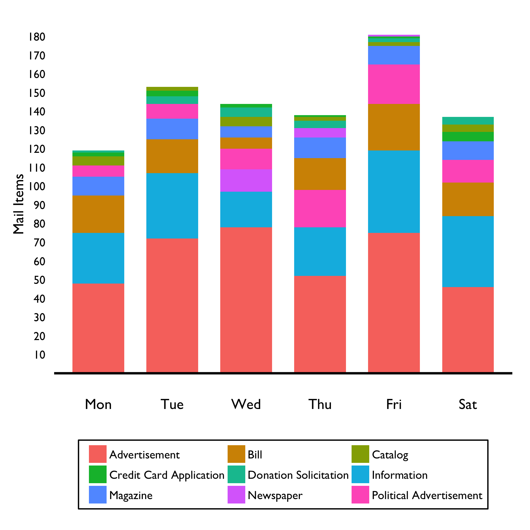
The quantity of mail, by category, with the day of the week it was delivered.
But there’s more to it than just that. We don’t get mail every weekday. Lots of federal holidays fall on Mondays where there is no mail delivery. What we really want to do is to look at how much mail we get for every day that mail was actually delivered. This lets us compensate for an uneven amount of delivery weekdays. When we do this, we find things even out quite a bit. Big Friday is still the king, but the other days even out quite nicely. Understanding what is going on with Friday deliveries is something I’m interested in.
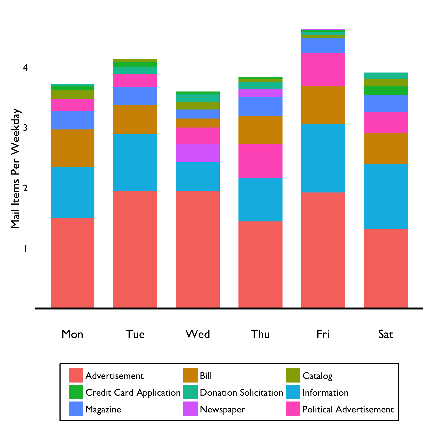
Mail by category each weekday, normalized to the number of days mail was delivered each weekday.
What you can see from all this is that you are (or I am, in any case) more likely to get certain types of mail on some days than on others. This is somewhat easier to see if we plot each category by itself. I find it remarkable to see that I basically don’t get bills on Wednesdays. Credit card applications come primarily Saturdays. Charities don’t ask me for money on Mondays. And political ads come on Thursdays and Fridays. I’ll bet that if I further broke down the advertisement category into senders that more weekday specificity would emerge.

Normalized daily mail categories per weekday.
In the interest of completeness, we finish up by looking at the statistics of the daily mail delivery. That is, how often do we get some particular number of pieces of mail in the letterbox? Here we don’t concern ourselves with the category, only the quantity and how many times that quantity shows up. We can see from the plot that we most often find three pieces of mail and have never found more than thirteen. This distribution in quantities approximately follows what is known as a Poisson distribution. It has nothing to do with fish, but rather was named after a French mathematician Siméon Denis Poisson. The red line fit is a scaled Poisson distribution with the average (lambda) equal to 3.5. This indicates that, on average, I get 3.5 pieces of mail daily. This is slightly lower than the mean value from the plots above of 3.9, but they’re calculated in slightly different ways and have somewhat different meanings.

The distribution of mail quantities follows a Poisson distribution.
The most unexpected things that I have observed are the Big Friday effect, and the amount of regularity in the weekly of delivery of some specific types of mail. As they have endured over eight months of data collection, I am inclined to think they are real, but it will be interesting to watch and see if they exist after an entire year of mail collection. It is also interesting that the Wikipedia article on the Poisson distribution specifically mentions that it should apply to mail, seemingly appropriately, but I can find no record anywhere that anyone has actually done this experiment.
