It has been some time since I last posted on my market index model. Quickly, I was looking for an objective, data-drive method for evaluating the value status of the stock market. Ten different people on the television will tell you ten different opinions of whether the markets are over valued or under valued or whether you should worry. This is silly. We have data, let’s use it.
You can read the older post for the details, but the essence is that the “wisdom of the crowd” in terms of investors and traders, knows where a given index should be and where their comfort levels around that number are. It turns out the comfort levels lie within about 30% or so of that number, just drawing from statistics. Over long periods of time, stock indices grow at constant annual rates; the day to day variations fluctuate around these long term numbers (and are probably completely unpredictable in any meaningful way).
Starting with the blue-chips, I have extended the model to take weekly Dow Jones Industrial Average data from 1935 until 10 December 2018. For all the plots below, the red line is the model fit to the data, which is a 6.5% annual growth rate here, and the green zone around it is one standard deviation of the actual data around the model value – about 32 percent in each direction for the Dow.
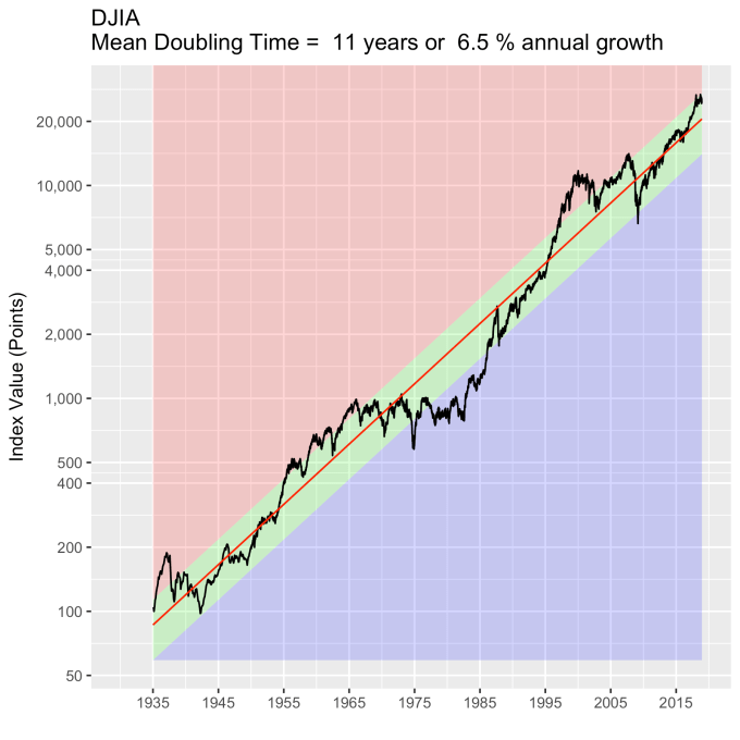
My thesis here is that the green zone boundary, one standard deviation from the model value, is essentially a turnaround point – inside it reflects the “normal” variation in index value. Broadly speaking, when the index value crosses into the red, the market will respond as though the market is overvalued, and when it crosses into the blue, the market will respond as though the index is under valued.
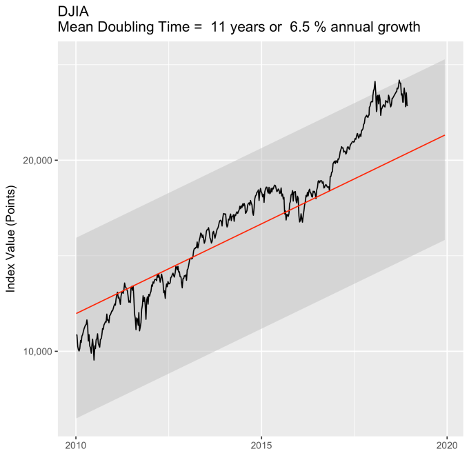
Recent events are agree with this thesis. Below is the DJIA since 2010. In 2018 it has been floating around the top of the “normal” zone (shaded grey in this plot), even crossing into being overvalued a few times, but generally not for very long. Though the DJIA has taken a beating lately, it is well within its historically normal (throughout 85 years) range of variation. The people who claim it is a bubble are not basing their claims on objective, historical reasoning.
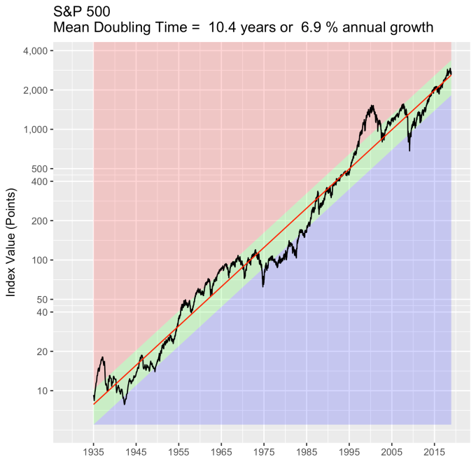
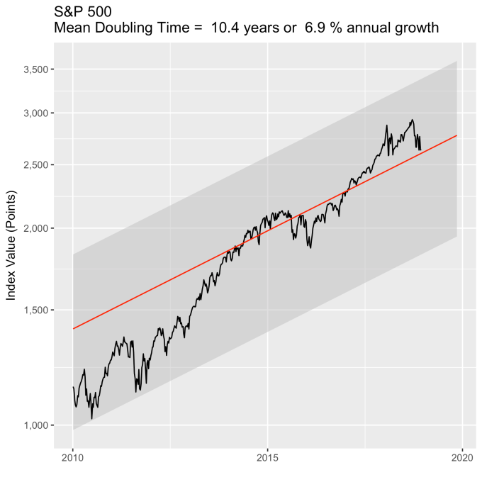
How about the broader indices? Below is S&P 500 back to 1935. The green zone here is 30% of the model value, and it adheres quite a bit more closely to my turnaround rule. That there are ten times more stocks in this index than the last one probably helps it behave better.
How is the S&P 500 doing lately? The data from above are replotted below since 2010, just like with the Dow previously. The S&P 500 is precisely where you would expect it to be from 83 years of data.
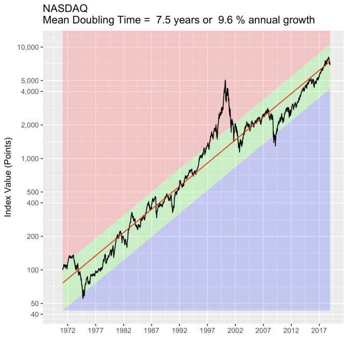
How about tech stocks? The NASDAQ (1972 to present) has a wider standard deviation than the previous two, about 43%, mainly from the tech bubble (where it was trading at 3x the model value). But note the NASDAQ is still tracking the same annual percentage growth line it’s been on for 46 years.
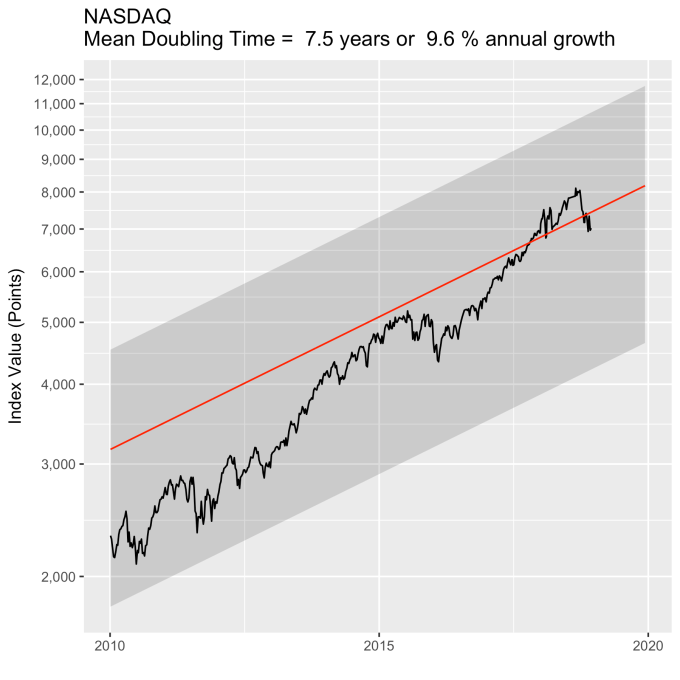
For consistency, below are the data since 2010.
You may ask how the actual index values are distributed around the model values. Meaning, is the standard deviation a good metric? Histograms of the percent deviation from the model are below for all three indices, with the first standard deviation colored green. They aren’t perfect gaussian distributions, but they are clearly symmetric around the model. You can clearly see, on the NASDAQ histogram, just how big the tech bubble was.


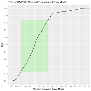
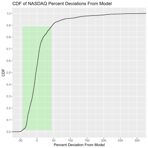
If you’re statistically inclined, the cumulative distributions make the case for the model quite well. The green rectangle is one standard deviation horizontally and the vertical axis reflects the time spent at or below a given deviation. The DJIA spends 65% of its time inside the box, the S&P 500 spends 70% there, and the NASDAQ spends 88%.

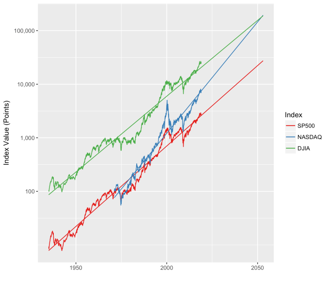
One last thing. Since we have such well behaved data, we can take a little gamble and forecast a little bit. Historically the average growth rate of the NASDAQ is almost 50% higher than the other two I’ve mentioned. What should we expect in the future if decades of data continue to hold true? Plotting them all together paints an interesting future. That is, some time around 2050 the NASDAQ should be overtaking the DJIA. And both the DJIA and the NASDAQ index values will be over 100,000 sometime around 2040.