Wall Street forecasters are notoriously bad at predicting what the markets are going to do. In fact the forecasts for 2001, 2002, and 2008 were actually worse than guessing. Granted, predicting the future is a hard job, but when it comes to stock markets, there are some things you can count on. Disclaimer: This is a look at the numbers; it is not investment advice.
Let’s take the Standard & Poor’s 500. It is an index of 500 large US companies stock values, much broader than the Dow Jones’s 30 company average. It isn’t a stock, and you can’t buy shares in it. But it is a convenient tool for tracking the overall condition of the stock market. It may also reflect on the state of the economy, which we’ll look at in a bit. Below are the monthly closing values of the S&P 500 since 1950. It’s value was about 17 points in January of 1950 and it closed around 2100 points here in June of 2015. It’s bounced around plenty in between.

Closing values of the S&P 500 stock index.
One of the questions to ask is whether the markets are overvalued or undervalued. Forecasters hope to predict crashes, but also to look for good buying opportunities. Short term fluctuations in the markets have proven to be very unpredictable. But longer term trends are a different story, and looking at them can give huge insights into what’s currently going on.
But first we have to look at the numbers in a different way. The raw data plot above makes things more difficult than they really need to be because it fails to let you clearly see the trend in how the index grows. Stocks have a tendency to grow exponentially in time. This is no secret, and most of the common online stock performance charts give you a log view option. Exponential growth is why advisors recommend most working people to get into investments early and ride them out for the long haul.
The exponential growth in the S&P is easy to see in the plot below, where I plotted the logarithm of the index value. For convenience I also plotted the straight line fit to these data — this is its exponential trend. Note that these data span six and a half decades, so we have some bull and bear markets in there — and whatever came in between them. And what you see is that no matter what short term silliness was going on, the index value always came back down to the red line. It didn’t necessarily stay there very long, but the line represents the stability position. It is a kind of first order term in a perturbation theory model, if you will. The line shows the value that the short term fluctuations move around.

Here I’ve taken the logarithm (base 10) of the index values to show the exponential growth trend. The grey area represents the confidence intervals.
This return to the line is a little bit clearer if we plot the difference between the index and the trend. This would seem to be a reasonable way to spot overvalued or undervalued markets. Meaning, that in 2000, when the S&P was some 800 points over its long term model value, the corresponding rapid drop back down to the line should have caught no one by surprise.
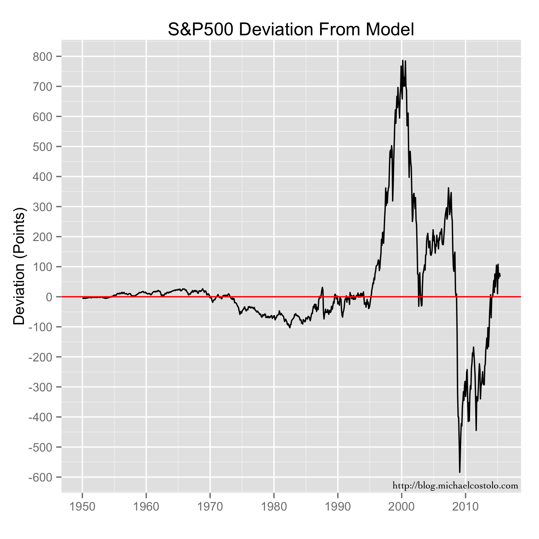
Differences between the S&P 500 index value and the exponential trend model value.
But this look at the numbers is a bit disingenuous. That’s because the value of the index has changed by huge amounts since 1950, so small points swings that we don’t care about at all today were a much bigger deal then. This makes more recent fluctuations appear to be a bigger deal than they may really be. So what we want to see is the percentage of the change, not the actual change.
And on top of this, let’s mark recession years (from the Federal Reserve Economic Database) in red. From this view we can see the bubble markets develop and the resulting panics that result when they burst (hello 2008). And that every recession brought a drop in the index (some bigger than others), but not every index drop represented a recession. In the tech bubble of the late 1990s the market was 110% overvalued at its peak. The crash of 2008 had it drop to about 45%, which is considerably undervalued. All that in 8 years. I think it’s safe to call that a panic. I know it made me panic.
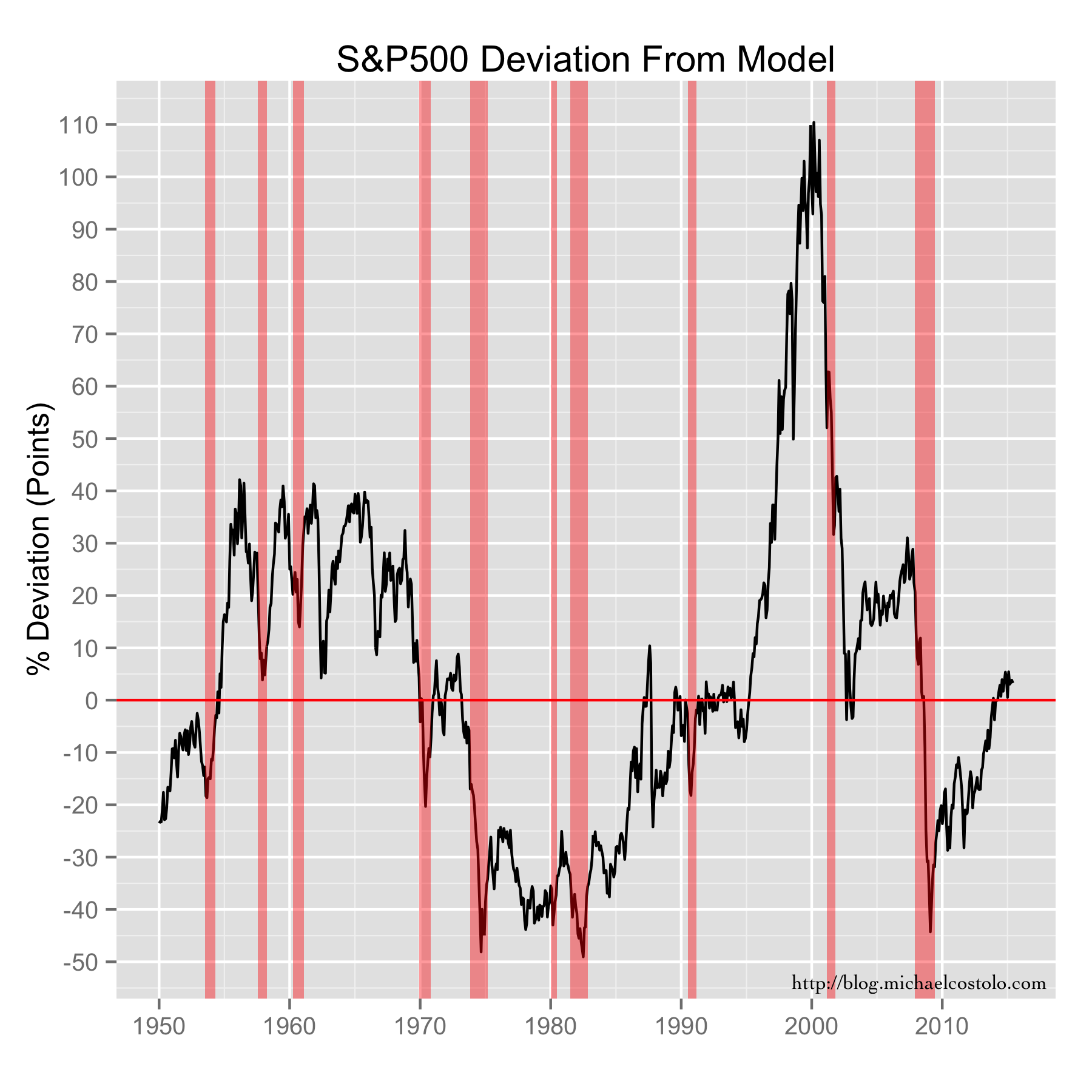
Deviations in the S&P 500 index value from the exponential model are shown as a percentage of the index values. And recession years (from FRED) are shown in light red.
What we see is that the exponential model does a good job at calculating the baseline (stable position) values. If it didn’t, the recession-related drops in the index wouldn’t line up with the FRED data, and things like the 1990s bubble and the 2008 financial meltdown wouldn’t match the timeline. But they do. Quite well, actually. So this is a useful analysis tool.
It is also enlightening to take the same looks at the NASDAQ index since it represents a different sector of the stock market. NASDAQ started in 1971 and is more of a technology focused index. The NASDAQ composite index is created from all of the stocks listed on the NASDAQ exchange, which is more than 3000 stocks. So more companies in the index means this is a broader look, but it is focused on tech stocks.
So, as with the S&P above, here are the raw data. It looks similar to the S&P, and the size of the tech bubble is more clear. The initial monthly close of the index was 101 points, and it is over 5000 today.

Closing values of the NASDAQ stock index.
Not surprising to anyone, this index also grows with an exponential trend. The NASDAQ was absolutely on fire in the late 1990s. I wonder if this is what Prince meant when he wanted to party like it was 1999. Maybe he knew that would be the time to cash out?

Here I’ve taken the logarithm (base 10) of the index values to show the exponential growth trend. The grey area represents the confidence intervals.
The size of the dot-com bubble is clearer if we look at the deviation from the model, as we did with the S&P. At the height of the tech bubble, the NASDAQ was about 3500 points overvalued. Considering that the model puts its expected value at about 1300 points in 2000, I have to ask myself, what were they thinking?

Differences between the NASDAQ index value and the exponential trend model value.
The percent deviation plot shows this very clearly. At the height of the tech bubble, the NASDAQ was some 275% overvalued, almost three times that of the S&P 500’s overvalue. Before the late 1990s the NASDAQ had never strayed more than about 50% from the model value. Warren Buffet has said that the rear view mirror is always clearer than the windshield, but maybe Stevie Wonder shouldn’t be the one doing the driving.

Deviations in the NASDAQ index value from the exponential model are shown as a percentage of the index values. And recession years (from FRED) are shown in light red.
From this perspective, the NASDAQ today actually looks a few percentage points undervalued, so tech still seems to be a slightly better buy than the broader market (this is not investment advice).
Not only that, but the growth model of the NASDAQ, based on its 45 years of data, shows that it grows considerably faster than the broader market. If you go back and look at the raw data for either of the two indices, you’ll notice something special about the nature of exponential growth. The time it takes to double (triple, etc.) is a constant. As these are bigger numbers and because it is convenient, let’s look at the time it takes to grow by a factor of ten (decuple). The S&P 500 index decuples every 33.3 or so years. The NASDAQ composite, on the other hand, decuples every ~24 years (about 23 years and 11 months, give or take). This has huge implications for growth. That’s nine fewer years to grow by the same factor of 10.
Now comes the dangerous part. Let’s take the both of these indices and forecast their model values out thirty years. Both of the datasets contain more than thirty years worth of data, so forecasting this far out is a bit of a stretch, but not without some reasonable basis. Still, this is an exercise in “what if,” not promises, and certainly not investment advice.
Since we started with the S&P, let’s look at that first. If the historic growth trends continue, the model forecasts that the S&P 500 (currently around 2000 points) should be bouncing around the 10,000 point mark some time in the middle of 2038.
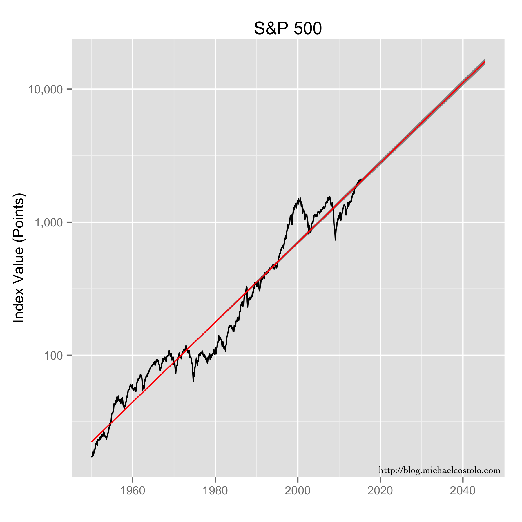
S&500 data, along with its exponential model fit, extended out thirty years. The grey area represents the confidence intervals.
The NASDAQ, on the other hand, which is currently around 5000 points, should average around 10,000 in late 2021, and 100,000 near the end of 2045. (Note: the S&P should be around 16,000 points at that time). Today the ratio of the NASDAQ to the S&P is about 2.4. But in 2045 it could reasonably be expected to be more than 6. Depending on the number of zeroes in your investment portfolio (before the decimal point…), that could be significant.
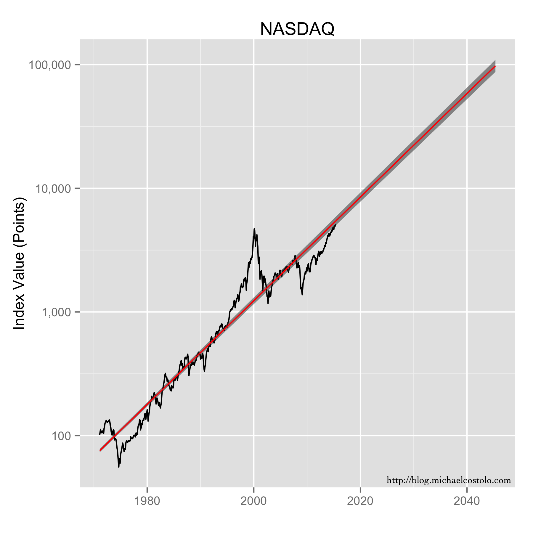
NASDAQ data, along with its exponential model fit, extended out thirty years. The grey area represents the confidence intervals.
This forecasting method will not predict market crashes. But that’s OK, because the professionals who try to forecast them can’t do that either. (Now if only Goldman-Sachs would hire me.) What it can do is give us a very clear idea of the market is over or under valued. By forecasting the stable position trend, we can easily spot bubbles, identify their size, and perhaps make wise decisions as a result.
