Amherst School District – Per-Student Spending and Special Education Budget Comparison

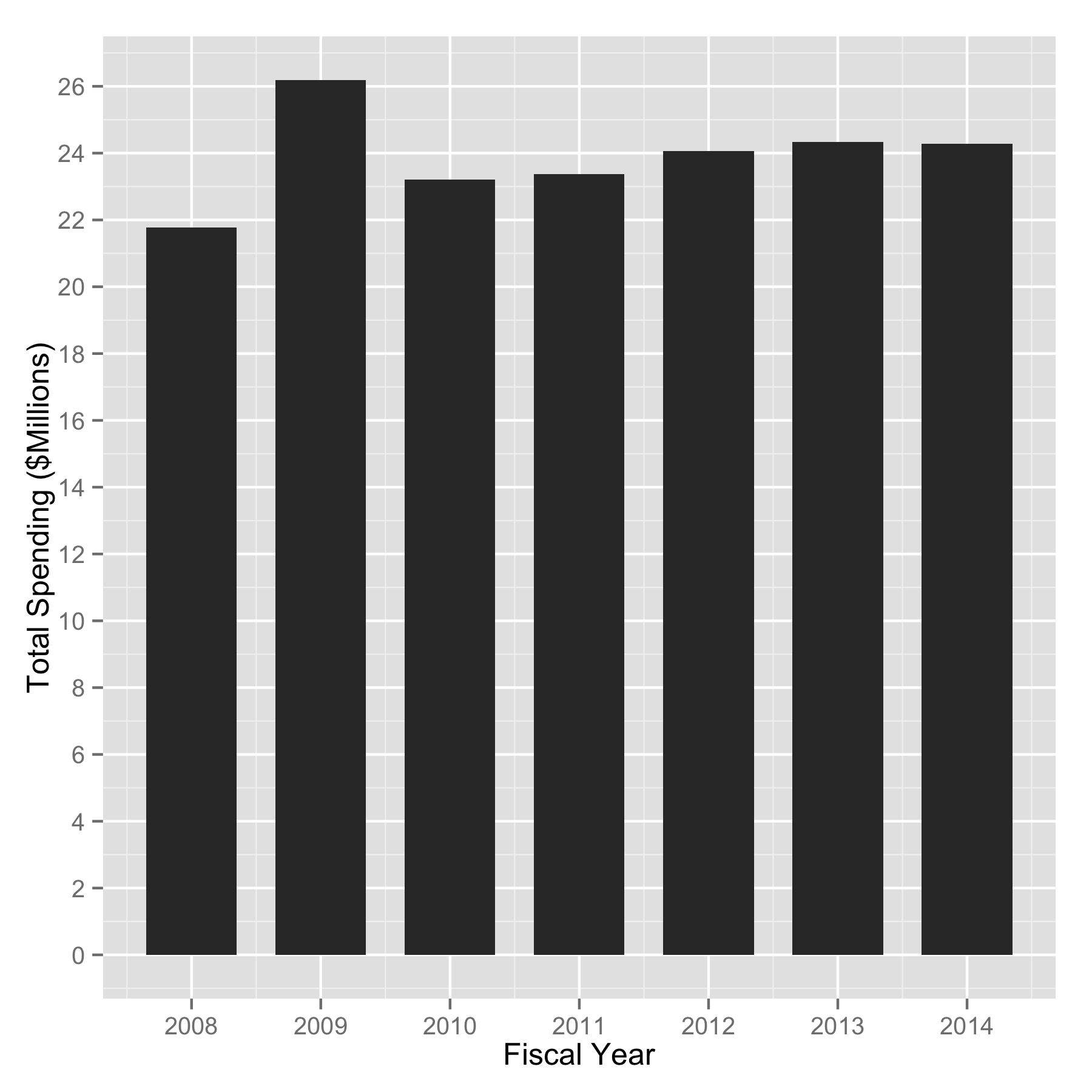
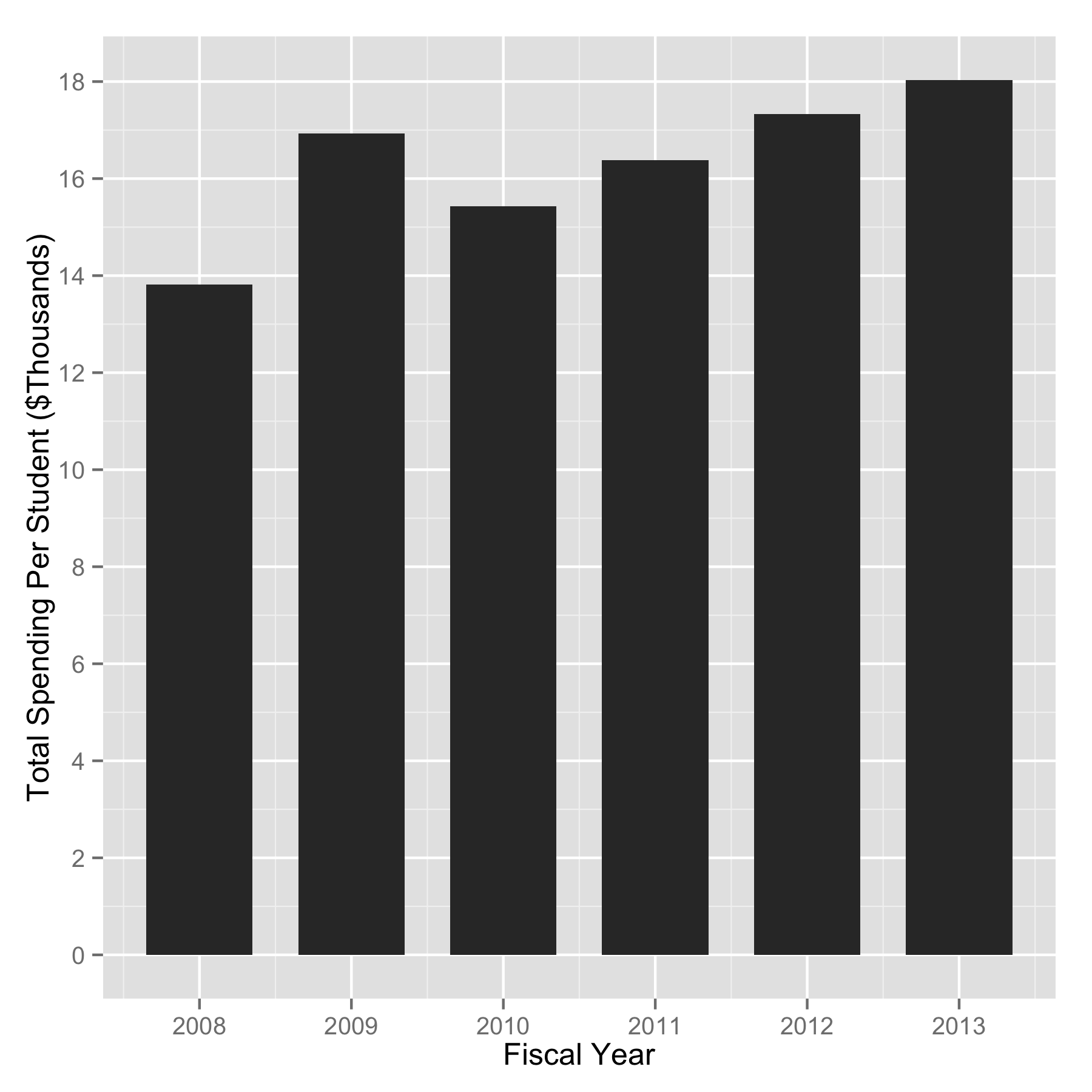
Recently I was preparing some charts to go over at the beginning of this year’s Amherst School District Ways and Means budget meetings.  I’ve gone through our budgets quite extensively trying to understand what our costs are and how we can control them.  One thing I look at is per-student spending, which we’ve gone over before.  What I really wanted to understand is how we compare with some of our neighboring towns.

Luckily, the state Department of Education puts their numbers online.  The state does the calculation somewhat different than you might expect as they remove certain budget areas like transportation and food service from the calculation.  With that in mind, these are the state’s cost per student numbers for elementary school education in Amherst, Bedford, Merrimack, and the state average as reported by the NH DOE from 2001-2012.

Per Student Costs by Fiscal Year For Amherst, Bedford, Merrimack, and the State Averages, by Fiscal Year.

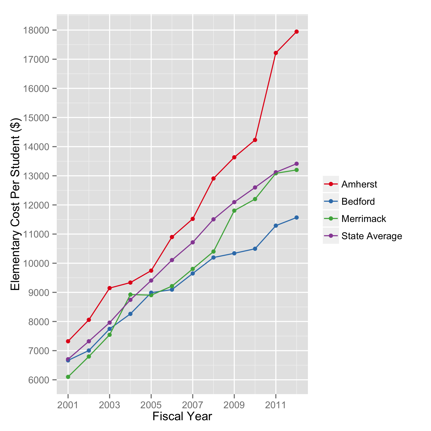
Per Student Costs for Elementary Education by Fiscal Year For Amherst, Bedford, Merrimack, and the State Averages.

So according to the state, in FY 2012 we outspent the state average by $4533/student, Bedford by $6378/student, and Merrimack by $4745 in elementary school education.  Go back and read that again.  I found this to be remarkable.  And a little surprising.  We need to understand why Amherst’s numbers are so very different from our neighboring towns.  Those other New Hampshire towns have the same health insurance and NH Teachers Retirement fund constraints that we do, so those probably aren’t the drivers.

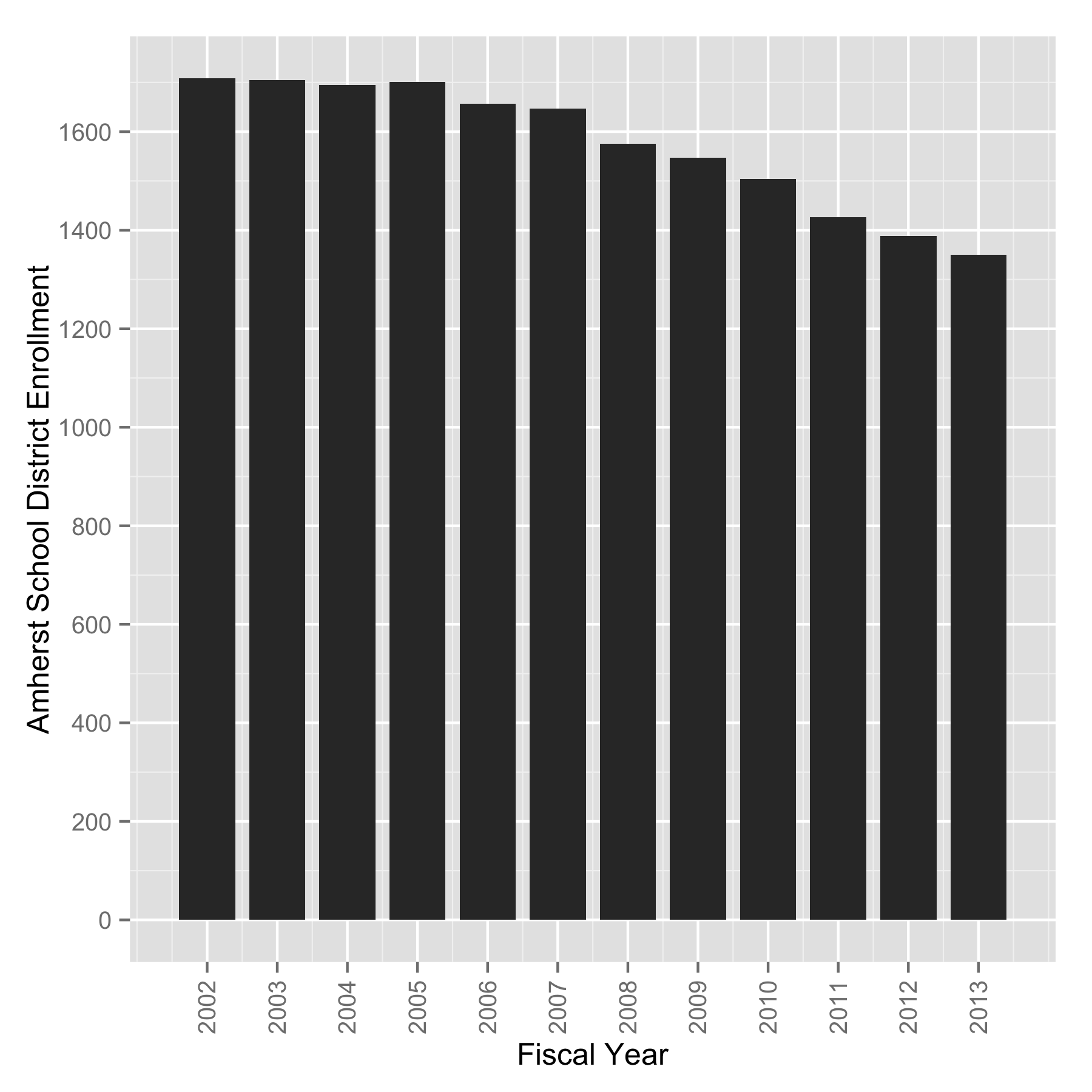
For the record, here are the middle school numbers.  We’re high there too.

Per Student Costs (Middle School) by Fiscal Year For Amherst, Bedford, Merrimack, and the State Averages, by Fiscal Year.

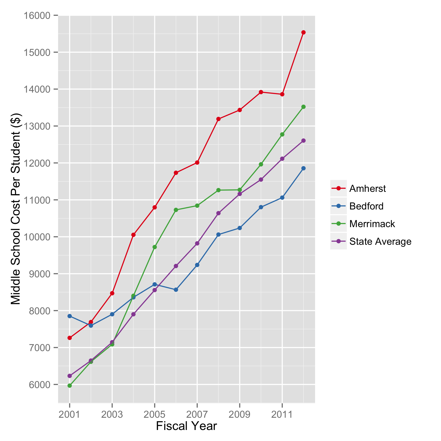
Per Student Costs for Middle School by Fiscal Year For Amherst, Bedford, Merrimack, and the State Averages, by Fiscal Year.

The table below has these cost/student numbers for just FY2012, and includes the numbers for the total district.  Keep in mind that Bedford and Merrimack don’t have multiple districts in their towns like we do, so their district numbers include high school (for the record, our Souhegan HS district comes in at $18,456.28/student in FY2012 according to the state).

Elementary Middle School District
Amherst $17,946.34 $15,536.66 $16,569.40
Bedford $11,567.85 $11,855.69 $11,385.20
Merrimack $13,201.02 $13,521.11 $13,157.54
State Average $13,413.70 $12,605.50 $13,159.15

I was pleasantly surprised to find that both Bedford and Merrimack school districts have their FY14 school budgets available online.  I have not yet done a thorough analysis to see how they compare with things we’ve already looked at, like health insurance.  But to try to understand how they spend so much less per student than we do, I took a quick look at their education spending and found something remarkable.  Amherst School District’s budget is heavily weighted in Special Education.  Considerably more than neighboring towns.  Here are the numbers, including the percentage of the budget spent on Special Education.

School FY14 Total Budget FY14 Special Education Budget % Special Education
Amherst $24,278,572.00 $5,073,488.00 20.9%
Bedford $62,660,875.00 $9,882,992 15.7%
Merrimack $67,291,503.00 $10,171,841.00 15.1%

Now these are telling numbers.  In Amherst we are spending between 4 and 5 percentage points more of our budget on Special Education than our neighboring towns. This is a lot of money.  Why these numbers are so different needs to be understood.

Now what would our budget and cost/student look like if we had the the Special Education budget percentages of Merrimack or Bedford this upcoming school year?  I ran the numbers using Merrimack’s spending:

  SPED @ 20.9% SPED @ 15.1%  
Special Education: $5,073,488.00 $3,415,745.21  
Total Budget: $24,278,572.00 $22,620,829.21  
Cost/student: $17,984.13 $16,756.17  

That is to say, if our special education spending was in line with neighboring towns, we would shave about $1.5 million off of our bottom line budget and reducing our spending/student by around $1200.  What I take from this is that we are extravagant in several areas in Amherst School District, Special Education being only one of them.

Amherst Cemetery Lot Inventory and Time Remaining

I spent some time at the Department of Public Works here in Amherst looking at the remaining lots (unsold) in Meadowview Cemetery.  I wanted to be able to make a calculation of how many years of usage are remaining at Meadowview as a double check on what the Cemetery Trustees have said.  It turns out that we have the capacity for 661 burials left at Meadowview Cemetery.  Here’s the breakdown:

Lot Type Number of Lots Burial Capacity
Single Lots: 66 66
Double Lots: 225 450
Triple Lots: 27 81
Quadruple Lots: 16 64
  Total Capacity: 661

To answer the question of how many years until the cemetery is full, we have to consider a few things – how many burials we make per year, and how many of those burials require a new lot.  This is because people can purchase lots today for usage in the future, and those lots make up the majority of the ones used for burials. So let’s go back over our burial rate in Amherst cemeteries.  Over the last 80 years, the average burial rate is 22/year, plus or minus 6.  We have seen this here before.  Remember that the current year’s number is not for the full year.

Annual number of burials in Amherst, NH cemeteries. Data from Department of Public Works records.

Annual number of burials in Amherst, NH cemeteries. Data from Department of Public Works records.

And we have numbers for lot sales, though unfortunately not for the same range of years.  To make this simpler, we will just look at the percentage of burials using previously purchased (perpetual care) lots here.  The most recent number is around 60%.  The details on where these come from is here.

Percentage of Amherst cemetery burials using previously held (perpetual care) lots.

Percentage of Amherst cemetery burials using previously held (perpetual care) lots.

So now we have what we need to know.  Let’s do the “most likely” analysis using the 80 year average burial rate (22/year) and the 60% number for perpetual care lot usage from the graph above.  That means 40% of the burials require new lots taken away from the 661 we have today.  So how long will it take until Meadowview is full?  Answer: 75 years.

Current Lot Inventory: 661
Burials/year: 22
Percentage using newly purchased lots: 40
New Lot Purchases/year: 8.8
Previously Sold Lot Usages/year: 13.2
Time to exhaust inventory (years): 75.1

Let’s take a “worse case” scenario and use the 28/year burial rate (22+6) and the same new/perpetual care split.  How many years are left at Meadowview then?  Answer:  59 years.

Current Lot Inventory: 661
Burials/year: 28
Percentage using newly purchased lots: 40
New Lot Purchases/year: 11.2
Previously Sold Lot Usages/year: 16.8
Time to exhaust inventory (years): 59.0

Obviously these hold so long as past trends continue into the future.  Who knows if or when our increase in population may eventually start to show in our burial rates.  But notice that it hasn’t for 80 years.  And we have no idea how many perpetual care lots are left to be used, because no one really keeps track of that specifically.  So let’s take this one step further and imagine there are no perpetual care lots left to use, and we use our statistical high rate of 28 burials/year rate, all of which take up a previously unsold lot.  This would be our “worst case” scenario.  How long then?  Answer:  23 years.

Current Lot Inventory: 661
Burials/year: 28
Percentage using newly purchased lots: 100
New Lot Purchases/year: 28
Previously Sold Lot Usages/year: 0
Time to exhaust inventory (years): 23.6

Amherst School District – Value and Trends in Standardized Testing (Part 2)

Value is a word that we should probably use more when it comes to the school district.  We talked before about the black box approach to understanding complicated things.  We take something complex, like an electronic circuit or a whole school district, and put it into a big black box and simply look at what goes into it and what comes out of it, and use those to learn what it does without having to be too concerned with the details of how it all actually happens (for now, at least).  This is a great way of getting an overall look at how something behaves, and we can use it to look at its effectiveness, or value.

A useful way to think about value is to look at input/output ratios.  You do this all the time, even if you don’t realize it.  Into your car you put gas, out of your car comes miles of travel, divide the two and you get your miles/gallon ratio.  In this case, a higher number means greater value – more miles out of a gallon of gas is greater output for every unit of input and therefore more value.  We can use this same approach with our black box model of the school district.  Into our school district go money, students, and staff, and out come educated students.  The measure of the amount of education the students have is currently done, for better or for worse, with standardized tests, which is a reasonably good way to look at groups as a whole.

Previously we looked at NECAP test scores over time.  But the word value often refers to comparisons made with money – how much of something do we get for our dollar spent.  So lets look at one of the measurements of education that we can make, average NECAP scores and proficiency numbers, and compare them with the dollars it took to get those scores.  In order to do this we have to get rid of the silly NECAP convention of adding the grade level in the hundreds place of the scaled score, and just use the actual test score numbers which go from 0-80.  I don’t have budget numbers for all of the years that I have NECAP scores, so there are a few less years on these graphs than there were on the ones you saw with just NECAP results before.  And because we usually like to look at large numbers instead of lots of decimal points and zeroes all over the place, we will flip the ratio so that the output is on the bottom of the fraction.  This means that instead of points/dollar, we’re looking at dollars/point, and value goes up as the numbers go down.  With all of that in mind, here are the dollars per student-NECAP score numbers for Amherst School District from grades 3-8 for 2008-2012 in reading and math.  We get these by taking the $/student numbers and dividing them by the mean scores for each year.

Amherst School District spending per student  per NECAP test score for reading and math for grades 3-8.

Amherst School District spending per student per NECAP test score for reading and math for grades 3-8.

2009 was the year we had a one-time $2 million bump in the budget.  What we see here is that over time, in general, more dollars are required for every point scored in math and reading.  In other words, value is going down as the years go by.

We can look at these in a slightly different way.  Rather than the cost/point each year, we can look at the test scores and how much we spent per student in the teaching year.  It is the same idea as above, but now we don’t necessarily care which year it is, only what the spending per student number was that year.  Per-student total spending was gone over in a previous post if you want to look at those numbers and how we get them.

This look gives us a sort of price elasticity curve, if you’re familiar with economics.  That is, looking at the numbers this way we see how the amount of education changes as the cost of educating a student changes.  First the NECAP average scaled scores, grades 3-8, math and reading.

ASD NECAP Math and Reading score as a function of per student spending.

ASD NECAP Math and Reading score as a function of per student spending.

NECAP reading and math scores don’t seem to be very elastic. That is, they don’t change much regardless of how much money we spend.  What about the percentage of students who test proficient or above?

ASD NECAP student proficiency as a function of per student total spending.

ASD NECAP student proficiency as a function of per student total spending.

No matter how we look at the numbers, it is clear that the increases in spending haven’t given us any increase in educational value.

The key to understanding why this is so is to look at how the money was spent.  So we have to dig a little bit into the budget.

There is a good reason why the extra spending we do each year doesn’t give us a bump in education – it isn’t spent on education.  Since  2008, the average annual budget increase is $417k.  The average increase on insurance and NH Retirement is $395k.  That is, the spending increases each year go overwhelmingly into health insurance premiums and the NH Teachers Retirement fund.

Insurance and retirement costs for Amherst School District.  The major drivers here are health insurance and the contributions to the New Hampshire Retirement System for teachers.

Insurance and retirement costs for Amherst School District.

What this means to me is that the top priority this year is to get control over these costs.  I am certain that the school board and the administration have plenty of programs they would like to implement, but can’t because of budget constraints.  I know from talking with people in town that they want tax relief.  Making this happen will take creativity and leadership.  I have high hopes that we are up to the challenge.

Amherst School District – Value and Trends in Standardized Testing (Part 1)

Before I changed my college major to Physics, I studied Electrical Engineering.  One of the ways electrical engineers look at complex circuits is to replace them with imaginary black boxes.  They can then measure what goes into the black box (inputs), and also what comes out of it (outputs), and from those measurements they can learn how the black box behaves without knowing too much about the details of what goes on inside of it.  This sort of approach can be useful in understanding the behavior of other complicated systems, school districts included.

We spend a lot of time evaluating things like budgets, staffing, and enrollment for the district – these are all inputs.  We can analyze spending areas and benefit costs over time, but these are just detailed views of some parts of these inputs.  What we haven’t looked at yet are outputs, and they are overdue for some attention.

So what are the outputs of a school district?  Different people will have different answers to this question.  For me, I’m going to say “educated students” as that is the reason the district was created – to educate the children of Amherst.  Measuring the level of education is an important, but complicated task.  Few professional educators I know can agree on a satisfactory way to measure it, and there are plenty of disagreements on what the measurements that are made actually mean.

But we shouldn’t let the lack of a perfect measurement stop us from making any measurements at all, and we should look very closely at the ones that we can make, or in this case, already have been making.  At the beginning of each school year, the New England Common Assessment Program, or NECAP, tests are given to children in grades 3-8 for reading and for math.  There are some other subject tests given, but not to all grades each year. The results of these tests for Amherst School District are posted on the New Hampshire Department of Education website (see the NECAP Longitudinal Reports section toward the bottom of the page).  There you will find the percentage of students that score proficient or above in each subject, and also the average scaled scores, both of these for each grade level tested.  Now if you’ve been following along with anything else on this website, you know that I’m about to show them to you.

Below are the individual grade level NECAP testing results for math and reading for teaching years 2006 through 2012.  Plotted first are the percentage of students scoring proficient or above for grades 3-8.  (Note:  The NECAP test for teaching year 2006 is given in the Fall of 2007, etc.)

Amherst School District NECAP data for math and reading.  Scores are reported for teaching year.

Amherst School District NECAP proficiency data for math and reading. Scores are reported for teaching year by grade.

Apart from the steady decline in the percentage of 7th graders testing proficient in math, nothing really jumps out here.  That is the problem.  Can you pick out the year we hired the literacy coaches from the reading results?  How about year we started with math coaches? I’ll admit that I’m having trouble figuring those out myself.

Perhaps we will have better luck looking at the average test score numbers.  So here they are broken down by grade, same style as above.  NECAP has an odd scoring system.  The scores are created by adding the grade level in the hundreds place, plus a numeric score that ranges from 0 to 80.  This strikes me as a very poor way to represent test scores, but here they are on comparable scales.

NECAP average scores for Amherst School District.  These are the mean scaled scores each year by grade.

Amherst School District NECAP average scaled scores for math and reading. Scores are reported for teaching year by grade.

Similar to the proficiency percentages we looked at before, there are a few years with some modest gains, but there are some modest losses as well.  What is quite clear is that since teaching year 2006 we have seen no significant improvement in reading or math standardized test scores, or the proficiency percentage of students tested.  Now would you be surprised to find out that we’ve added about $4 million to the Amherst School District annual budget in this amount of time (i.e. going from about 20 up to 24 million)?  This is where the question of value comes in.

There may or may not be better ways than NECAP to measure individual student performance, but that is an issue for a different time.  Standardized tests are generally accepted to be a reasonable way to make year-to-year comparisons for establishing progress on a broader scale.  And I think the numbers speak for themselves that we have room for improvement in the district.  It is reasonable to guess that this was the goal behind starting our teaching coaches program.  Now I don’t want to sound like I’m picking on teaching coaches, but it is not clear that this experiment has paid off.  Rather, it looks to me quite the opposite.

I should point out that last year during the Ways and Means budget meetings, I asked the director of curriculum development about metrics demonstrating the effectiveness of the coaching program.  I was told they did not have them, but that they had a plan to get them (though the time scale was not clear).  Now consider that in the school year starting this Fall we will spend $435,000 (salaries + benefits, etc.) on teaching coaches in Amherst School District alone.  Literally millions of Amherst taxpayer dollars have been spent on the coaches program since it was started, and without any discernible impact on measured education levels in either math or reading.  That is enough to make me question the value the teaching coaches program has brought to the students or to the taxpayers of Amherst.

Death and Burial Trends in Amherst

When it comes to understanding how we use our cemeteries in Amherst, something was still missing in my mind after going through the population growth in town, the annual burial numbers in our cemeteries, and also the cemetery lot sales numbers. To quickly review, since 1934, on average, we have a flat average of just 22 burials per year (+/- 6) in Amherst, NH cemeteries (see below).  The lot sales numbers indicate that we sell on average less than 8 cemetery lots per year (between 1971-2008), indicating that most of the burials are in lots that have been previously purchased (perpetual care lots).

Annual number of burials in Amherst, NH cemeteries. Data from Department of Public Works records.

Annual number of burials in Amherst, NH cemeteries. Data from Department of Public Works records. The red line shows the average value of 22.

This is rather surprising in light of the town’s population growth in that time. As per the US Census, we have gone from about 1000 people in Amherst to over 11,000 in that amount of time (see below).  So the conundrum is that even though there are 11 times more of us here now than there were 8 decades ago, the number interred in our cemeteries each year hasn’t changed.  At all.

US Census data for the town of Amherst, NH.

US Census data for the town of Amherst, NH.

This doesn’t make a whole lot of sense, but the numbers are all real.  Something to ponder while we press on.

One missing piece of this puzzle is the number of Amherst residents who die every year. Now you might guess that the number of residents who die and the number of people who are buried here would be basically the same.  This would make sense, but this would be wrong.  The number of resident deaths in Amherst is tabulated and reported every year in the annual town reports, which are available in the town library’s archive room, and that is where I obtained the numbers (graphed below). These are still remarkably small numbers, though they do show a slow growth trend, tripling in 8 decades.

Amherst Resident Deaths from 1934 to 2012, as recorded in Annual Town Reports.

Amherst Resident Deaths from 1934 to 2012, as recorded in Annual Town Reports. The blue line shows the running average.

So here is the conundrum now, since 1934 the population of Amherst has increased by a factor of 11, the number of annual resident deaths have gone up by a factor of 3, and despite those increases, the burial rate has not changed.

There’s a twist to this story, we just haven’t seen it yet.  It is difficult to plot resident deaths the same graph with the burial numbers for comparison, but we do need to compare them. So instead let’s look the ratio of burials to deaths.  This will be a much more useful graph.  Plotted here (see below) is our annual Amherst cemetery burials as a percentage of Amherst resident deaths each year. There is something quite surprising going on, do you see it?

Burials in Amherst, NH cemeteries as a percentage of Amherst resident deaths.  These numbers are skewed by the "Brought from away and buried in Amherst" burials.

Burials in Amherst, NH cemeteries as a percentage of Amherst resident deaths. The unlikely percentages are caused by the “brought from away and buried in Amherst” burials.

It turns out that it has been quite common for people to be “brought from away and buried in Amherst.” In some years those numbers have exceeded the numbers of Amherst residents who died. When that happens, we get some statistically very unlikely burial percentages, which you see above.  Now why people would be brought in for burial is a question for the historians.  But up until ten years ago or so, these “brought from away” numbers were in the town reports.  Whether or not this is still going on is an unanswered question at this point, and we have no information on the number “sent away” for burial.

One thing that is readily discernible here is that the percentage of dead which are buried is decreasing.  Let’s assume for a moment that the number of “brought from away” burials is currently the same as those who are sent away.  If this is true, the 2012 numbers show that about 50% of our residents who die are not buried.  Now if the number “brought from away” is greater than those sent away, as it must have been for many years, this fraction of residents not buried increases.  So what happens to the 50%+ who aren’t buried?

The answer, I believe, is cremation, an increasingly popular alternative to burial in this part of the country.  That explanation is consistent with the numbers that are reported here, and also with funeral homes reports in the area, which report that more than 60% are choosing cremation over burial.  The numbers from Amherst here are somewhat muddied by the fact that the head of DPW tells me that cremated remains are sometimes buried, requiring a lot and being recorded as a burial, so cremation rates in town are greater than what would be suggested here by burial numbers alone.

Now I think we have a reasonably complete picture of how we use our cemeteries in Amherst.  A useful thing to know for planning purposes would be the numbers of unsold and perpetual care (sold but unused) lots currently in town cemeteries.  We could use these, along with what we know from historic numbers, to forecast the number of years left before new cemetery space is required.

Amherst School District Health Insurance and NH Retirement Costs

In my last post I made a reference to the growth in expenditures in the health insurance and New Hampshire Retirement fund contributions in the Amherst School District budgets, and how they are driving forces in increasing the  budget over the years.  I also said I would dig through the budgets and come up with these numbers.  This is a somewhat cumbersome task because the budget is organized into sections like “regular education” and “special education,” with a complete set of spending numbers for each section.   So a subject like health insurance appears in about 12 separate places throughout the 30 or so pages of the budget, and then there are separate lines for the different schools in the district.

So with the caveat that I went through PDFs of these budgets by hand and could have missed a line in the tallies (though I was quite careful in doing this), here are the annual budgets for the NH Retirement contributions for non-teachers (NH Ret (NT)), contributions for teachers (NH Ret (T)), health insurance, and dental insurance for Amherst School District from FY10 through the budget we just voted on in March (FY14).  Click it for a bigger version.

Insurance and retirement costs for Amherst School District.  The major drivers here are health insurance and the contributions to the New Hampshire Retirement System for teachers.

Insurance and NH Retirement fund costs for Amherst School District. The major drivers here are health insurance and the contributions to the New Hampshire Retirement System for teachers.  NT denotes contributions made for non-teachers (red).  T indicates contributions made for teachers (blue).

Since we have been reducing the levels of staffing in the district in response to the decrease in enrollment that I talked about in my previous post on the budget, we would hope to see these numbers decreasing.  However, this is not a trend that we can see here.  There are a few modest occasional decreases, but these are nowhere near offsetting the increases.  From FY13 to FY14, the NH Retirement fund contributions for (not from) teachers increases by 20% ($231,551) and health insurance by 4% ($135,393).  Those changes are more than either the dental insurance or non-teacher retirement entire budgets.

Now that we have seen how each category changes independently, let’s look at them combined so that we can see their total impact on the school budget each fiscal year.  This one also gets bigger with a click of the mouse.

Insurance and retirement costs for Amherst School District.  The major drivers here are health insurance and the contributions to the New Hampshire Retirement System for teachers.

Insurance and NH Retirement fund costs for Amherst School District. The major drivers here are health insurance and the contributions to the New Hampshire Retirement System for teachers.  NT denotes contributions made for non-teachers (red).  T indicates contributions made for teachers (blue).

This is impressive.  Now, we can see that these four spending areas combined have increased from $3.8 million to almost $5.5 million since FY2010.  They increase by an average of just over $395,000 per year, with almost 40% (~$150,000/year) of that average increase being the beyond-our-control NH Retirement fund contributions for teachers that the state downshifts to us (that is, more of the fraction they used to pay is now taken on by the town).  Health insurance costs increase by an average of about $244,000/year – or about 1% of our most recent ASD budget.  And both of those dollar increases are with staffing reductions in place.

Almost every person I know in town has complained about rising property taxes in Amherst, and the school budgets are the majority component of them.  If we seek to reduce this overall budget, or even hold it constant, then without implementing any new initiatives, either $400k of new cuts must be made in other areas annually to compensate or we will have to find some way to get these annual increases under control.  Frankly, I’d rather see us find ways to make our insurance more affordable than to have to cut more teachers.

So why are these numbers what they are?  What we were told last year on health insurance is that there are contractual obligations in place that obligate us to keep certain health insurance programs available.  And that the more expensive option (the JY Plan) has been removed.  Also that there are a very limited number of insurers in the state, which keeps competition down and prices high.

Those may all be true.  But we should not be entering into the sort of contracts that obligate us to carry unaffordable options in perpetuity.  And what other plan options have we considered?  I have seen companies drop HMOs for PPO plans with secondary insurance plans to cover deductibles in order to reduce costs without reducing benefits.  Has this been investigated?  Would a consolidated school district allow us to reduce our health insurance premiums by increasing our group size?  Have those numbers been run?  Not a bad starting set of questions.

Amherst School District Budget History

Last year I served my first term on the Ways and Means committee for the Amherst School District.  During budget season, the committee reviews a very complicated budget and scrutinizes it, submitting questions to the administration, meeting with various district employees responsible for budget areas, and reviewing spending plans for efficiency and value.

As I begin to prepare for budget season this year, I thought it would be a good exercise to review some information from previous budget years to understand how the budgets have changed.  This is important to understand as the Ways and Means committee is somewhat dynamic in its makeup.  That is, appointments are for three year terms, and so information has a way of quickly becoming lost as people cycle through their turns on the committee.  It makes sense to me to share this information publicly.

A little bit of background.  The district annually publishes a summary of its proposed budget and revenue assumptions.   This is its “MS-26” file, and they are published online on the district’s finance page for each fiscal year.  This document gives a very high level overview and breaks spending down into coarse categories.  Things like “regular programs,” and “special programs.”  These are the totals for all of the spending categories inside of the  regular and special education programs in the full budget, and they’re the two largest categories in the budget.

So let’s have a look at the six largest budget areas (in 2008) and see how they change over time.  These areas are regular education, special education, support, operation & maintenance, administration, and SAU management services.  The graph below shows these numbers, as taken from the MS-26 forms mentioned previously.  Now each year when these forms are published, they show the actual spending numbers from the previous fiscal year, the appropriated numbers in the current budget, and the requested numbers for the budget to be voted on.  The numbers in the graph below are actual numbers with the exception of the last two years, which fall into the “appropriated,” and “requested” categories.  Go ahead and click on it for a larger version.

Spending in Amherst School District for the top 5 categories (in FY08)

Spending in Amherst School District for the top 6 categories (in FY08)

Here are the individual categories shown separately each year.

Budet category spending in Amherst School District for the top 5 categories (in FY08)

Budet category spending in Amherst School District for the top 5 categories (in FY08)

It would seem that in 2009 much of the money that was previously in the “support” budget was shifted into “regular” and “special” education budgets, and so after 2008, support is a relatively minor budget area.  That would explain the large percentage changes in those education spending  budgets.  Other than that, these combined budget areas show an average total of a few hundred thousand dollars per year annual growth in spending, with single digit percentage changes in each budget per year.  There isn’t anything else huge that jumps out at me.

Total spending, seen below, increases at about the same rate, with the outlier being 2009.   I’m not sure what happened this year, but we spent a few million dollars more than the trend would otherwise lead you to expect.  Large contributions to the increases in total spending each year come from uncontrolled health insurance expenses (something I addressed during my campaign for school board last year, but I digress) and the state of NH’s downshifting teacher retirement expenses to the districts.  I plan to dig into these budgets to get these numbers (it isn’t as easy as you might think), but I don’t have that done yet.  (Note:  It is done now.)

Total spending numbers for Amherst School District since FY08.

Total spending numbers for Amherst School District since FY08.

So spending is one thing, but there’s something else we haven’t thought about yet.  When we think about something as complicated as a school district, it can be instructive to think about it as something simpler – a black box.  Into the box go things like students, staff, and money (all easy to quantify), and out of it comes something somewhat less easy to measure – education (a topic for another time).  This sort of simplification can let us more easily think about efficiency in terms of output as a function of input; efficiency being a word too infrequently used when we consider publicly funded enterprises.

We just looked at the money input, now let’s consider the student input.

Below is a graph of the enrollment in the Amherst School District since 2002.  These numbers come from the New Hampshire Department of Education.  Notice that enrollment has dropped every single year since 2005.  Now go back and look at that spending graph above.  Sure, education spending has been relatively flat, but what does that mean when you have a decreasing enrollment?  This graph gets bigger with a click as well.  It is instructive to have a good look at it as it is what is happening in our schools right now.

Total enrollment at Amherst School District by fiscal year.

Total enrollment at Amherst School District by fiscal year.

I want to take a small aside here and try to understand why this enrollment decline might be happening.  There are likely to be a number of factors behind it, but it would seem to me that the birth rate should be a sensible thing to look at as an enrollment predictor.  It would be nice to have more enrollment data to do a correlation study with, but I just don’t have them.  Birth rate data, on the other hand, is somewhat easier to get.  Not for the state, of course, that would be too convenient.  Plotted below are the US birth rates (live births per 1000 people) since 1960, and plotted along with them are US economic recession years (in red).  It isn’t too surprising to mee to see that all of the significant drops in birth rate coincide with recession years.

Take note of something interesting.  You would expect a 5 year lag between birth rate changes and their impact on enrollment.  2000-2001 was the last recession drop, which is in line with our 2006 enrollment decrease.  Both data sets are roughly flat the few years prior to the drop as well.  If this means anything, it should allow us to make plans for future enrollments in the public schools.

US Birth Rates since 1960.  Recession eras are shown in red.

US Birth Rates since 1960. Recession eras are shown in red.

Now since we have both spending numbers and enrollment numbers, let’s take a look at the all important “total spending per student” number.  The school administration officials don’t really seem to like this number.  It is true that the Dept. of Education uses a different algorithm to calculate per student spending.  This is because they only use education spending, as opposed to total spending, in their calculation, which allows them to compare districts based on education costs alone.

That’s all fine and good, but our per student cost is our per student cost.  Pretending it is something other than what it is doesn’t benefit anyone.  Below is a graph of our per student costs since FY08.  These are total expenditures divided by enrollment for the year.  Yes, we have reached $18,000/student in K-8 spending.

The total spending per student for the Amherst School District.

The total spending per student for the Amherst School District.

The District has not managed to control costs.  That’s about a 30% increase from 2008 to 2013.  Granted, things like teacher retirement costs are out of their control. And for the first time in many years, next year’s ASD budget (FY14) did not increase.

My question is what actions can be taken to get the primary budget increase drivers under control?  And the most important question that needs to be answered, have we realized any additional educational value for those increased costs?

Amherst Cemetery Lot Sales

There is one significant aspect of our town cemeteries that has managed to evade the conversation. Burial lots can be purchased at the time of need prior to a funeral, or they can be purchased in advance. These are known as “perpetual care” lots, and it is not uncommon for people or families to make these purchases, sometimes in quantity, for the future.

We have already looked at the usage of cemetery lots in town by examining the annual interment data and finding a relatively constant average 22 burials/year over many decades.  But what we have not looked at is how quickly new lots are being purchased.  That is, how quickly are we purchasing the unsold lots in our existing Amherst cemeteries, and how quickly are we using up those which were already purchased?  Understanding these numbers lets us understand the demands our town places on our cemetery land reserves.

This is a relatively straightforward question to answer, at least during a span of time over which we can get numbers. The fine people at our Department of Public Works have been very patient and most helpful with my requests for information. As it turns out, one of the annual reporting duties of the DPW is to notify the NH Attorney General’s office of the sale of cemetery lots (the AG’s office oversees cemetery trusts), so this information is already tabulated on an annual basis. Unfortunately there are some years (1982-1991) for which the numbers can’t be readily located in town records (these records used to be maintained in other places and they would seem to have either been lost/misplaced or were perhaps never recorded). I may request copies of these reports from the AG’s office, but I digress. What data I have now will suffice.

The graph below plots burials in Amherst cemeteries (in blue) during the years for which I was able to obtain lot purchase data (1971-2008), and also the lot sales data (in red). Note the 1982-1991 lapse in red points on the graph – the missing record years. It is, I think, reasonable to assume the trend bridging the gap here. In any case, the sale of new lots is a surprisingly small number, with the average over more than three decades being 7.6 cemetery lots sold per year.

Amherst cemetery burials and lot sales from 1971-2008.

Amherst cemetery burials and lot sales from 1971-2008.

If you are the sort of person who sees value in histograms, we can view it that way too.  If you aren’t used to histograms, what this shows is a count of how many times each number shows up in each set.  In other words, how many years there were sales or usage of a given number of burial lots.  You can see that there were six years where six lots were sold (red), and also six years where 20 lots were used (blue) and each set peaks very close to its average lots/year value (7.6 for lots sold, 22 for burials). This is just another illustration of the separation between the number of lots used and sold each year.

Histogram view of the burial lots used and sold for the years 1971-2008.

Histogram view of the burial lots used and sold for the years 1971-2008.

These data give us some insight into how our cemeteries are used. It is quite clear from the above graphs that more burials are performed than there are sales of new lots each year. We have no good way of knowing if the lot purchases were made for immediate use, or if the lots were bought to be held in perpetual care. But let us assume they were purchased for immediate use.  Now the difference between two data sets establishes the lower limit to the number of previously sold (perpetual care) lots used for burial each year. This is graphed below.

Usage of previously purchased cemetery lots in Amherst, 1971-2008

Usage of previously purchased (perpetual care) cemetery lots in Amherst, 1971-2008 (lower limit).

This is useful because it can be used to calculate the lower bound on the percentage of burials in Amherst which draw from the previously sold, or perpetual care, lots, as plotted below.  The average value is 68.3%.

Percentage of Amherst cemetery burials using previously held (perpetual care) lots.

Percentage of Amherst cemetery burials using previously held (perpetual care) lots.  Note that this is a lower bound because we are assuming that lot sales go to immediate burials and not to perpetual care.

What these data indicate is that an average of at least 68% of burials in Amherst each year are performed using perpetual care lots (i.e. lots which were not purchased in the burial year). The lot sales numbers from DPW indicate that 7.6 new Amherst cemetery lots are sold on average each year, which is the actual demand for new cemetery land in Amherst.  As the town’s population surpasses 12,000 today, I will admit to being rather surprised by this.

The obvious followup question here is how many unsold plots remain in our existing cemeteries?  This is one which can only be answered by the DPW.  The other question is what is the difference between the number of deaths in town each year and the burial numbers.  Understanding this would help us to interpret what we see here.

Amherst Cemetery Usage

With the cemeteries in Amherst making headlines in local news, I thought it was appropriate to obtain some numbers on the historic demand for the town’s cemetery land. The actual number of burials per year are only one facet of the issue, though. The other big aspect, which has not been a part of public discussion as I am aware of it, is the sale of burial plots. I am also working on those data in order to provide a more complete picture of our resource demands. That will have to wait, though. (Note:  Now complete.)

The town’s Department of Public Works has been very helpful with providing access to the town’s burial records (for which I am most appreciative), which go back to 1934 and are graphed below. These data conclude with the current year’s burial numbers, which, this being May, should be understood to be incomplete.

Annual number of burials in Amherst, NH cemeteries. Data from Department of Public Works records.

Annual number of burials in Amherst, NH cemeteries. Data from Department of Public Works records.

This graph nicely shows the fluctuations in the annual interment rates, and indicates that the data set is well represented by its mean value (red line). In order to make some other comparisons, however, we can determine the average number of burials per year, averaged over a decade, and replot. The graph below shows the average number of burials per year in the decade preceding the data point. So the 20.5 value in 1950 is the average number of burials from 1940-1949, and so on. The trend was clearly upward for the 2000-2010 decade, though it has fallen back to an average of 25 since 2010, as the graph above illustrates (not counting this year for obvious reasons).

Annualized mean burials in Amherst, NH cemeteries.

Annualized mean burials in Amherst, NH cemeteries.

In a previous post on the town’s population growth, the US Census was the primary source of data. There, the information is on the decade years and showed Amherst’s considerable growth. I have replotted these Amherst population data below, restricting the graph to just the years for which I have burial data. In the 60 years shown here, the population of the town increased from 1461 to 11,201 (by count of the US Census department).

US Census population data for Amherst during the burial data years.

US Census population data for Amherst during the burial data years.

The remarkable thing about this is that with the 766% increase in population of the town (2010 vs. 1950), the interment rate has remained largely flat. In other words, a shrinking percentage of the town’s population is being interred over this time, as shown graphically below. This should not be confused with our absolute burial space demand, which is clearly demonstrated by the first graph in this post.

Percentage of the population of Amherst buried, averaged for each decade.

Percentage of the population of Amherst buried, averaged for each decade.

This is a very surprising result. And probably not attributable to longevity, although life expectancy numbers in the US have increased (see below). I have no numbers on cremation or private cemetery usage, but those are likely possible factors in play.

Historic life expectancy in the United States.

Historic life expectancy in the United States.

What the population and interment numbers do tell us is that there are more of us in town every year, but a relatively fixed number of us are buried here annually.

Historic Population and Growth of Amherst and Neighboring Towns

The town of Amherst, NH has had much growth in the past few decades.  Some insight into that growth can be found by digging through town records as published in our annual Town Reports (available in the Reference Room in the town library).  Page 80 of the town report for the year 2000 provides data on the town’s annual population, as taken by Selectmen’s census, since 1960 and is shown here.  I find it interesting that we had only 2000 people in town in 1960.  These are very informative data, but are somewhat limited in value because in their short time scale.

Amherst, NH population as recorded in annual town reports.

Amherst, NH population as recorded in annual town reports.

The US Census records the decennial population, something they’ve been doing since 1790, which is plotted below for Amherst from 1910 until the most recent one in 2010.  Take note that the US Census data and the Selectmen’s Census from above do not generally agree in their absolute numbers, though they do follow the same trends during the years they overlap.  These US Census data, while they does not contain the fine level of detail that the Selectmen’s Census does, paint a much broader picture of the history and growth of the town and are useful for that analysis.

US Census data for the town of Amherst, NH.

US Census data for the town of Amherst, NH.

From is information, we can consider how and when our population has changed significantly.  For this, we will examine the percentage of change of the population of town from the previous decennial census (graph appears below).  These values paint a remarkable picture of the town’s growth.  The 1960 and 1970 decades (1970 and 1980 census values) show enormous growth in the town.  Between 1960 and 1970, the town’s population more than doubled (from 2061 to 4605).  And from 1970 to 1980 it almost doubled again (4605 to 8243).  After 1980, the growth rate plummeted and has remained relatively low.

The percentage change in the population of Amherst, NH from its previous decennial US Census.

The percentage change in the population of Amherst, NH from its previous decennial US Census.

To understand if this trend was broad or simply localized to Amherst, we can look at the same historic data for nearby towns.  The US Census populations of Bedford and Hollis are plotted together below with the Amherst data from above.  Note the large similar large population growths at approximately the same times.

US Census data for the towns of Amherst, Bedford, and Hollis, NH.

US Census data for the towns of Amherst, Bedford, and Hollis, NH.

We can also calculate the percent change for Bedford and Hollis and plot those data with our Amherst data from above.  The absolute values vary somewhat, but the data for the three towns all have in common several decades of large growth which peaked around the 1970 time period.

The percentage change in the population of Amherst, Bedford, and Hollis NH from their respective previous decennial US Census.

The percentage change in the population of Amherst, Bedford, and Hollis NH from their respective previous decennial US Census.

From these combined charts, we can conclude that the rapid population growth in the 1960s and 1970s was not localized to just Amherst.  Amherst and its neighboring towns experienced a population boom in the decades following the “baby boom” (1946-1964).